Reddit Ads - Saas Sign-up page

Overview:
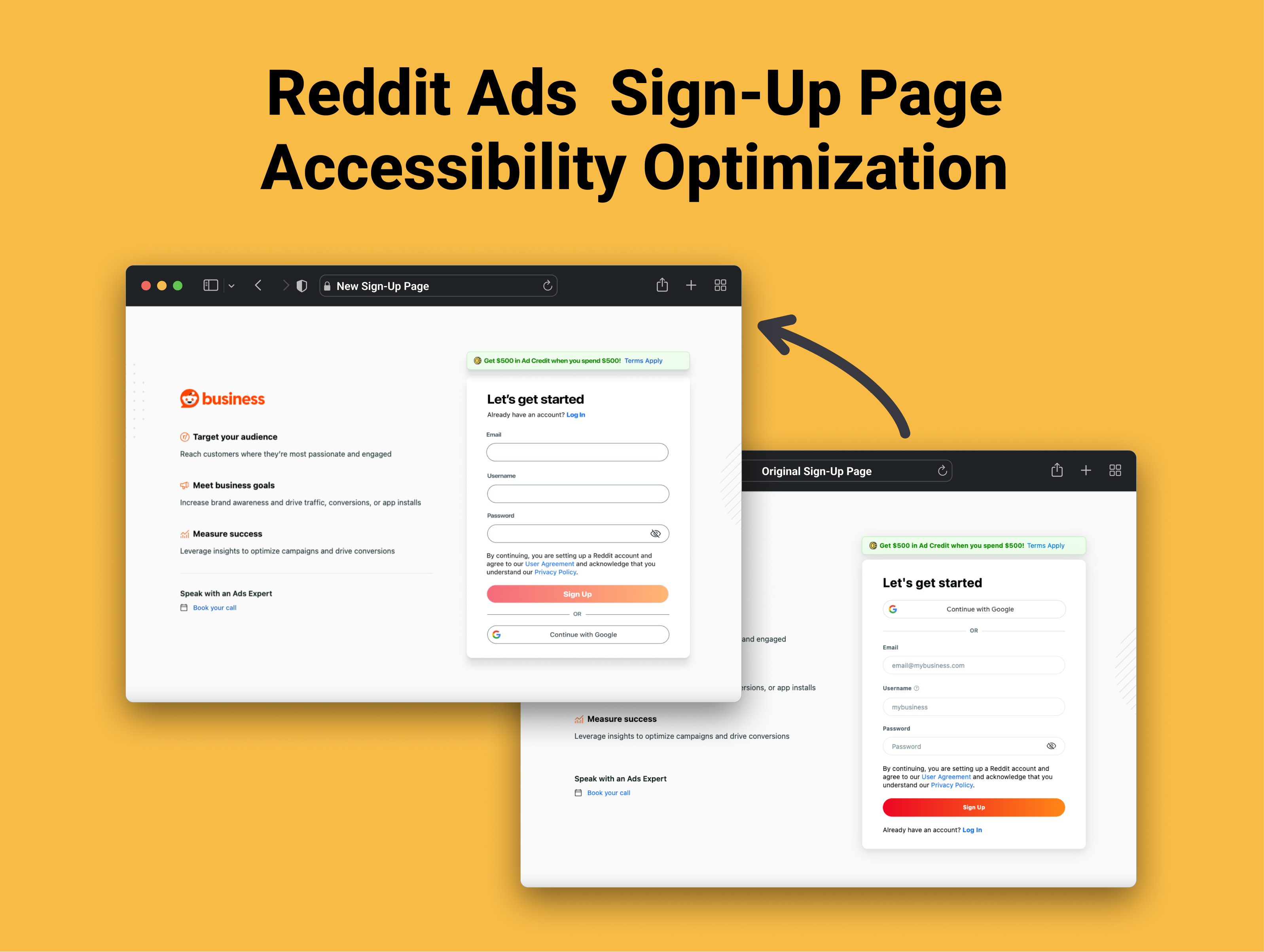
The goal of this project was to enhance the accessibility and user experience of the Reddit Ads sign-up form by addressing key usability issues. The original design presented several challenges, including non-compliance with WCAG accessibility standards, inefficient layout, and poorly designed call-to-action (CTA) elements. These factors not only affected the general user experience but also created barriers for users with disabilities.
Key Issues:
- Accessibility Errors:
- The page did not meet WCAG (Web Content Accessibility Guidelines) standards.
- Missing labels for form inputs, which made navigation difficult for screen readers.
- Insufficient color contrast, making it hard for visually impaired users to read the text.
- Poor focus and error states, lacking visual cues and clarity when users interacted with fields.
- Unoptimized Spacing and Structure:
- Overly spaced form elements resulted in a scattered layout, impacting usability.
- The primary CTA (Call to Action) was pushed below the fold, reducing visibility and interaction.
- There was no clear distinction between Login and Sign-Up switching, causing confusion for users.
- Unprioritized CTA:
- The size and boldness of the primary CTA button were too small and lacked visual prominence.
- Missing AutoFill Suggestions:
- AutoFill was missing, which could assist users with disabilities (both temporary and permanent) by reducing the manual effort required for input.
Implemented Solutions:
Accessibility Improvements:
- Label Placement:
- Moved password suggestions and labels to fixed positions outside of form fields for better visibility and access by screen readers.
- Color Contrast Enhancements:
- Increased the color contrast of labels and field borders to meet WCAG AA guidelines, ensuring readability for all users, especially those with visual impairments.
Usability and UX Enhancements:
- Focus and Error States:
- Improved focus indicators by widening field borders and adding color contrast to make them stand out when active.
- Added warning and confirmation icons for better form validation, ensuring users can easily identify errors and correct them without confusion.
- Primary CTA Improvement:
- Increased the size and boldness of the primary CTA button to make it more visible and encourage interaction.
- Repositioned the CTA above the fold, making it the focal point of the page and reducing user frustration.
Conclusion:
This project demonstrates the importance of considering accessibility and user experience in all aspects of design. By implementing simple yet effective changes, the sign-up page was made more accessible, user-friendly, and respectful of users' mental well-being.

Reviews
1 review

I really liked the way you presented your work—clear and concise notes highlighting the problematic elements. Your meticulous approach shows that you put every detail under a microscope, which is great!
That said, there are a few solutions I don’t fully agree with:
- Moving the "Already have an account? Log in" option up – placing it higher in the flow might interfere with the sign-up process, distracting users and causing unnecessary confusion. Plus, keeping the Google sign-up option first makes sense, as many users prefer single sign-on for both sign-up and login.
- As to the autofill option, it’s important to ensure that among the autofill suggestions, a user’s business email appears as an option. I’m not entirely familiar with Reddit Ads account policies, but I assume personal emails wouldn’t be eligible for sign-up, so this needs to be considered.
Overall, great job analyzing the accessibility of the form!
You might also like

Loginino


Notification microcopy - Project


El Mandoub-GovTech App


MalishaEdu Counselor Workspace


Portfolio website

MalishaEdu - Website Design
Visual Design Courses

UX Design Foundations


Introduction to Figma

Design Terminology
