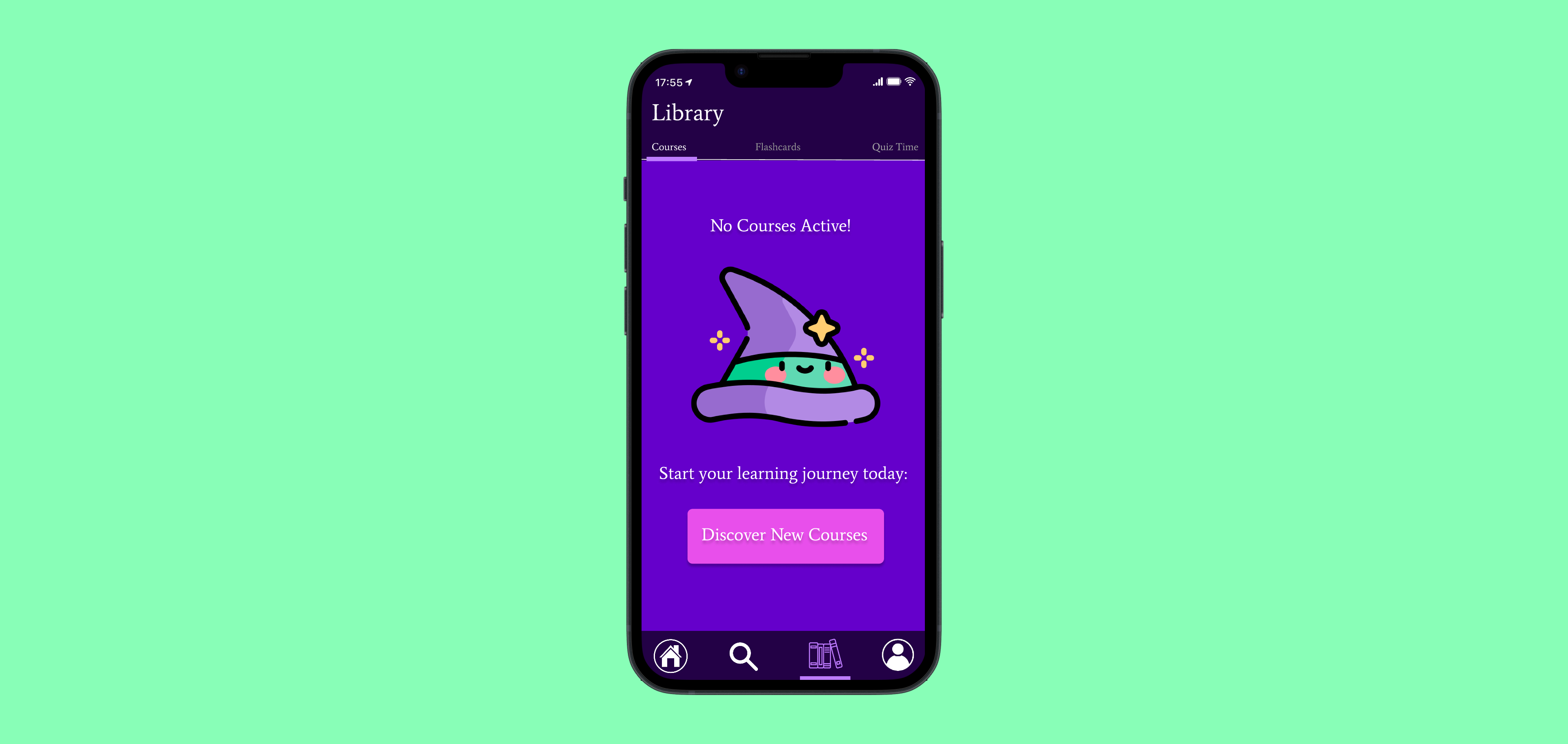
QuizZone - Empty State Page

QuizZone is a learning application for students, to study courses and use interactive tools such as quizzes and flashcards, to memorise information and test their knowledge.
This specific screen is displayed when a user navigates to Library > Courses but there are no courses available/they have not added any courses to their library.
This is a friendly and welcoming empty state page, with a CTA "Discover New Courses" to prompt and encourage users to explore and engage within the app for courses.
Cartoon Image Sourced from: www.freepik.com

Reviews
3 reviews

Hi Aoibheann, great job on making the QuizZone empty state playful and inviting! 🎨 The microcopy is clear, the CTA stands out, and the illustration fits the quiz theme perfectly. For improvements, consider emphasizing the main message (“No Courses Available”) with bolder typography, adding more padding for readability, and pairing vibrant colors with subtler tones for better accessibility. Overall, very engaging and fun! ✅

Hi Aoibheann!
I think the topic of quizzes has a very fun nature, which you highlighted with the playful colours and image. But there is still room for improvements, like typography, accessible colours and font sizes, hierarchy.
Great start!
/Yuliia

Your design included all essential elements for an empty state page. The microcontent was short and easy to understand. The color palette was also wisely picked to represent the fun and excitement of a quiz app.
Here are my suggestions on the design improvements:
- Information hierarchy => the phrase “No Courses Available” should be highlighted as the most important message of this page. You might bold it and increase its size to make it more outstanding.
- Page padding => The text was quite too close to the left and right side of the page. You might give a little more space by padding it.
- Colors => Both background and CTA button colors were vibrant which decreased the level of readability. You might pair a vibrant color with a less saturated one to make the interface easy to go through. (A big) personally, the complementary color – which is yellow in this case – might be a better choice for CTA buttons to capture users’ attention.
Thank you for sharing this lovely work!
You might also like

Pulse Music App - Light/Dark Mode


Designing A Better Co-Working Experience Through CJM


Monetization Strategy


Zoom Sign in Screen


Button System for Mobile Web Platforms Brief


Mobile Onboarding

Content Strategy Courses

UX Writing


Common UX/UI Design Patterns & Flows


Building Content Design Systems
