Profile Page Design For Hiring Platform
My design is from the perspective of hiring managers when viewing job seeker profiles, beginning with an understanding of the issues faced by both parties
___________
Issues
Hiring Managers:
- Time-Consuming Review: Reviewing each profile to ensure it fits the job requirements is time-consuming.
- Inactive Candidates: Some candidates may no longer be active on the platform, leading to wasted time when trying to contact them.
Solutions:
- Job Seeking Status: Display the candidate's current job-seeking status.
- Profile Match Percentage: Indicate that matches percentage of the profile with the job preferences.
- Last Active Time: Show the last time the candidate was active on the platform.
Job Seekers:
- Finding Suitable Jobs: Seek jobs that align with their skills and preferences.
- Self-Representation: They need an effective way to represent themselves, knowing HR managers have limited time to review profiles.
Solutions:
- Clean Layout: Maintain a clean and organized layout.
- Information Hierarchy: Prioritize information display, starting with the most important and relevant details, followed by additional, detailed, and nice-to-know information.
Reviews
1 review
I liked the concept from hiring manager point of view. I didn't understand it until I had read your notes which is a sign that the design is not easy to detect. I was especially confused with "I am looking for" line. Also, I like how you showcased the profile match and recommendations, but you could show more like the total number of candidates, and more metrics on how many are 60 % or higher match and other requirements match like location, work style and pay roll expectations.
13 Claps
Average 4.3 by 3 people
You might also like

Project
Islamic E-Learning Platfrom Dashboard
Visual Language & Color I wanted the interface to feel like a quiet room you'd actually want to sit in and study. The warm neutrals - off-wh

Project
Pulse — Music Streaming App with Accessible Light & Dark Mode
Platform & DeviceFor this project, I designed Pulse, a mobile music streaming application for iOS devices (using the provided mobile templat
Project
SiteScope - Progress Tracking App
🧩 Project OverviewThis project showcases the design of a mobile login and sign up experience for a construction progress tracking app. The

Project
Mobile Button System
As my first ever ux design attempt, I tried to go with a simplified approach with only a few button types and states. I kept the color palle

Project
FlexPay
The onboarding was designed to reduce financial anxiety, create a sense of instant reward, and encourage early action. Instead of overwhelmi

Project
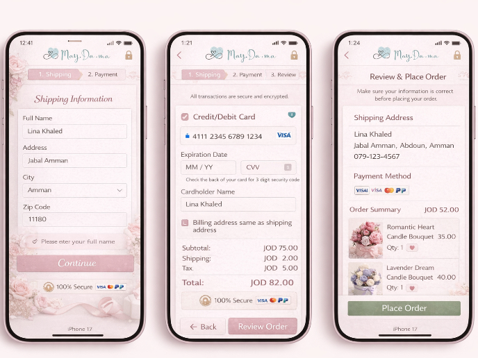
May.Da.Ma Candles & more
Content Strategy Courses

Course
UX Writing
Learn to write microcopy that communicates clearly and concisely to improve user experience, build trust, and boost conversions across digital products.

Course
Common UX/UI Design Patterns & Flows
Learn how to use tried and tested UX/UI design patterns and flows to solve recurring design problems faster and build interfaces that feel intuitive

Course
Building Content Design Systems
Master systematic approaches to creating consistent, reusable content across your entire product ecosystem


