Profile Page Design for BestJobs (Desktop)
The profile page, as seen by a candidate:
The profile page, as seen by an employer:
Reviews
2 reviews
- Content — Overall, I feel like the content is good, with a clear hierarchy in the majority of cases. However, there are areas for improvement, especially regarding the different components within your experience listings that you can enhance.
- Visual Design — Visually, it looks appealing with good readability and design. However, I feel you could improve the spacing to increase consistency. I’d recommend using a fixed set of spacing tokens. Additionally, there are a few cases of misalignment, such as the navigation menu icons or the icons/links in the sidebar. Have a look at these and see if you can spot them. I’d highly recommend spending some time learning the auto-layout feature in Figma, as it will help you avoid any spacing mistakes in the future. Also, pay attention to the icon sizes, as there are some inconsistencies.
- Usability — I recommend testing your colors and buttons with a contrast checker tool (there are some useful plugins available directly in Figma). One thing to check is your primary button, “Edit Profile.” Also, consider if that function should remain primary, or if there might be another function more important to feature on this screen. Something to think about.
- Presentation — It’s easy to follow and read, which is great. However, it would have been nice to see more details of your A/B test, such as how it looked before and after, and your process. This information is very useful for recruiters and potential clients.
Keep up the good work!
Thank you for such helpful feedback! I implemented the changes, as suggested :)
Made small enhancements on the experience listing, and fixed spacing issues, using a set of spacing tokens. I also fixed the misalignment issues in the navigation and the sidebar and checked for other misalignment issues that might have been missed.
I adapted the icon sizes and retested the colour contrast with webaim.org. I slightly adapted the green and increased the contrast ratio from 7.83:1 to 8.47:1, as I felt it would be better for the outlined buttons.
I also swapped the positions of "Profile Visibility" and "Edit Profile," giving higher priority to "Profile Visibility". Considering that each section can be edited individually, I changed the button styling from primary to secondary.
Lastly, I added the two header options that were shown to users during the A/B testing session in the presentation. I also included some relevant quotes collected during user interviews.
(edited)
The design is clean, intuitive, and user-friendly. The layout and typography make navigating and editing profiles easy, while the design elements align well with the brand. It’s a functional and visually appealing interface that enhances the user experience.
8 Claps
Average 4.0 by 2 people
You might also like

Project
Islamic E-Learning Platfrom Dashboard
Visual Language & Color I wanted the interface to feel like a quiet room you'd actually want to sit in and study. The warm neutrals - off-wh

Project
Pulse — Music Streaming App with Accessible Light & Dark Mode
Platform & DeviceFor this project, I designed Pulse, a mobile music streaming application for iOS devices (using the provided mobile templat
Project
SiteScope - Progress Tracking App
🧩 Project OverviewThis project showcases the design of a mobile login and sign up experience for a construction progress tracking app. The

Project
Mobile Button System
As my first ever ux design attempt, I tried to go with a simplified approach with only a few button types and states. I kept the color palle

Project
FlexPay
The onboarding was designed to reduce financial anxiety, create a sense of instant reward, and encourage early action. Instead of overwhelmi

Project
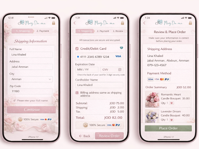
May.Da.Ma Candles & more
Content Strategy Courses

Course
UX Writing
Learn to write microcopy that communicates clearly and concisely to improve user experience, build trust, and boost conversions across digital products.

Course
Common UX/UI Design Patterns & Flows
Learn how to use tried and tested UX/UI design patterns and flows to solve recurring design problems faster and build interfaces that feel intuitive

Course
Building Content Design Systems
Master systematic approaches to creating consistent, reusable content across your entire product ecosystem


