Portfolio Website

Clean and minimalist portfolio website
Reviews
2 reviews

Hi Ameer,
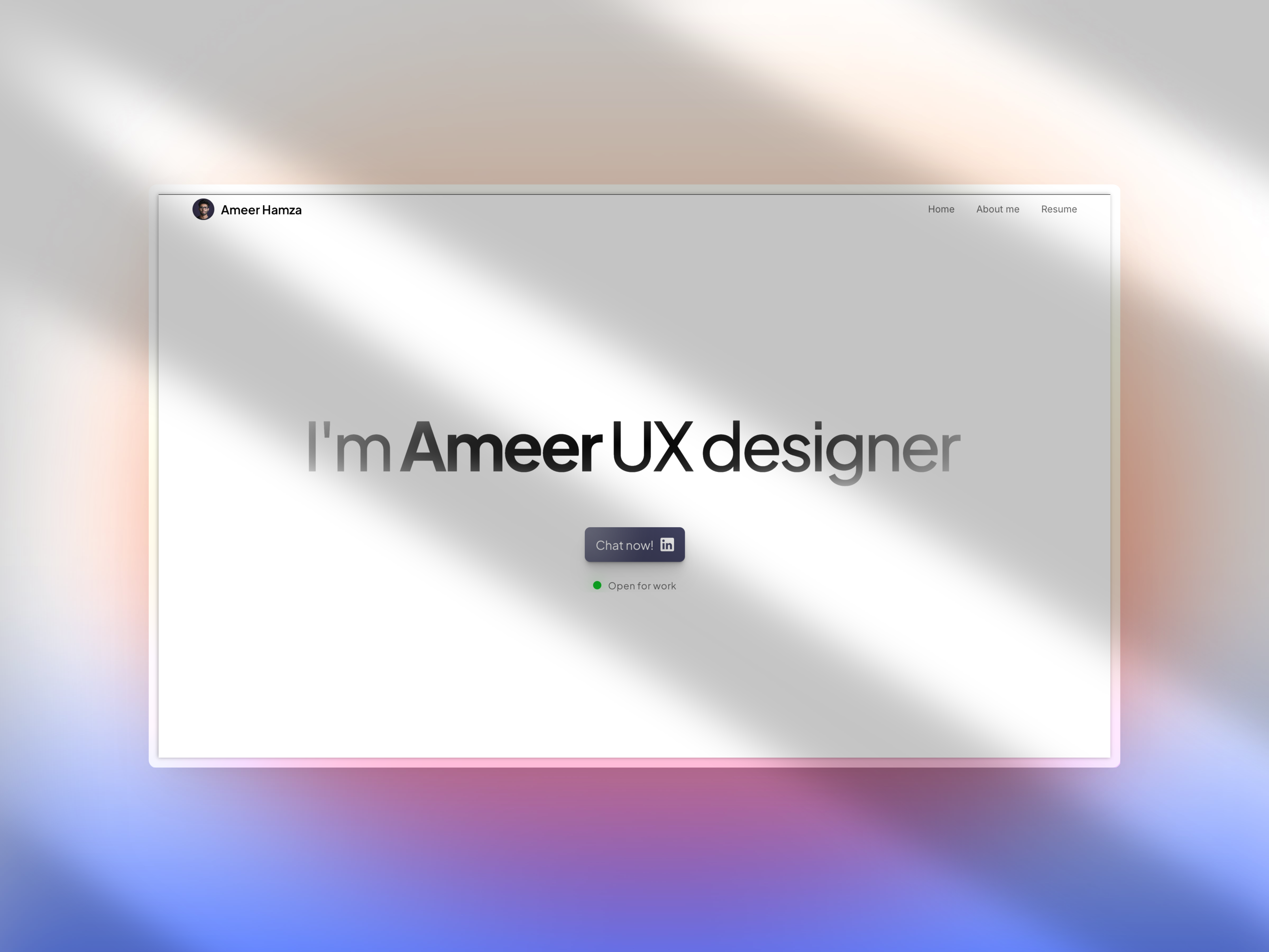
I genuinely enjoyed exploring your portfolio site. The clean aesthetic, well-paced scroll behavior, and minimal yet expressive design immediately convey your understanding of clarity and simplicity—just as your tagline promises.
Your selection of case studies shows a thoughtful range of problems, especially how you tailor design solutions to real user needs in the local context. I particularly liked Digital Khata—it’s a great example of identifying a high-impact opportunity and designing with empathy for users who may not be tech-savvy. Roadside Assistance was also a smart and timely idea. The UI is clean and well-executed, and I can see how it would feel reassuring in stressful moments for drivers or riders.
I appreciated the inclusion of testimonials; it's clear you’ve worked closely with others and left a strong impression. Those human touches go a long way in making a portfolio feel grounded and trustworthy.
A few suggestions that I think could elevate your already solid portfolio even more:
- Deeper Case Study Narratives: While linking to Medium is totally fine, I’d love to see at least one or two complete case studies built into the website. Having your process—from user research, journey mapping, and ideation to wireframes and iterations—right on your site will make it easier for recruiters or clients to get a complete view without leaving the experience.
- Visual Repetition: Some sections—like project showcases—are presented a few times with slightly different styles. You could consider consolidating these a bit to reduce scroll fatigue and make room for more storytelling or detail.
- Stronger CTA in Contact Section: Right now, the contact options feel a bit hidden. Maybe try adding a simple contact form, or a clear “Let’s work together” call-to-action button to encourage more interaction.
- Show More of the UX Thinking: Things like personas, early sketches, usability testing results, or even some failures you learned from could help people see your full design mindset—not just the final screens.
Overall, your work is super clean and your personality shines through, which is great to see. If you're looking for inspiration on how to showcase deeper process work within the same minimal aesthetic, you can take a look at my own portfolio at sepantapouya.com.
You're definitely on the right track—I can see your passion and talent clearly. Keep it up! I'm looking forward to seeing where your design journey takes you next.
Warmly,
Sepanta

Hey Ameer, nice work on this Framer Portfolio website. I like the use of white space and the minimal aesthetics.The cover design is also awesome.
However there are some areas you can improve:
- The hero section is great and all but most users might just bounce of thinking there isn't much to explore. You can fix this by teasing continuity- thus showing some of the works in the hero to prompt users to scroll down.
- The cards showing the works are unique but the visit now button doesn't stand out much so I will consider making the entire clickable instead or making the button more prominent
- The last two cards are not consistent with the first making it feel like something else other than works
- The mobile screen recording jumps outside of the container when you adjust the viewport width to a smaller size.
- The about me section layout could be improved, you repeated your image twice and the length of the paragraph text and email are too long.
- You can explore a copy email interaction or make the email linked by adding "mailto:" followed by the email in the link section in Framer
I hope these points help improve the overall look and functionality of your portfolio site.
You might also like

NORTHSIDE - Coworking space Customer Journey Map


Wealthsimple 404 Page


HealthFlow: Designing a Simple and Insightful Wellness Dashboard


Rethinking Content Discovery for Netflix


Accessibile Login & Signup Form for Notion

Improving Dating App Onboarding: A/B Test Design
Popular Courses

UX Design Foundations


Introduction to Figma

Design Terminology
