Optimizing Indeed’s Onboarding for Better Profile Completion

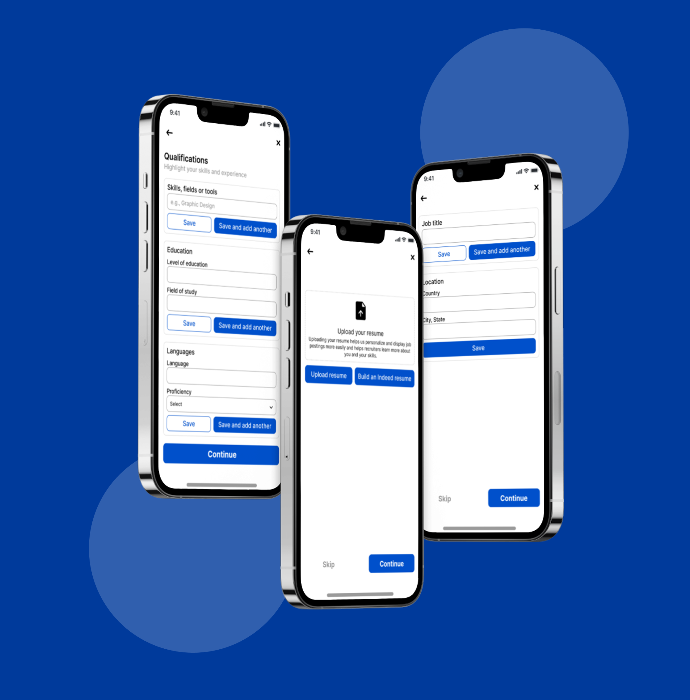
Note on Project Selection: Instead of the suggested dating app scenario, I chose to apply this A/B test to a Job Search app (Indeed). I believe the core challenge of 'matching' is identical in both fields; just as dating apps need personal data to find a partner, job platforms need specific skills and education data to find the right career match. This transition allows for a more professional focus while addressing the same UX friction points.
Tools used
From brief

Topics
Share
Reviews
3 reviews

Excellent strategic thinking, Nada! Pivoted to Indeed—smart. Core insight solid. A/B test plan is well-structured. Here's my feedback:
Strengths:
- Strategic pivot: Reframed the brief to the real problem. Shows product thinking
- Problem diagnosis: Clear friction analysis ("Cold Start," abrupt ending, no personalization)
- Hypothesis-driven: "Friction vs. Value"—will adding steps improve profiles or increase drop-offs
- Comprehensive test plan: Clear metrics (15% increase), sample (1,000), duration (14 days), guardrail (20% drop-off)
- Mentor recognition: Insan gave a standing ovation
- Post-test strategy: Plan for iteration and next A/B test
Critical Gaps (Product Perspective):
- User Research Foundation — Where's the evidence users want to add skills/education? Interview job seekers? Hypothesis, not validated
- Competitive Analysis — How do LinkedIn and other job apps handle onboarding? What's the industry standard? Context matters for a hypothesis
- Qualitative Research Plan — Quantitative focus only. Where's qualitative? Plan interviews at friction points
- Implementation Details — How to handle users without a resume/education? UX for "skip" or "add later"?
- Accessibility — No mention of accessibility testing, mobile-first design, or inclusive design
- Wireframes/Prototypes — High-level flow shown. Detailed wireframes for Version B? How to make 6 screens lightweight?
- Success Definition — 15% increase in good, but significant for business? Revenue/retention impact? Cost of longer flow?
Strategic Questions:
- If Version B wins on completion but loses on retention?
- Progressive profiling (ask data after first search)?
- Fallback if Version B fails? Version C?
- How communicate results? Decision framework?
Overall: Strong product thinking. Understand A/B testing. This is 70% of the strategic plan. Missing: user research, competitive context, implementation depth.
Next: User interviews (5-10 seekers) to validate. Competitor research. Detailed wireframes. Qualitative plan. Clarify success metrics.

Very well structured presentation. Great job Nada.

Please correct me if I am wrong but this is not actual A/B testing. In the current project I see something more like a process flow, not a comparison.
Feedback based on: https://app.uxcel.com/glossary/ab-testing
You might also like

Smartwatch Design for Messenger App


Bridge: UI/UX Rebrand of a Blockchain SCM Product


Pulse Music App - Light/Dark Mode


Monetization Strategy


Designing A Better Co-Working Experience Through CJM


Design a Settings Page for Mobile
User Research Courses

Ethical & Responsible Product Design


Product Management Foundations


The Product Development Lifecycle & Methodologies
