OneCart - Accessible Signup Form

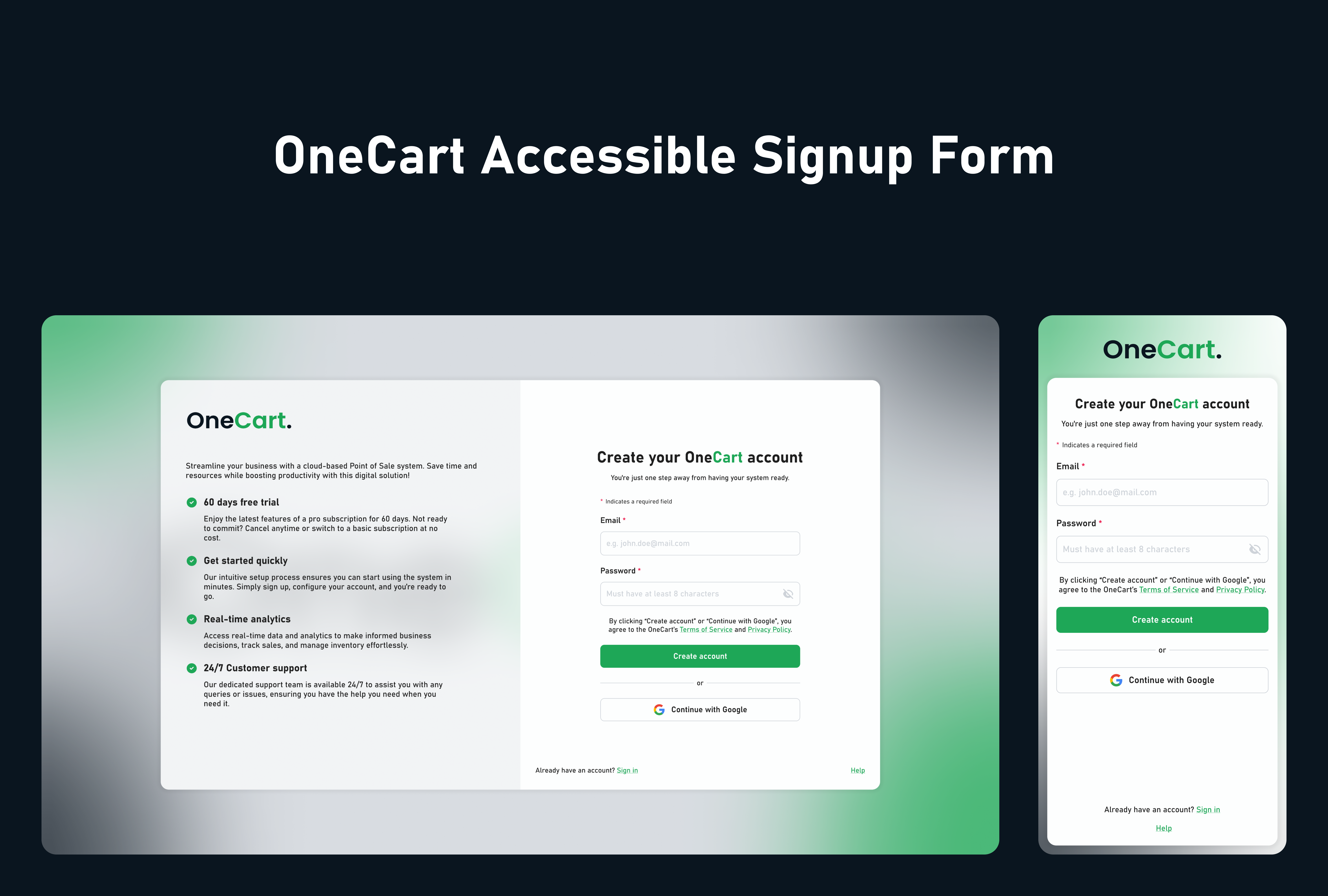
As part of this project, I focused on enhancing the accessibility and usability of OneCart's sign-up form. By strictly adhering to WCAG standards, I aimed to make the form accessible to all users, regardless of their abilities.
To achieve this, I took a comprehensive approach to design the user experience. I carefully selected visual elements that were both aesthetically pleasing and functionally accessible, considering factors like colour contrast and text readability. I also optimized the interaction flow by simplifying the steps, minimizing cognitive load, and ensuring keyboard and screen reader compatibility.
To accommodate users with diverse needs, I provided clear labels, instructions, and feedback throughout the form. By prioritizing accessibility, I significantly improved the overall user experience, making it easier for all users to start using OneCart. This holistic approach to design contributes to a more inclusive digital environment.
Tools used
From brief

Topics
Share
Reviews
1 review

Overall, the design seems great and also follow the hierarchy which is important to user needs and preventing the users pain.
Prioritizing Signup Efficiency: Since a major business goal is to collect as many signups as possible, the signup process should be quick and straightforward. This means reducing unnecessary steps, minimizing input fields, and clearly guiding users toward the signup button. An efficient flow will help users proceed without distractions, enhancing the overall user experience and improving conversion rates.
Reducing Body Texts on the Left Side:
- Reason: Long body texts can overwhelm users, especially if they’re repeated for every point. Reducing the text will allow users to scan and understand the information more quickly. Concise and targeted content keeps the focus on the primary action (signup) and avoids cognitive overload. This simplicity aligns with user expectations for efficiency and ease of use in signup flows.
Providing Illustrations for Each Point:
- Reason: Illustrations help convey the message visually, making it easier for users to grasp key information at a glance. Visuals can break up the text-heavy sections, making the design feel lighter and more engaging. They also create an emotional connection, reinforcing the brand’s message and guiding users toward the desired action (signup).
Proximity Rule in UX:
- The Proximity principle in UX states that items close to each other are perceived as related, while items further apart are viewed as separate. This principle helps create intuitive groupings, so users can easily understand what elements belong together and which actions they should take next. Grouping related content makes navigation simpler and supports user understanding.
Applying Proximity to the Login Section:
- Based on this rule, the Login text should be positioned closer to the Google login button. This spatial grouping signals that these elements are related, creating a clearer, more cohesive experience. When login options are nearby, users intuitively know where to take action, reducing friction and making the process feel more seamless.
All the best:)
You might also like

edX Sign-Up Page Redesign


Beautify Login page WCAG principles


Design Prioritization Workshop


Sanyahawa - Personal Portifolio_login page

Uxcel Halloween Icon Pack

eWallet App Development Project

Visual Design Courses

UX Design Foundations


Introduction to Figma

Design Terminology
