Fundraising Website

The fundraising website is a dynamic platform designed to support individuals, communities, and organizations in their efforts to raise funds for meaningful causes. This user-friendly platform simplifies the fundraising process by connecting donors with campaigns in need, making it easier to create, share, and manage fundraising efforts across multiple sectors, including education, healthcare, social welfare, and disaster relief.
Reviews
5 reviews

Great work, Adil!
I really like the colors, layout, and typography you used. One thing to consider is how you apply the primary color in your titles. If the text in the primary color isn’t clickable, it’s better to avoid using it that way since the primary color usually indicates interactivity.
You can highlight or emphasize parts of the text in other ways instead of using the primary color.

Super clean and solid work mate! You did amazing and hope to see your next one!

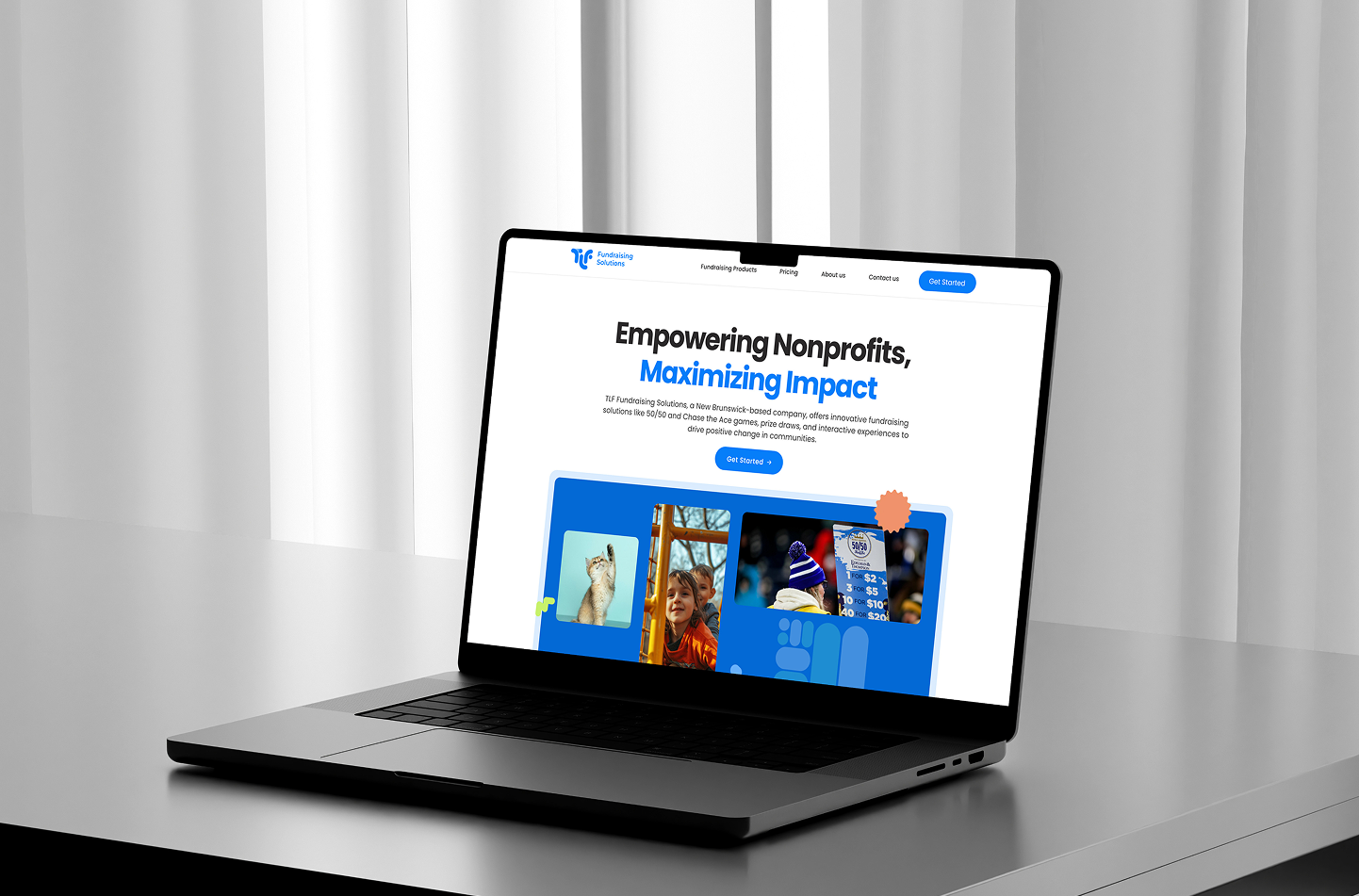
Design feels immediately trustworthy and optimistic. The use of bright blue strongly reinforces the theme of "Empowering" and gives the site an energetic, modern feel. The overall layout is clean, and the main headline is clear and impactful.
The primary Call-to-Action (CTA) button ("Get Started") is clear, but I'd audit the navigation bar. The white text on a white background (except for the blue CTA) is low contrast and difficult to read. This is an accessibility/usability friction point.

great job!

Your design shows a strong understanding of modern UX/UI principles. The layout feels clean and well-structured, with excellent visual hierarchy and spacing. The color palette is balanced and consistent, creating a professional and trustworthy mood.
You might also like

Mobile Onboarding: Casa di Pasta


Accessible Signup & Login Experience — Brainex


Accessible Signup Form


Auction


Entrant - Analytical Dashboard


Transit Cairo — Digital Mobility Redefined

Popular Courses

Design Composition


HTML Foundations


CSS Foundations