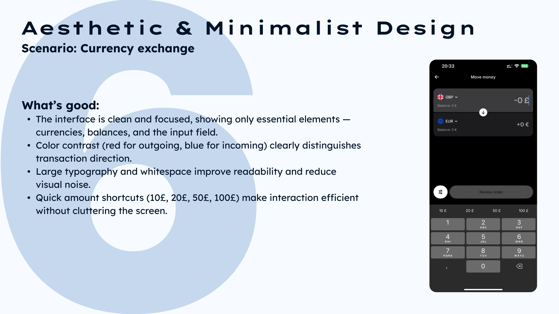
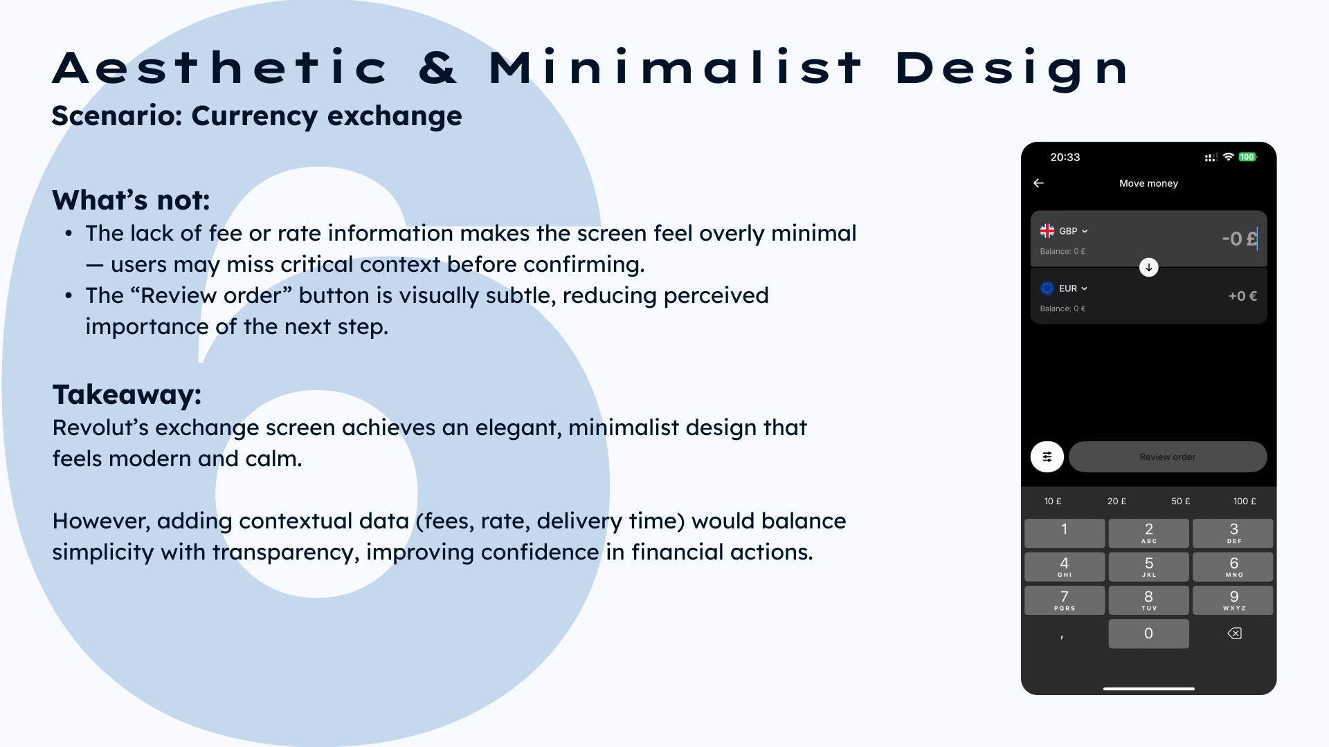
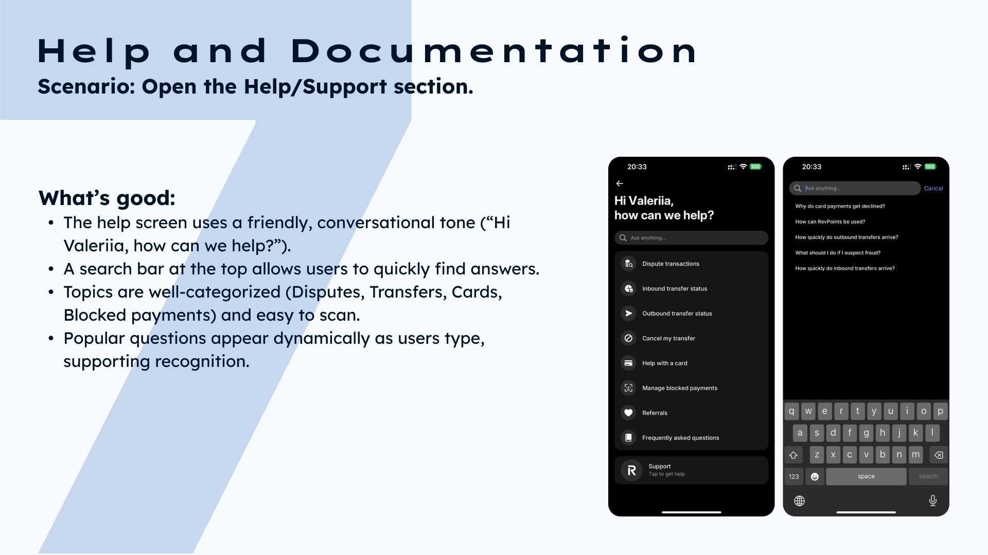
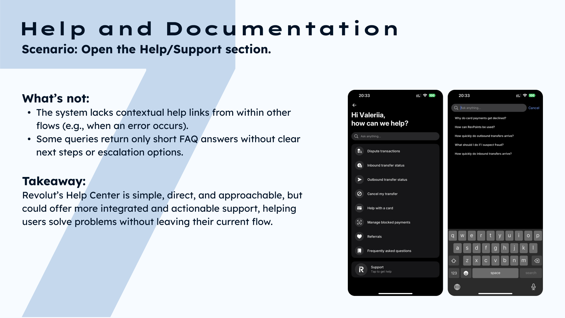
Heuristic Evaluation of Revolut Mobile App


Tools used
From brief

Topics
Share
Reviews
4 reviews

This is a really great, in-depth analysis! You do a really good job of walking through key scenarios to see what the pain points are where the app is lacking in the usability heuristics. The presentation design is very clean, your points are scannable, and the screenshot mockups demonstrate what you're talking about very well.
Awesome work!

Very detailed, great job!

Hello Valeria, this is really impressive work. You've clearly spent serious time understanding how users actually interact with the app, and it shows in every detail.
What stands out is how well you've structured everything—you present the interface, analyze what works and what doesn't, and explain your reasoning clearly. The visual presentation is clean too, with screenshots placed thoughtfully alongside your insights.
I really like that you're thinking about real user problems, not just making things look pretty. This kind of thorough analysis is exactly what makes good design work. It's the kind of project that feels polished and professional from start to finish.

Good job! You can see you approached this systematically and extracted concrete insights. Clear breakdown into scenarios and heuristics, easy to read and find specific issues. This isn't another generic report. You show exactly what and where, not limiting yourself to generics like "poor status visibility". Screenshots with annotations are a plus. Balance between positive and negative – you don't just focus on problems, you show what Revolut does well too. This builds credibility for the analysis.
Solid heuristic evaluation that shows you understand UX fundamentals. 😊👏
You might also like

HealthFlow: Designing a Simple and Insightful Wellness Dashboard


Improving Dating App Onboarding: A/B Test Design

FORM Checkout Flow - Mobile


A/B Test for Hinge's Onboarding Flow


Accessibility Asse


The Fitness Growth Engine

User Research Courses

Ethical & Responsible Product Design


The Product Development Lifecycle & Methodologies


Writing Effective Product Specs
