Docto
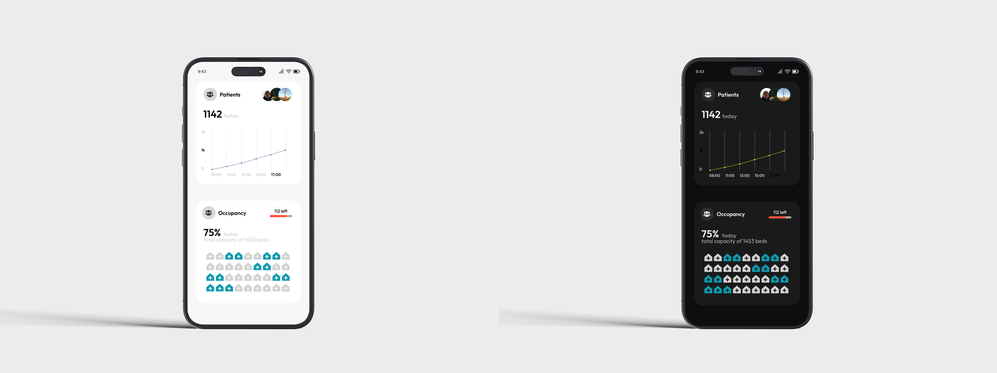
This is an app for medical services, and these are the two variants of light and dark mode. Below, I am describing some of the decisions.
- I select Outfit, a Google font which I believe has good readability and gives a good feeling of the app.
- The light mode has colors which are more close to the medical environment, that's why I select them, in the dark mode they match well and don't stand too harsh.

Reviews
6 reviews

This is a great, focused design that effectively uses both light and dark modes to present critical data. Excellent work on clarity and visual balance

Hey Mariyan,
The app looks clean and well structured at first glance!
What I’m missing are a few details about your color palette choice, which colors did you pick and why? I’d also love to hear how your palette supports accessibility and aligns with WCAG guidelines.
Lastly, could you explain your design choices and overall thought process a bit more? It would really help to understand the reasoning behind your visual and interaction decisions.
Great job overall!
Visually clean design with light and dark modes balanced.
Would be nicer if you could illustrate more about your design decision processes and rationales.
All in all, good job.

Great job! Your designs look really nice — clean and visually balanced.
A couple of suggestions to make your case study even stronger:
- Add a bit more context about your color choices for both the light and dark themes — it’ll help viewers understand your design rationale.
- Double-check the preview image — the phones appear a bit too far apart, so bringing them closer would make the composition feel more cohesive.
Overall, really nice work!
Well done
Overall, I like your concept of the light and dark modes. You choose good colours in both your light and dark variants. I like the design you chose from a user perspective. The negative space use is perfect for this kind of app.
In the dark mode, your choice of shading and font colours works especially well.
In the case of the light mode, I would suggest adjusting your typeface to something more readable. I can't quite see the grey font colours against the white background on my screen.
In both light and dark modes, I would suggest increasing the line thickness on your chart image to make this easier to see on all mobile device types.
One final option to consider is increasing the size of your microcopy to match that of the numbers. With the numbers being larger than the sentence, engagement may drift off before readers have read the whole sentence. You could emphasise the key numbers in a different way, perhaps using thickness or a colour change.
You might also like

Smartwatch Design for Messenger App


Bridge: UI/UX Rebrand of a Blockchain SCM Product


Pulse Music App - Light/Dark Mode

Uxcel Halloween Icon Pack


Monetization Strategy


Designing A Better Co-Working Experience Through CJM

Visual Design Courses

UX Design Foundations


Introduction to Figma

Design Terminology
