Ohana Boutique - E-commerce Landing page

Ohana is an Ecuadorian brand that specializes in sustainable clothing and giving a second chance to clothing that is in good condition.
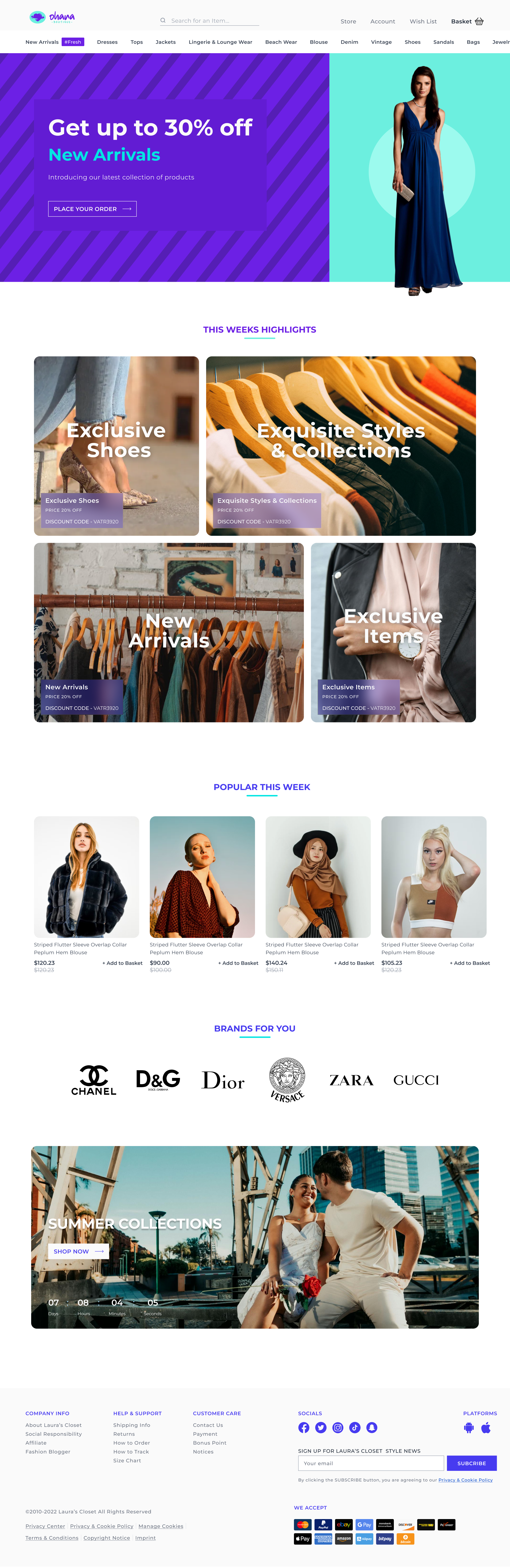
“Ohana” is a Hawaiian word that means “family.” It is a term that is used to refer to the family into which one is born, but also to the one that is created throughout life.
Based on this, the considerations that were taken into account were:
- Palette of intense and striking colors, in line with current fashion.
- The rounded images allude to the movement that the brand projects, in addition to the subtlety.
- Direct sales texts with promotions and discounts to inspire action.
- The types of images are fresh and real to meet the objective of showing what is offered.
- Clean, white backgrounds to improve contrast with the textual information presented.
Overall, the brand projects movement, liveliness, hope and agility with the intention of being current and empowered.
Tools used
From brief

Topics
Share
Reviews
3 reviews

Good job, Dario. The design looks solid. I’d recommend adjusting the text hierarchy in the caption box of the 'This Week Highlights' section. Specifically, the 'Price 20% OFF' text under 'Exclusive Shoes' should be bolder and larger than the discount code to emphasize the offer more effectively. Keep up the great work!

Hello Dario! Great proposal!
You have a solid base. Considering the explanation you include, I would add some points that can improve the storytelling of the brand.
- Main headline: In addition to talking about discounts, I would include something associated with the purpose of the brand, which is to sell second-hand clothes.
- Highlights: I would include a section related to sustainability; maybe they could promote a particular brand that manufactures this type of clothing. I mention this also because you have categories that could be perceived as generic and without differential, such as “Exclusive Items” and “Exclusive Styles & Collections”.
- Section on how to participate (optional): I would include a section directed to brands or people who want to offer second-hand clothes. Many times, these types of resale services have information on how to be part of the circular economy movement focused on clothing.
I love the project, and I think I could go on commenting about it, but I leave these three starting points for further work.

Page is visually appealing and well-structured, with a clean layout that highlights key products and brand identity. The use of high-quality imagery, consistent typography, and a soft color palette creates a cohesive and inviting aesthetic. The inclusion of clear CTAs and intuitive navigation enhances usability, though adding more interactive elements (e.g., hover effects or animations) could further elevate user engagement. Overall, it’s a polished and effective design that aligns well with the boutique’s brand. Great job
You might also like

SONZ - Entertainment platform


Camp & Travel Explorer - App Design


Solar system Dashboard Utility


Signup page for a SaaS website

Uxcel Halloween Icon Pack


PLANTIST

Content Strategy Courses

UX Writing


Common UX/UI Design Patterns & Flows


Go-to-Market Strategy Fundamentals
