New ClickUp Color Palette
The newly curated color palette of ClickUp has been meticulously crafted to resonate with users, invoking the desired emotions and enhancing the overall user experience. By seamlessly blending innovation and simplicity, ClickUp's core principles of continuous improvement, collaboration, transparency, and customization are vividly brought to life.
Maintaining a strong connection to ClickUp's original branding colors, the chosen palette expertly combines bold and light shades. This deliberate selection aims to cultivate a more mature aesthetic, departing from the platform's previous playful appearance. Through the incorporation of darker tones and lighter fades, the palette introduces contrast, symbolizing a shift towards a more balanced and serious theme.
The rationale behind these color choices lies in their capacity to effectively communicate and reinforce ClickUp's values and evolutionary journey. The transition to a sophisticated palette mirrors ClickUp's dedication to continuous improvement and maturity. The juxtaposition of darker shades and lighter fade signifies the harmonious balance between ClickUp's guiding principles, projecting professionalism and earnestness.
In essence, the color palette not only resonates with users but also logically aligns with ClickUp's core values and its pursuit of a refined and serious visual identity.
Reviews
0 reviews
You might also like
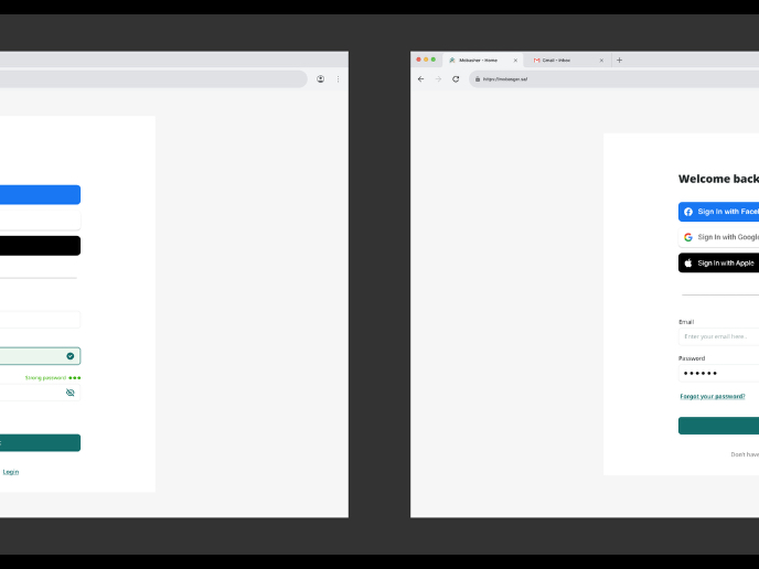
Auction

Accessible Signup Form
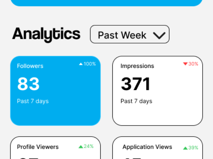
Entrant - Analytical Dashboard
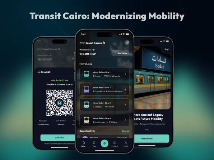
Transit Cairo — Digital Mobility Redefined
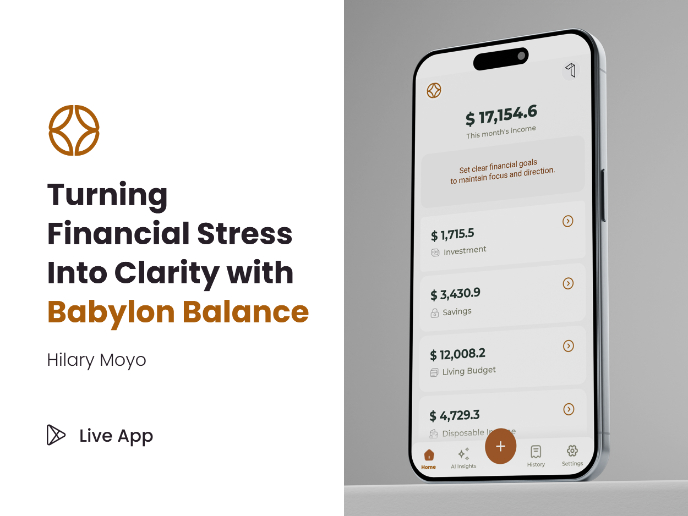
Babylon Balance - Designing Financial Clarity Through Constraint
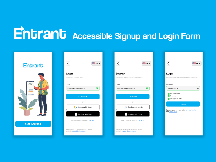
Entrant Accessible Signup and Login Forms
Visual Design Courses

UX Design Foundations

Introduction to Figma


