Monday.com - Work Management App Color System Revamp

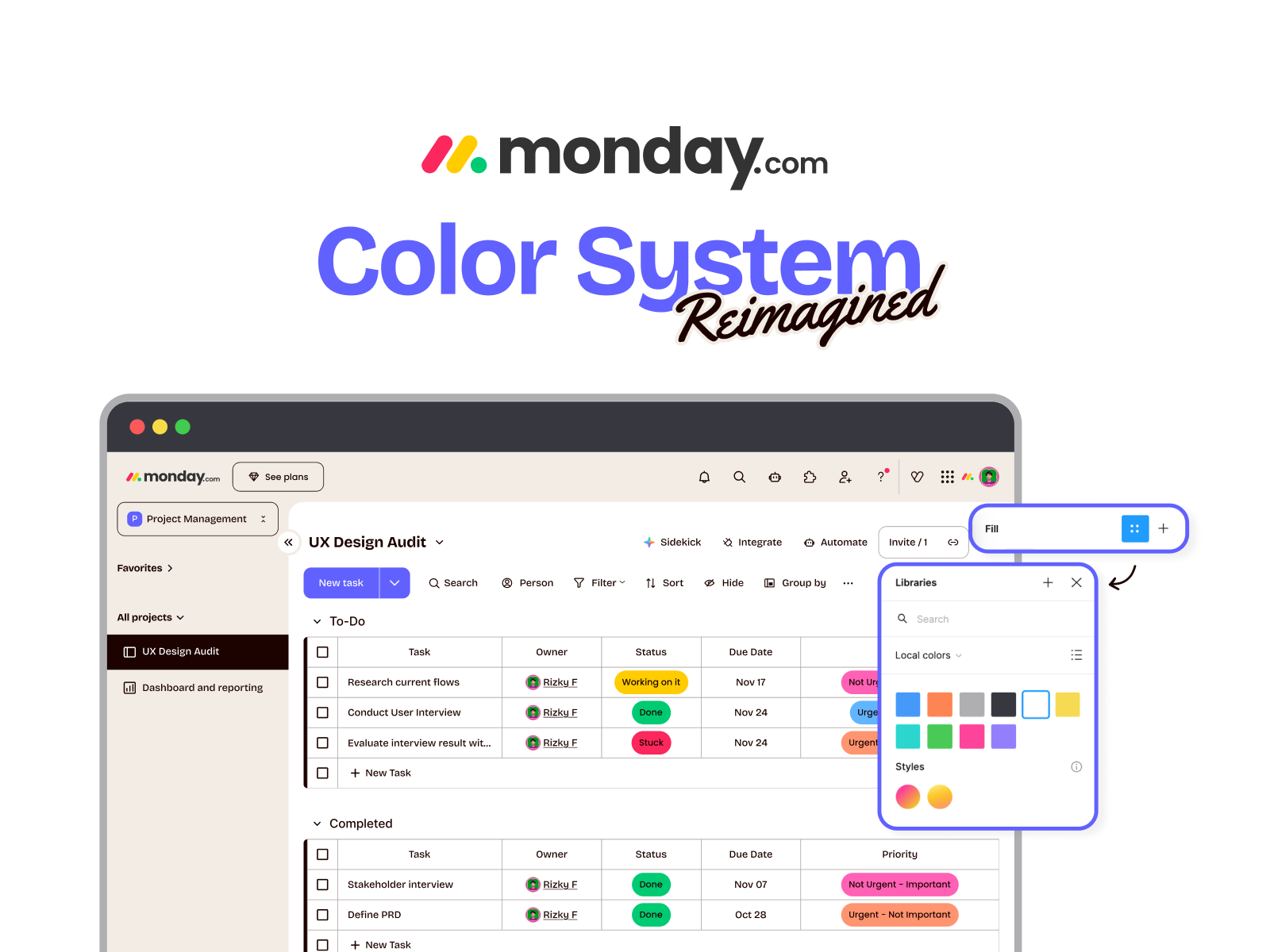
Reimagine Monday.com's visual identity with a fresh Color System. The goal was to create a distinct, accessible (WCAG-compliant) visual language that elevates the user experience beyond standard SaaS aesthetics.
The brief required evolving the brand image to resonate with modern teams. I moved beyond standard corporate blues to a spectrum of communicating momentum, clarity, and optimism.
Tools used
From brief

Topics
Share
Reviews
1 review

Hey Rizky!
Well done on making sure everything checks out in terms of WCAG compliance.
I would have loved to better understand the motivation and rationale of the colors you picked. Besides your reasoning on your neutral choice, there's not much on your submission to understand your visual design goals.
Beware when choosing too many similar colors (I count 3 shades of green, 2 oranges and 2 reds) across different types of usages, and (very minor thing) try avoiding repeating explanations on future presentations (like you did by repeating 3 times what contrast and WCAG levels are)
Thanks for sharing your work! 🙌
You might also like

eWallet App Development Project


🖥 Desktop Checkout Flow Design


Website CRM Dashboard


Helpful 404 Error Page for a Fintech Mobile App

TaskFlow Authentication Flow


Pebble Accessible SAAS Signup Flow

Visual Design Courses

UX Design Foundations


Introduction to Figma

Design Terminology
