Mon Paris - Accessible Signup Form

I was tasked with improving the user experience of the account creation page for the "Mon Paris" platform. The initial version had several usability issues. Below are the key changes I implemented:
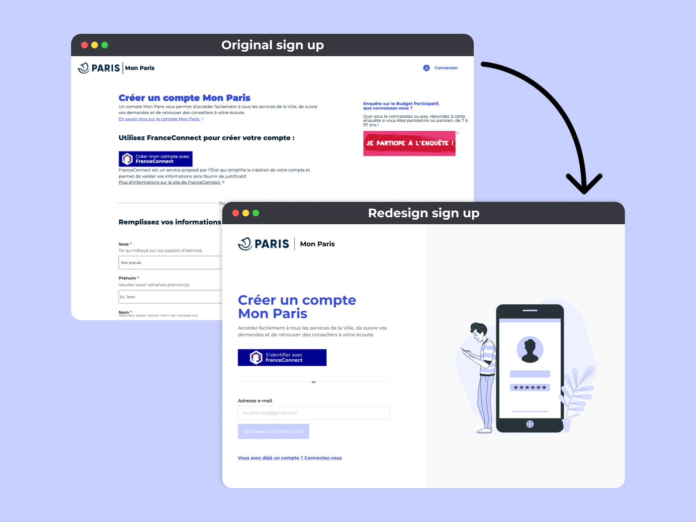
- Focus on the essentiels
The original page contained a large advertisement banner, which distracted users from the main goal. I removed this banner to keep the page simple and focused solely on the email input or the "France connect" identification.
- Reducing cognitive load
The first version of the form was overwhelming, with too many fields presented at once. I streamlined this by reducing the number of required fields and organizing the process into multiple, smaller steps.
- Clear input labels and simple language
To further improve the user experience, I ensured that all input fields had clear, understandable labels.
- Detailed Error Feedback
One of the major improvements was implementing precise and context-sensitive error messages for each input field. This means users now get clear feedback when something goes wrong.
- Quick Identification with FranceConnect
Finally, I introduced the option for users to sign up or log in quickly using " FranceConnect ", which streamlines the authentication process and provides a faster, more secure alternative to manually filling out the form.
Tools used
From brief

Topics
Share
Reviews
2 reviews
I think you did a great job with improving and redesigning the page. Removing the large ads banner definitely made the page easier to digest. Minimizing the sign-up to just one field requiring an email would simplify the process (hopefully it's technically feasible). It's a pity the interface is in French, and we're not able to evaluate the copy. Also, the link you've provided says I'm not having access to the file. Maybe check the settings to make the page accessible for visitors without permission to edit. Thank you for your work!

I agree with my colleague; it's a pity that the website is in French. I used Google Translate to understand the content—so if some parts of my feedback sound like they’re not from this world, you know why! But it would still be helpful to have more context about what the website is generally about. Nevertheless, I noticed a few areas where the user experience could be improved.
In the first step of the form, I wouldn't display the email address again because the user has just filled it in, plus they have the option to go back and check which address they entered.
The back button should be placed above the tab navigation because right now the user might think that this button only navigates within the tab element, not the entire page. If you place the navigation element in the header, it would be much clearer.
When we have only a few options (up to 5), we don't need to hide them in a dropdown; instead, we can display them directly with radio buttons. Alternatively, we could use a Chip element that functions like a radio button.
This will help users fill out the form faster without any friction (I’m referring to the gender selection).
I also suggest starting the form with simple and less personal questions, like asking about gender later. Some people may feel sensitive about this question. So, if the form begins by asking for the user's first and last name and only then moves on to gender, the user would more gradually feel comfortable providing sensitive information.
I like the birth date input—it's a good solution that allows the user to simply enter their birth date (a much easier solution than selecting the required information from a date picker).
I also appreciate that the input fields have an additional check icon, which helps users with visual impairments or other disabilities understand whether they have filled out the field correctly.
The second step currently feels overloaded and complex, which may confuse users and increase the time it takes to complete the form—this aligns with Hick’s Law, which suggests that the more choices and complexity a user faces, the longer it will take for them to make a decision. Simplifying the content will help users complete the form more efficiently. I recommend removing redundant information, such as unnecessary fields, text, or graphics. Designers should only include required fields in the form, as non-mandatory fields, text, or graphics slow down the user’s progress. If all fields are mandatory, the sentence about required fields can be removed entirely. If a field is not necessary, then it shouldn’t be included in the form at all. Including only essential fields will streamline the user experience and make form completion faster.
Additionally, the password strength indicator could be improved by showing a graduated scale, as it's unclear how strong my current password is or how many levels of strength there are.
It’s great that users receive feedback and helpful hints for creating a strong password. Also, it's a great idea to integrate a show/hide password button, which is useful for users who want to double-check if they’ve entered their password correctly.
I also recommend removing the secondary button that asks users if they already have an account, as it’s unlikely that a user with an account would navigate this far into the process.
Finally, the consent checkbox icon should not be center-aligned but aligned to the top left, in line with the text block, to create a cleaner and more organized layout.
Overall, the work looks solid! Congratulations.
You might also like

Smartwatch Design for Messenger App


Bridge: UI/UX Rebrand of a Blockchain SCM Product


Pulse Music App - Light/Dark Mode


Monetization Strategy


Designing A Better Co-Working Experience Through CJM


Design a Settings Page for Mobile
Visual Design Courses

UX Design Foundations


Introduction to Figma

Design Terminology
