Mom and I Mother Toddler Program
Our toddler program nurtures bonds through playful learning, creative adventures, and heartfelt connections. Mom and I designed it for little explorers and their moms. We create cherished memories while fostering early development. Together, let’s laugh, grow, and discover—because every giggle, cuddle, and shared milestone makes childhood (and motherhood!) brighter.
Reviews
4 reviews
Love this, too clean
💅
Ah, amazing, Abhishek! They lead big with this warm and unforgettable logo. It has a mature sense of purple (mother), but it is still playful and perhaps embodies the (child/i) side of the child. One thing I noticed right away was the different stroke weights between the logogram and the logotype. Running the same weight with the same weight makes me more familiar with you, and am I excited to know that you know this?
Another thing I noticed at a glance is that there are two competing logograms at the same time.
Heart shape and amplifier and current version are started and integrated into the area, so it almost steals the spotlight from the actual logogram.
Have you ever thought about changing it with an actual logo, or do you mix both to make it more optimal?
Nice work, Abhishek!
I really appreciate the use of playful illustrations and a friendly font, these choices align well with the theme of motherhood and children, creating a warm and inviting tone. The navigation is clear, and the overall user experience feels intuitive and pleasant.
A few suggestions for improvement:
- In the hero section, consider placing the primary CTA to the left of the secondary one to follow common UX patterns and improve visibility
- Pay attention to spacing—some titles are quite close to the content cards, making the layout feel slightly unbalanced. Maintaining consistent spacing will help with visual hierarchy
- Overall, increasing white space throughout the layout could help reduce cognitive load and prevent the page from feeling cluttered
Oh, wow, Abhishek! You lead strongly with this warm and memorable logo. It has a mature sense of purple (Mom) yet it is still playful, probably embodying the childlike (Kid/I) side. One thing I noticed instantly is the different stroke weights between the logogram and logotype. I’m more accustomed to them using the same weight and I’m curious to know your take on this?
Another thing I noticed after a second glance is that there are almost two competing logograms at the same time: the heart shape and the ampersand “&” The current version is almost stealing the spotlight from the actual logogram, mainly because it is injected and integrated naturally with the surroundings.
Have you ever thought about switching it with the actual logo or perhaps blending both to make it more streamlined?
You might also like
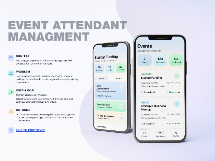
Events Managment App
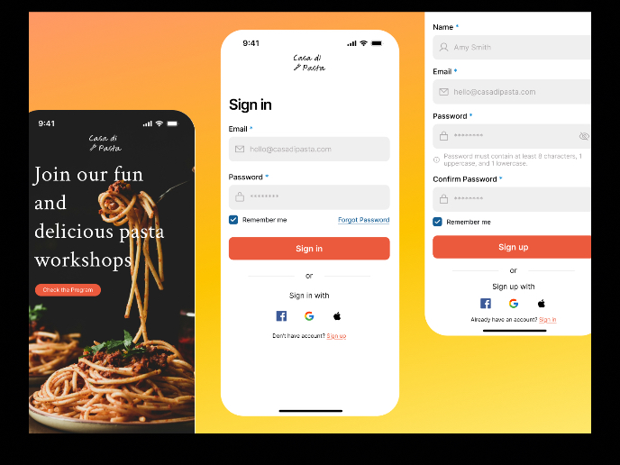
Mobile Onboarding: Casa di Pasta
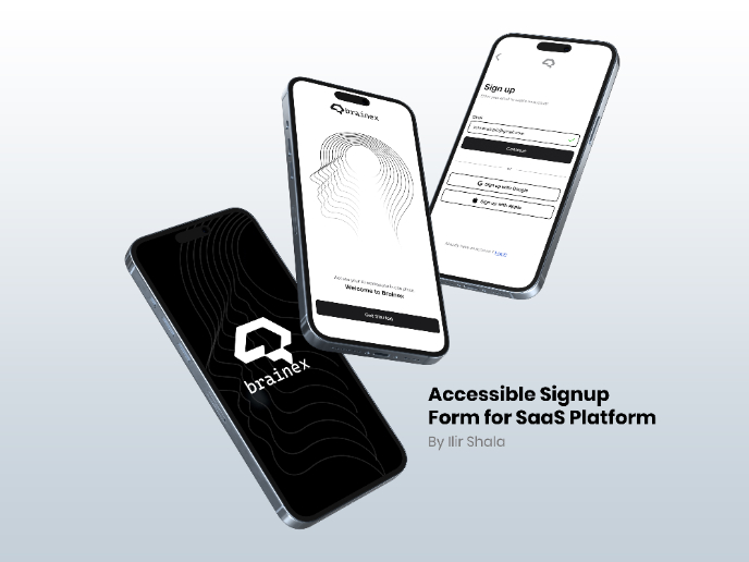
Accessible Signup & Login Experience — Brainex
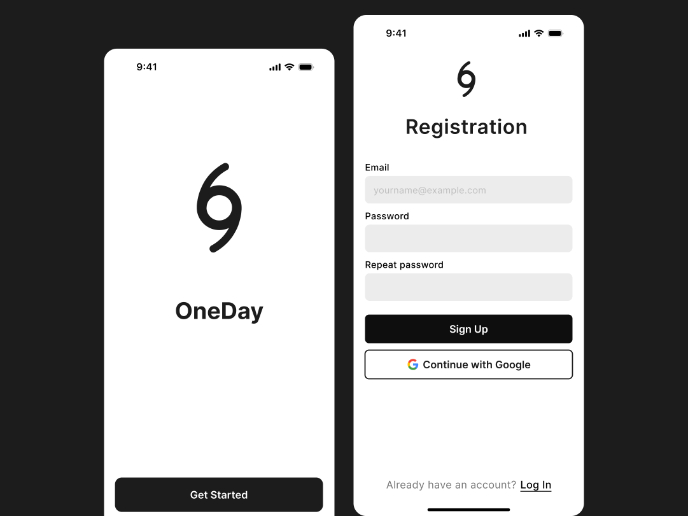
Accessible Signup Form
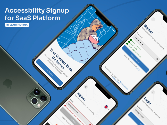
Accessible Signup Form
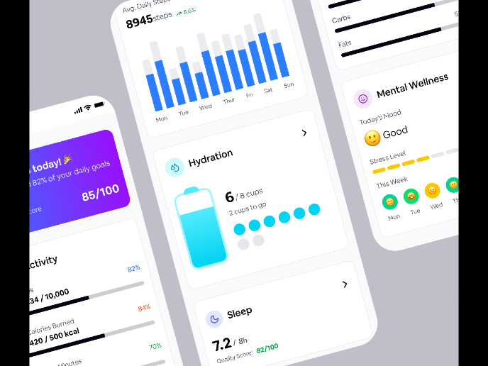
WellNest
Popular Courses

UX Design Foundations

Introduction to Figma


