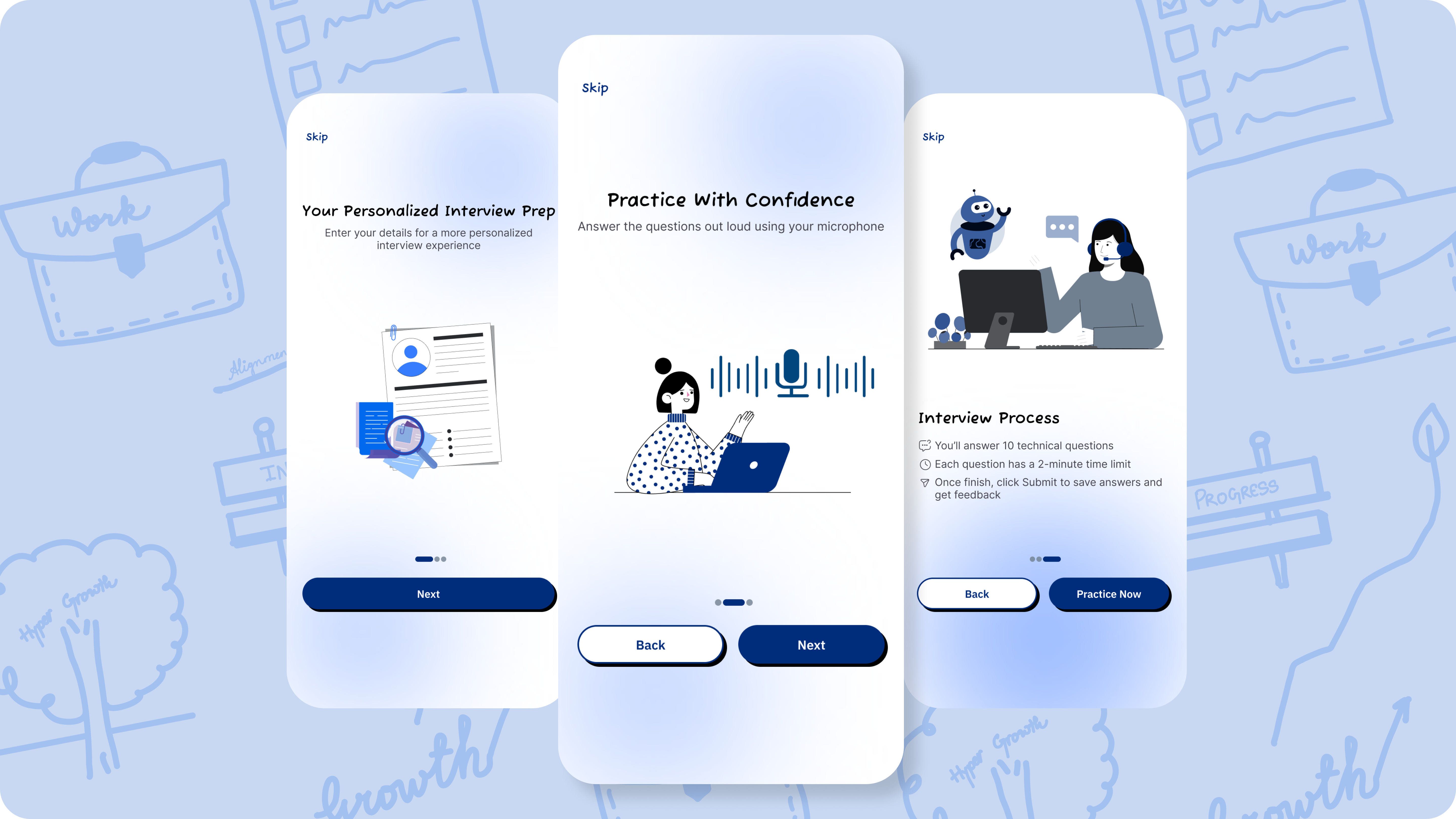
Mobile onboarding flow

Interaction Design Rationale for virtual interview mobile app
Value Proposition and Personalization
- Core Message: "Welcome to Personalized Interview Prep!"
- Purpose: Establishes the core benefit (Personalization) and prompts the user's first interaction: defining their job role. This simple action starts the user’s relationship with the app and makes the subsequent screens more relevant.
Building Confidence and Mechanism
- Core Message: "Practice With Confidence."
- Purpose: Explains the core interaction mechanism using the microphone for simulated interviews
- Flexibility: Inclusion of the "Back" button here is crucial. Users may hesitate upon seeing the commitment to practice and need to quickly review the value proposition (Screen 1) before moving forward.
Clear Process and Conversion
- Core Message: "Interview Process" (followed by key rules).
- Purpose: Sets clear expectations regarding time limits, number of questions, and feedback ensuring users know exactly what to expect.
- Primary CTA: The prominent "Practice Now" button acts as the final conversion point. It is highlighted and distinct, leading the user directly to the core feature after the value has been fully understood.
Tools used
From brief

Topics
Share
Reviews
4 reviews

Ooh, icey, me likey.
I’m still on the fence about the handwritten typeface 🤔 It definitely adds personality to the app, but I’m not sure it holds up in terms of readability, especially with today’s fast-scrolling habits. Might be worth running a quick comprehension test to be sure.
The visual cues are clear, and the illustrations nicely reflect each onboarding step. It feels like a well-paced walkthrough that sets the tone without overwhelming. A solid first impression that aligns well with the product’s purpose!

The onboarding flow makes sense - from value, through mechanics, to process details. It's logical and doesn't overwhelm the user with everything at once. Good job with that "Back" button on the middle screen - indeed, someone might want to retreat when they see they need to speak into a microphone.
But there are a few things you need to pay attention to:
- Typography and readability - This font doesn't seem to work well in headlines. I know you probably aimed for a "human, friendly" approach, but honestly? It makes this look unprofessional. In an app for interview preparation, you need to build trust, not look like a birthday card. Consider something like medium/semibold sans-serif - it can still be warm, but readable and credible.
- Gradients and background - That background with the gradient... It's competing for attention with the content. The content cards should be center stage, but now my eye is jumping between illustrations, gradients, and actual content. Try to tone down this background or simplify it altogether.
- Buttons - CTAs are okay in terms of hierarchy (primary vs secondary), but I'm missing consistency. On the first screen you have a full-width "Next", on the middle one two side by side, on the third again two. Look - I'm not saying it has to be identical everywhere, but the pattern should be clear. Plus those border-radius values on buttons are quite aggressive - you could reduce them a bit.
- Illustrations - I like that they're minimalistic and stylistically consistent. But on the middle screen (Practice with Confidence) those two people with laptops... I don't fully understand what they're communicating? Is this supposed to show a conversation with a recruiter or fight ;) ?
- Content and microcopy "Click Start button to begin your interview prep" - but there's no "Start button", there's "Next". This is disorienting. A small thing, but these details annoy users.
What I'm missing (but maybe it's further along):
- I don't see any option to skip onboarding. What if someone returns to the app?
- I don't see what this "Personalized Interview Prep" looks like in practice - how does the user input their job role?
Overall:
Conceptually this makes sense, but the execution needs refinement mainly in the visual layer. I feel like you tried to make this "friendly and approachable", but overdid it in several places at the cost of professionalism and readability. In an interview prep app, people are looking for confidence and competence - the design should support that.
But honestly - without access to the full project, all interaction states, and business context, this is just a surface-level assessment. Maybe some of my points are off if I could see more. So treat this as a starting point for discussion, not a final verdict. ✌️😊

Nice work!
The onboarding feels clean and approachable. I’d suggest refining the hierarchy to make key messages quicker to scan, improving contrast for readability on lighter areas, and tightening consistency in illustration style.
Keep going 👏🏻

Zakariyah Bux
Hi Radwa
Firstly, without full context, it is difficult to give you very solid feedback - but I looked at your project for a bit and this what I thought.
Firstly, visually, I think you have done a good job. I like the idea of the handwritten font as it lowers any forms of expectations for the user, enforces the idea that they do not have to be perfectly prepared for an interview and almost reduces anxiety for interviewees. The illustrations are fine for their purpose. I do feel like the skip button should use a more clear typeface like the one used for the buttons. Also, love the idea of the background shapes (hope they are dynamic ;))
Then, in terms of the content, I feel like there is room for improvement. On all 3 frames, you are a bit too descriptive. Telling users about the names of buttons to click at this stage is irrelevant and adds unnecessary cognitive load. Also, mentioning "10 questions", and "2 minutes" is also irrelevant here.
For the back buttons, I think you should remove them. Using the argument that someone may be confused by the commitment to start practicing immediately is illogical. For the same reason, you should have then used different copy for the final primary button saying "Practice Now". This is just a suggestion, but rather get rid of them and use single full width buttons (adds more visual consistency too).
I hope my quick analysis helps you in your project.
All the best!
Zak
Lacks founder or design narrative
You might also like
SiteScope - Progress Tracking App


CJM for Co-Working Space - WeWork


Ubani Design System


Accessible Signup Form for SaaS Platform

Loginino


Notification microcopy - Project

Interaction Design Courses

UX Design Foundations


Introduction to Figma

Design Terminology
