Mini Visual Audit of SadaPay

This Slide deck shares a few personal thoughts and suggestions on the SadaPay app’s visual design. My sole goal is to learn, grow, and contribute ideas, not to criticize or disrespect the amazing work SadaPay team does every day.
Tools used
Share
Reviews
2 reviews

Hi Ameer Hamza,
Sharing personal thoughts on a design is a great way to learn and grow, especially as a beginner designer. However, in the field of UX/UI, feedback should not rely solely on personal taste or intuition. Design is not just a matter of opinion it’s a problem-solving discipline grounded in research, user behavior, and established principles.
If you’re presenting a critique of an existing product, especially one developed by a professional team it's essential to go beyond “what you feel” and explain why you think something could be improved, and based on what.
Here are a few important points to consider:
Avoid purely subjective language
Instead of saying “This part feels confusing,” try: “This layout may violate Jakob Nielsen’s Consistency and Standards heuristic, which could confuse users who expect a standard navigation pattern.”
Support your ideas with data or best practices
If you haven’t conducted your own usability testing yet, you can still refer to existing UX research, user behavior studies, or design heuristics.
Useful Resources for UX/UI Research and Design Justification
Nielsen Norman Group (NNGroup)
https://www.nngroup.com/articles/
Smashing Magazine – UX Design
https://www.smashingmagazine.com/category/uxdesign/
Baymard Institute
https://baymard.com/research
UX Collective (on Medium)
https://uxdesign.cc/
Awwwards
https://www.awwwards.com/
Behance
https://www.behance.net/
I hope these insights help you grow even further as a designer and empower you to create truly impactful work. Keep learning, stay curious and best of luck on your journey ahead!🚀

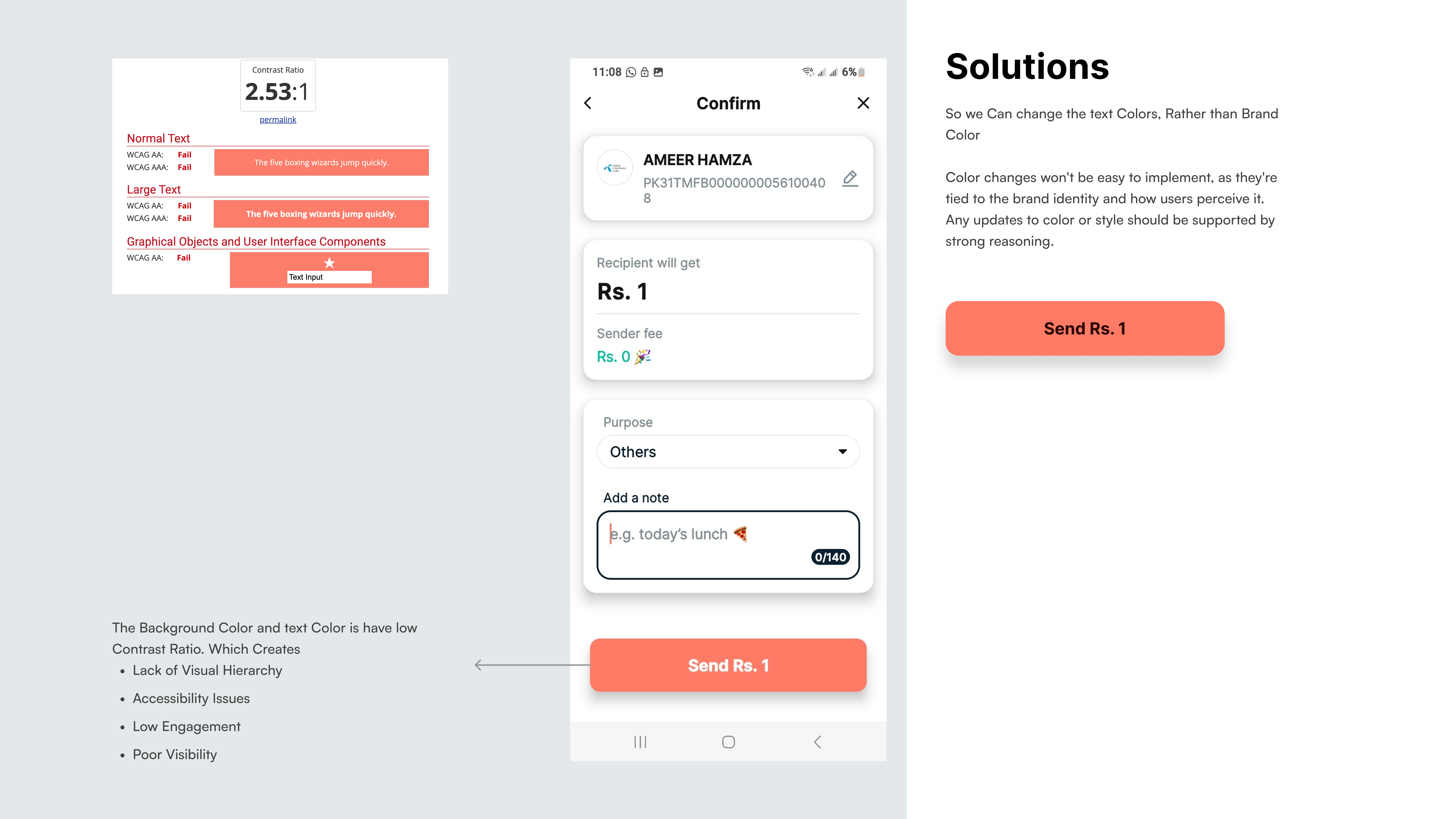
Overall good visual audit you have done, however I do have a few suggestions:
- Distinguish visual styling between audit suggestions and actual UI demos. This will give stakeholders a quick way to find information that is vital
- Offer potential metrics of business impact that could occur (honestly this is very specific to the goal of this project and who your audience would be)
Like I said though, overall good presentation and I liked how you used Figma Slides to give more of a business presentation vibe.
You might also like

Improving Dating App Onboarding: A/B Test Design

FORM Checkout Flow - Mobile


A/B Test for Hinge's Onboarding Flow


Accessibility Asse


The Fitness Growth Engine

Uxcel Halloween Icon Pack

Popular Courses

UX Design Foundations


Introduction to Figma

Design Terminology
