Milestones

Product Overview
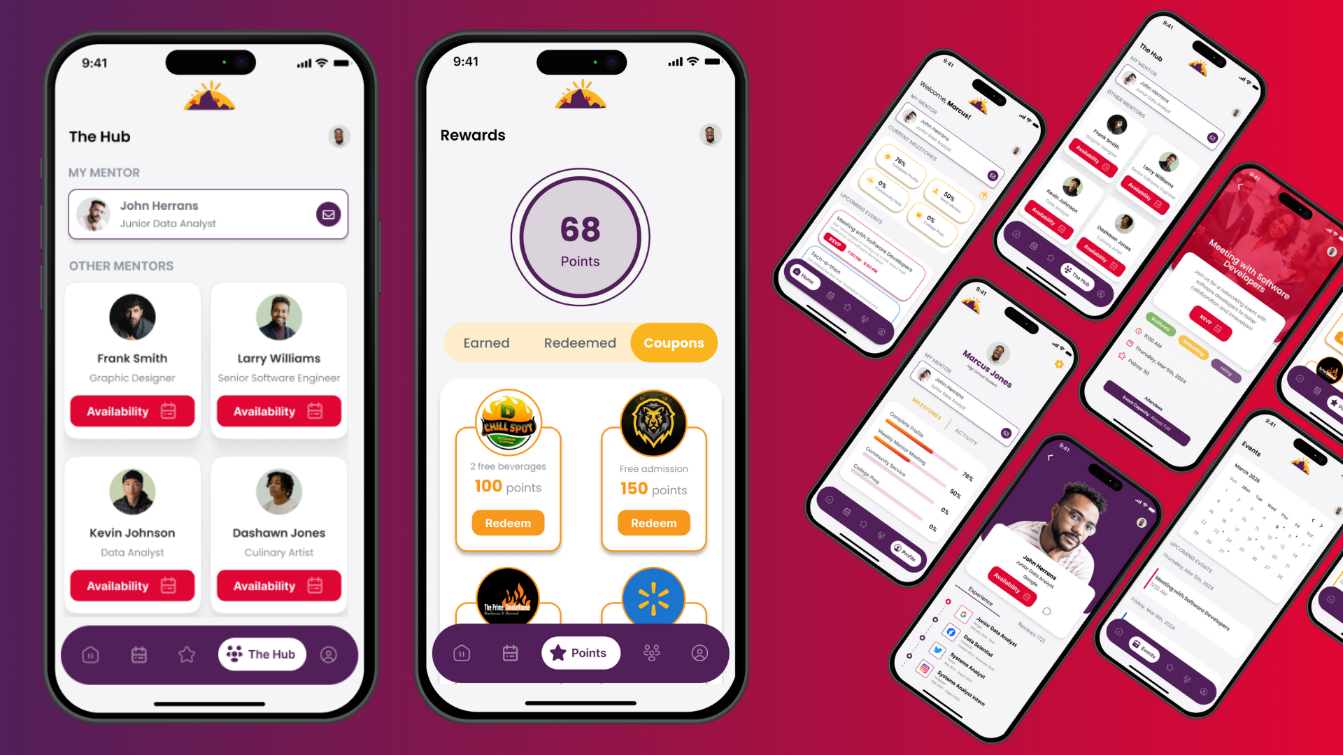
As apart of the HBCU Smart Cities challenge, we took the time to tackle the subject of Public Safety within the Rocky mount area with creating a platform and program that will cater to males from ages 15-26 to help decrease the number of violence and let students be engaged.
Project Details
Competition: HBCU Smart Cities Challenge
Duration: 3 months (Jan 5th - Mar 10th, 2024)
Role: Product Designer
Results: Top 3 - 2nd place winners
Project Links:
Figma - Prototype
Canva - Presentation
Reflection:
Having the opportunity to be apart of a pitch competition and working on the Milestones project, was really hard but rewarding at the same time!, Being this was my first time pitching what I created with a team, this helped me understand what it means to be business centered designer. From being the only designer on team, negotiating and talking with city officials, to finally representing my product I created to have it soon be developed in real life, all of skills and techniques I learned to be a better product designer with the understanding of business.
Reviews
2 reviews

Hey Brianna,
You're doing a great job already! I really like that you attached a polished Figma prototype—sometimes it helps better in understanding the project than a text case study!
I have a few notes though:
- Try to review all the design elements and components. It looks like there are a lot of elements in different styles and colors; for example, some elements have shadows, some don't, some have gradients, and some don't. It'd be much easier to maintain one visual language with a consistent style.
- It's slightly hard to navigate freely through the prototype with such an extensive tutorial. Even though I appreciate the tips, it should be self-explanatory what is possible in the app! Trust the users; they will find a way to do their job ☺️

I found the project idea fascinating. Thank you for sharing it with us, Brianna! I was only able to evaluate the prototype, but I couldn't access the Canva presentation due to permission restrictions. The prototype looks intuitive, and the bright and bold colors make it engaging. I appreciate the incorporation of gamification elements.
However, the onboarding process is too detailed, and tooltips pop up unnecessarily often and are kinda annoying. I suggest simplifying it, as most users are likely familiar with app navigation.
Additionally, the "Sign In" and "Sign Up" buttons are confusing due to their similar spelling. Renaming them to "Log In" and "Sign Up" or "Log In" and "Register" could improve clarity.
Lastly, I'd like to understand the reasoning behind the color choices. While the primary interface color (purple) is great, I have concerns about the reddish/magenta color used for the primary button, as it's often associated with errors and destructive actions. Perhaps exploring alternative tones would be beneficial.
Thank you once again!
You might also like

Accessible Signup Form


Entrant - Analytical Dashboard

Uber Eats Push notifications


Transit Cairo — Digital Mobility Redefined


Babylon Balance - Designing Financial Clarity Through Constraint


Entrant Accessible Signup and Login Forms
Popular Courses

Introduction to Product Management


Product Discovery


Product Analytics