Mez - The Messaging App (SmartWatch Interface Exploration)

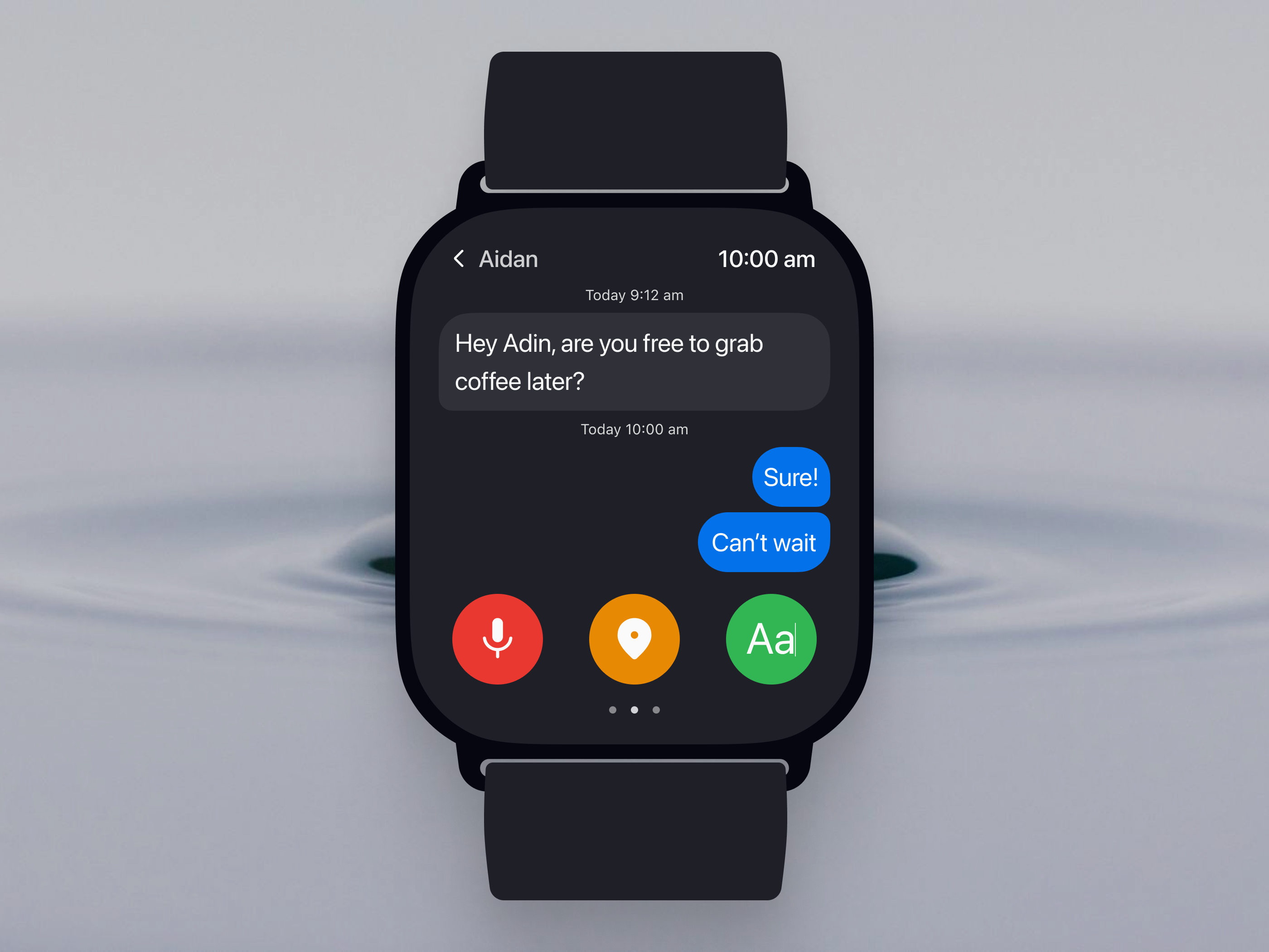
This is my first exploration or so-called, my take on a message app user interface on a smartwatch. Here is the design rationale behind it:
1. I focused on quick interaction:
- Minimalist design: The screen prioritizes the essential information, the conversation with Aidan, and the quick reply options.
- Clear hierarchy: The sender's name ("Aidan") and the time are prominently displayed at the top, immediately establishing context. The message bubbles themselves stand out against the dark background.
- Voice input focus: The microphone icon (red) at the bottom emphasizes voice dictation as a primary input method.
2. I optimized the limited input on a small screen:
- Vertical scrolling: The conversation flows vertically, the most natural scrolling direction on the Watch.
- Large tap targets: The reply buttons and the microphone icon are generously sized, minimizing the risk of mistakes.
- Dark mode as the default mode: The dark background is battery-efficient and improves readability in various lighting conditions.
3. UI considerations:
- Rounded message bubbles: The rounded corners create a softer, more approachable feel and visually distinguish messages from other screen elements.
- Consistent spacing: The spacing between elements is carefully managed, ensuring readability and visual balance.

Reviews
2 reviews

Hi Adinda, great jon on the first exploration on smartwatch design. The presentation looks clean, well-designed and completed with the detailed description.
Don't forget to have the minimum set of size font especially for this kind of interface. As I can see, the text of sent time is a bit small to be read for the most of users in real life.
Love to see more from you.

Well done Adinda! Voice-to-text is the best possible solution for a smartwatch messaging app in my opinion. Now, two things to think about:
1. What is the function of the button in the middle? It's not very clear to me.
2. I don't think the current button colors are the best possible choice. Red, yellow, and green (specially the tones you used) have very specific functions in UI/UX and they make yours a bit confusing.
Although you wanted to grab attention with red, it gives me the "stay away" feel while the green button gives me the "safe" feel and the middle one, although I don't understand its function, gives me the "be aware" feel.
Great work so far but think about these two points.
You might also like
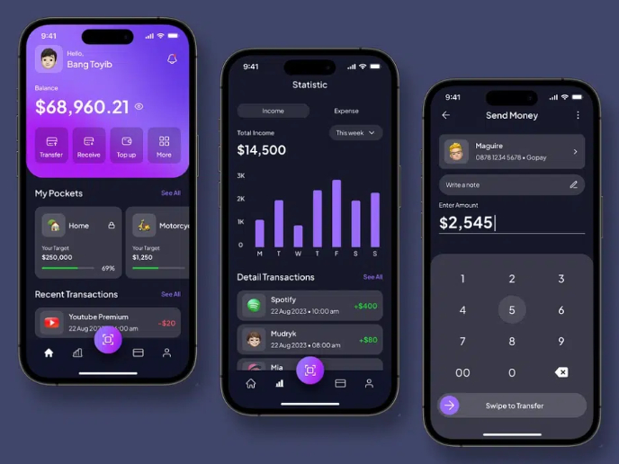
eWallet App Development Project

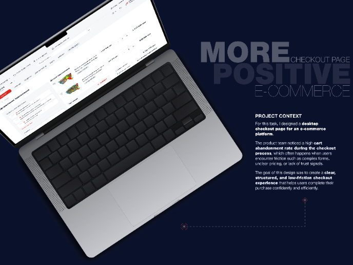
🖥 Desktop Checkout Flow Design

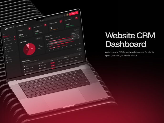
Website CRM Dashboard

Helpful 404 Error Page for a Fintech Mobile App

TaskFlow Authentication Flow

Pebble Accessible SAAS Signup Flow

Interaction Design Courses

UX Design Foundations


Introduction to Figma

Design Terminology
