MarQ HR - Login

I designed this signup page following WCAG 2.1 accessibility principles to ensure that every user, regardless of ability, can easily complete the registration process. Here’s how the design aligns with accessibility standards:
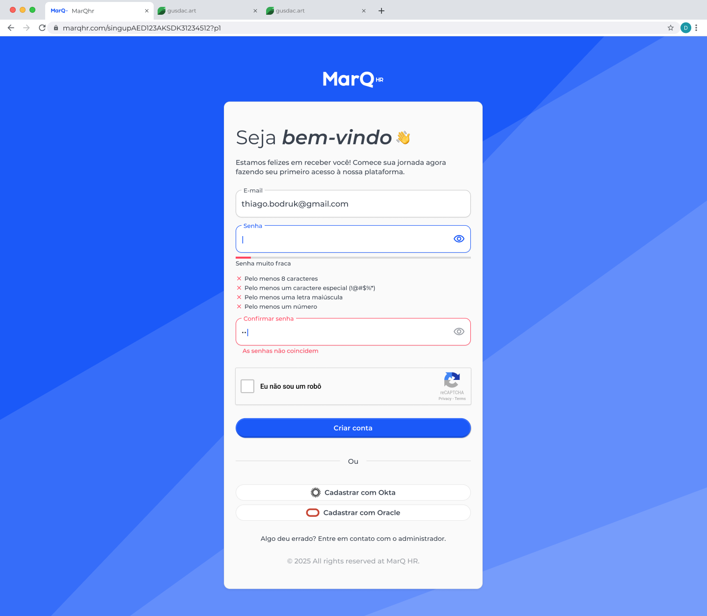
1. Color and Contrast
The interface uses a high-contrast color palette (blue background, white form container, and dark text) to maintain legibility and visual clarity for users with low vision or color blindness. Error messages and validation states use red text with icons to ensure both color and shape communicate status.
2. Clear and Consistent Labels
Each input field (email, password, confirm password) includes visible and descriptive labels that remain outside the field, supporting users with cognitive disabilities and improving compatibility with screen readers.
3. Error Prevention and Feedback
Real-time validation helps users correct errors immediately. For example:
- Password strength feedback clearly explains what criteria are missing (e.g., “At least 8 characters,” “One uppercase letter”).
- A message explicitly states when “Passwords do not match.”
- This approach improves usability and accessibility by providing both textual and visual feedback.
4. Keyboard Navigation and Focus States
All interactive elements (input fields, buttons, and checkboxes) can be navigated using the keyboard (Tab, Shift+Tab).
Clear focus indicators ensure users know which element is currently active, supporting users with motor or visual impairments.
5. Assistive Technology Compatibility
The form structure uses semantic HTML elements (<label>, <input>, <button>) so screen readers can announce fields correctly. The “I’m not a robot” reCAPTCHA includes an accessible label and complies with ARIA guidelines.
6. Readable Typography and Layout
The design uses large font sizes, sufficient line spacing, and a single-column layout for easier scanning. Text contrast and font weight make reading comfortable for users with dyslexia or low vision.
7. Error Recovery
The design ensures users never lose progress — if an error occurs, the page provides specific guidance to fix it rather than erasing inputs, supporting a smooth and frustration-free experience.
From brief

Share
Reviews
1 review

Nice work, Gustavo! The layout feels clear and accessible, with good contrast and helpful password feedback.
You could make the buttons a bit larger for easier tapping, especially on mobile. Slightly increasing the padding would improve comfort without changing the layout.
You might also like

PLANTIST


Lumen

NORTHSIDE - Coworking space Customer Journey Map


Accessible Signup Form for Monkey Survey


Crave Corner - Bakery App Design


Wealthsimple 404 Page

Visual Design Courses

UX Design Foundations


Introduction to Figma

Design Terminology
