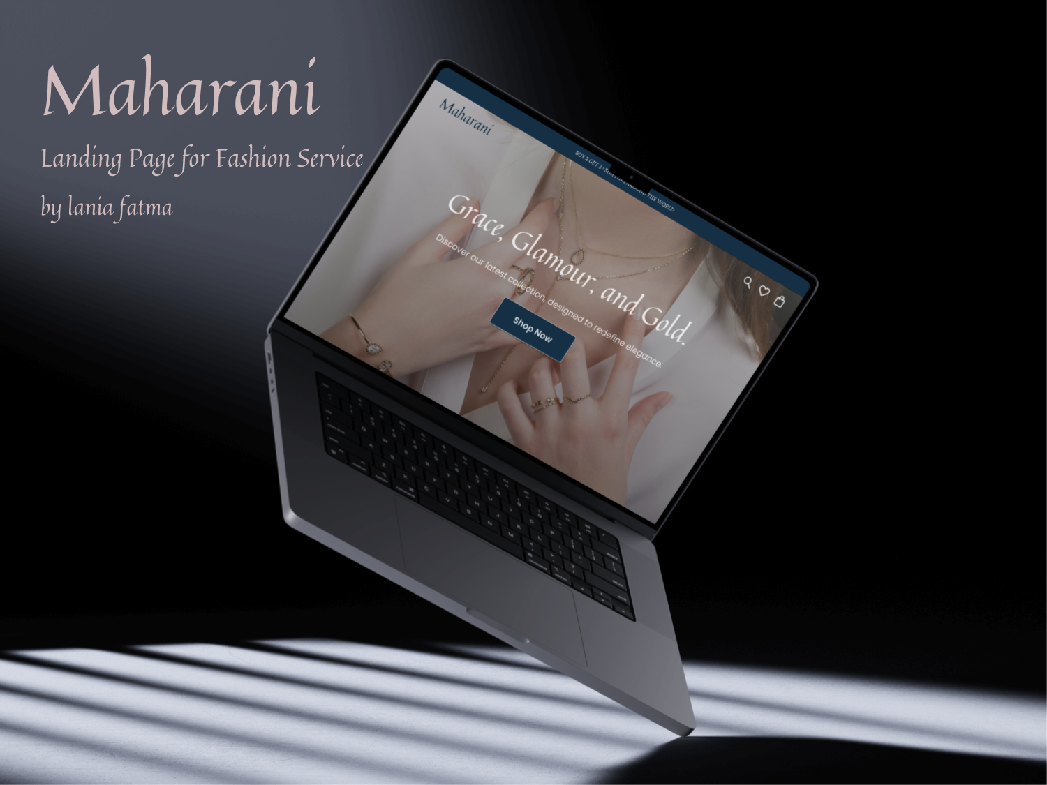
Landing Page for Fashion Service : Maharani by Lania Fatma

Project Info :
- Platform: Web design
- Device Type: Dekstop
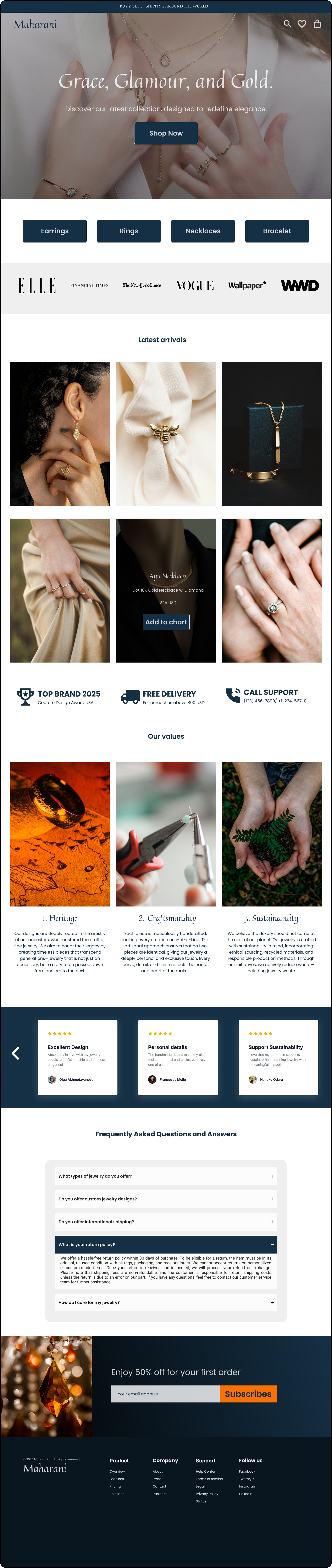
Maharani
is a jewelry design company that operates worldwide both online and offline. Maharani has the tagline "Grace, Glamour, Gold" and offers jewelry products such as earrings, necklaces, bracelets, and rings.
After conducting user interviews, Maharani understood that customers desire jewelry that is timeless, can be passed down to future generations, features craftsmanship that is highly personal to the wearer, and is sustainable, meaning it does not harm the planet. These values form the foundation of Maharani's company principles.
The design process is divided into several stages:
- Competitor analysis
- Information architecture
- Wireframing
- Mood boards
- Visual concepts
- Development of UI kits and prototypes
I used Quintessential font for a clean, modern look.
I wish it meets your expectations. Please feel free to share any feedback, whether positive or constructive, so I can enhance my UI design in the future.
Tools used
From brief

Topics
Share
Reviews
1 review

Hey Lania, you have a great base with this design. I think if you could work a bit more on the typographical hierarchy and spacing consistency it will push it even further.
Example is the title before the grid of images. It's too small compared to other title texts. Also the spacing between the grid images could be consistent vertically and horizontally. And the same spacing value could be used for other cards and elements spacing to keep things streamlined.
Aside from those I think you have done most things right and you should keep it up.
You might also like

HealthFlow: Designing a Simple and Insightful Wellness Dashboard


Improving Dating App Onboarding: A/B Test Design

FORM Checkout Flow - Mobile


A/B Test for Hinge's Onboarding Flow


Accessibility Asse


The Fitness Growth Engine

Content Strategy Courses

UX Writing


Common UX/UI Design Patterns & Flows


Building Content Design Systems
