Logo Design

Objective
The objective was to create a visually appealing and meaningful logo for Martin Vavra Photography that reflects the client's brand identity and values, while also being versatile for various applications.
Design Elements
Typography
- Font Choice: The font used for "martin vavra" is a modern sans-serif typeface, chosen for its clean lines and contemporary feel. This complements the elegance and professionalism of the photography business.
- Letter Spacing: The letter spacing in "PHOTOGRAPHY" was adjusted to ensure readability and balance, providing a sleek look that aligns with the high-end nature of the services offered.
Color Scheme
- Primary Colors: The logo uses two primary colors: a deep purple and a magenta. Purple is often associated with creativity, wisdom, and luxury, which suits the artistic aspect of photography. Magenta adds a touch of vibrancy and energy, symbolizing passion and innovation.
- Contrast: The combination of these colors provides a striking contrast that ensures the logo stands out in various backgrounds and applications.
Graphic Elements
- Letter 'M' Design: The central graphic element is an abstract representation of the letter 'M'. This not only stands for "Martin" but also forms a dynamic shape that can be interpreted as a mountain peak, symbolizing high achievement and aspiration.
- Flow and Movement: The curves and angles of the 'M' suggest movement and fluidity, which are key aspects of capturing moments in photography. The design also hints at a camera lens aperture, subtly reinforcing the photography theme.
Design Rationale
Brand Identity Reflection
- The logo effectively captures the essence of Martin Vavra Photography by combining modern aesthetics with a hint of classic elegance. The use of a bold and stylish 'M' makes the brand instantly recognizable and memorable.
Versatility
- The logo was designed to be versatile across various mediums, including business cards, website headers, watermarks on photographs, and social media profiles. The clear and concise design ensures that it maintains its integrity and readability at different sizes.
Reviews
1 review

Hey Augustin,
Great job with the logo design!
Here are a few suggestions to elevate it further:
• Explore different lockup options and variations of the logo, as different touchpoints will require different treatments of layout, symbol, and typography.
• It's a bit odd having "Photography" on top of the name instead of underneath it.
• Since the "V" is in dark purple, consider making the entire "vavra" the same color instead of the "Photography."
• Consider adding small gaps where the "M" strokes meet the "V."
• Lastly, create some mockup presentations to better sell the idea and demonstrate the various lockup options in context.
Great work so far.
Consider these suggestions to push it even further.
Cheers!
You might also like

Customer Journey Map for a Co-Working Space


Reimagining Asana's Color System

Responsive Main Screen

Latios - Free Portfolio Template for UX/UI Designers

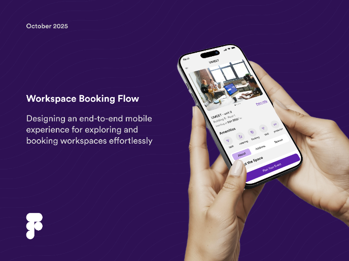
Workspace Booking Flow - UI/UX Design

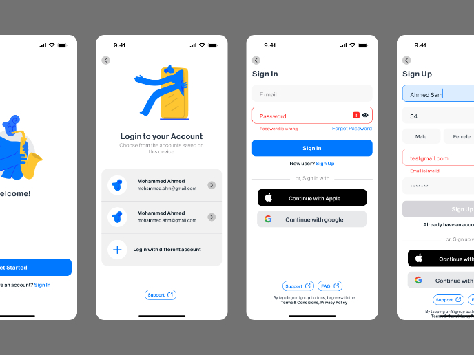
Login/Sign up Form

Popular Courses

UX Design Foundations


Introduction to Figma

Design Terminology
