LEARNR - Checkout flow

Design Rationale:
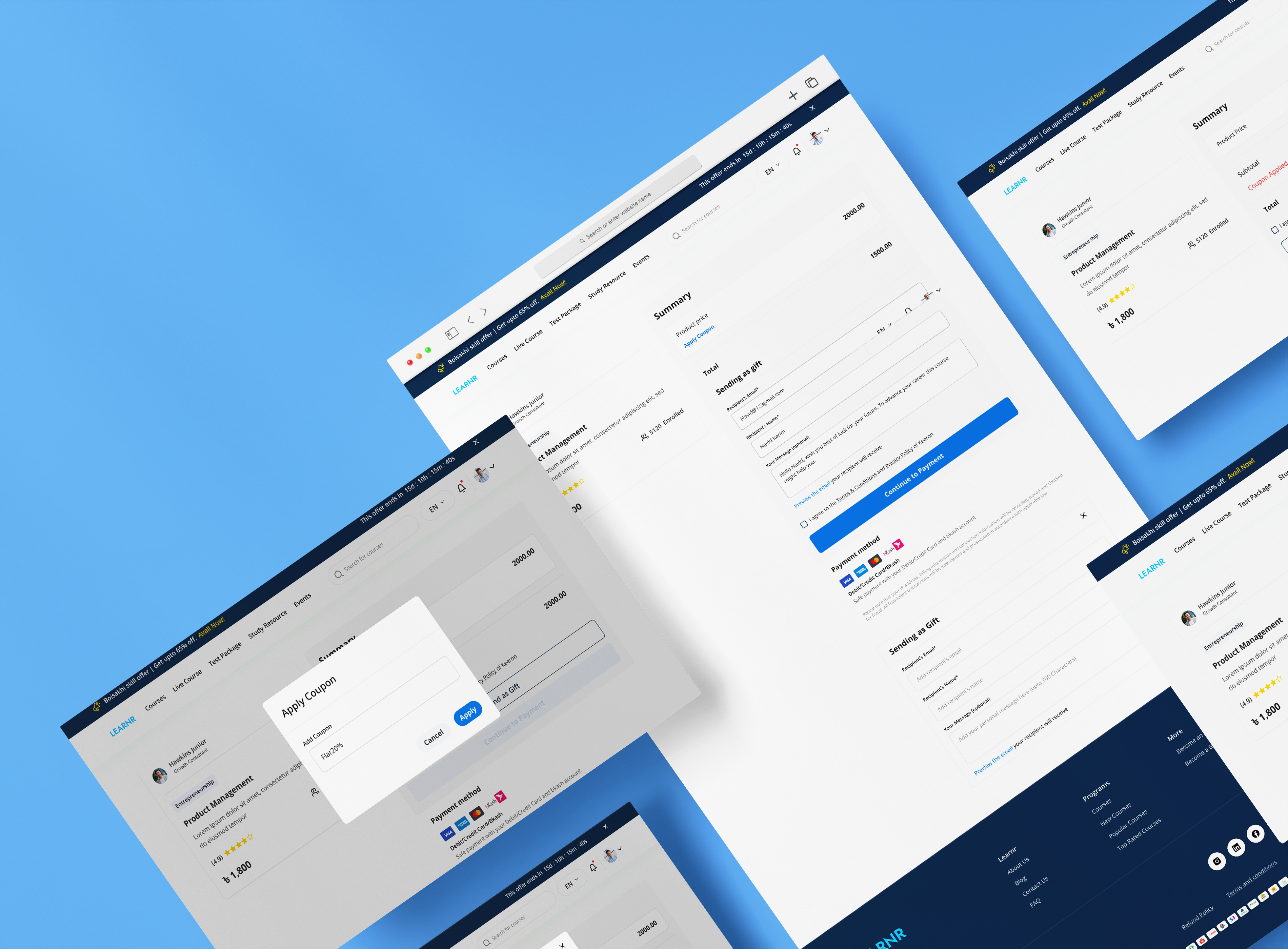
The checkout form is designed following the user first approach, that said simplicity and clear design are highly considered while developing the form to get the best experience for users. The following key principles guided the decision-making process:
User-Friendly Organization:
We group form fields into logical sections, with the intention to make it easy for users. It also helps the users to move smoothly through the updated contents regarding Payment, Billing Address, and Order Summary.
Visual Hierarchy and Scannability:
The visual hierarchy was thought about to make it easier to read. But as we recognized we could always improve the spacing, we focused on the space itself and started adding visual dividers (field sets). The purpose of this enhancement is to lower cognitive load by better separating the different sections and fields from each other.
Clear and Concise Microcopy:
Labels and placeholders were created meticulously to make microcopy elements for the users to gain a clear understanding of the required information. Error messages have been worked out successfully; with a promise of better(specificity) so as to help make the process more informative and easier (user friendly).
Strategic Call-to-Action Placement:
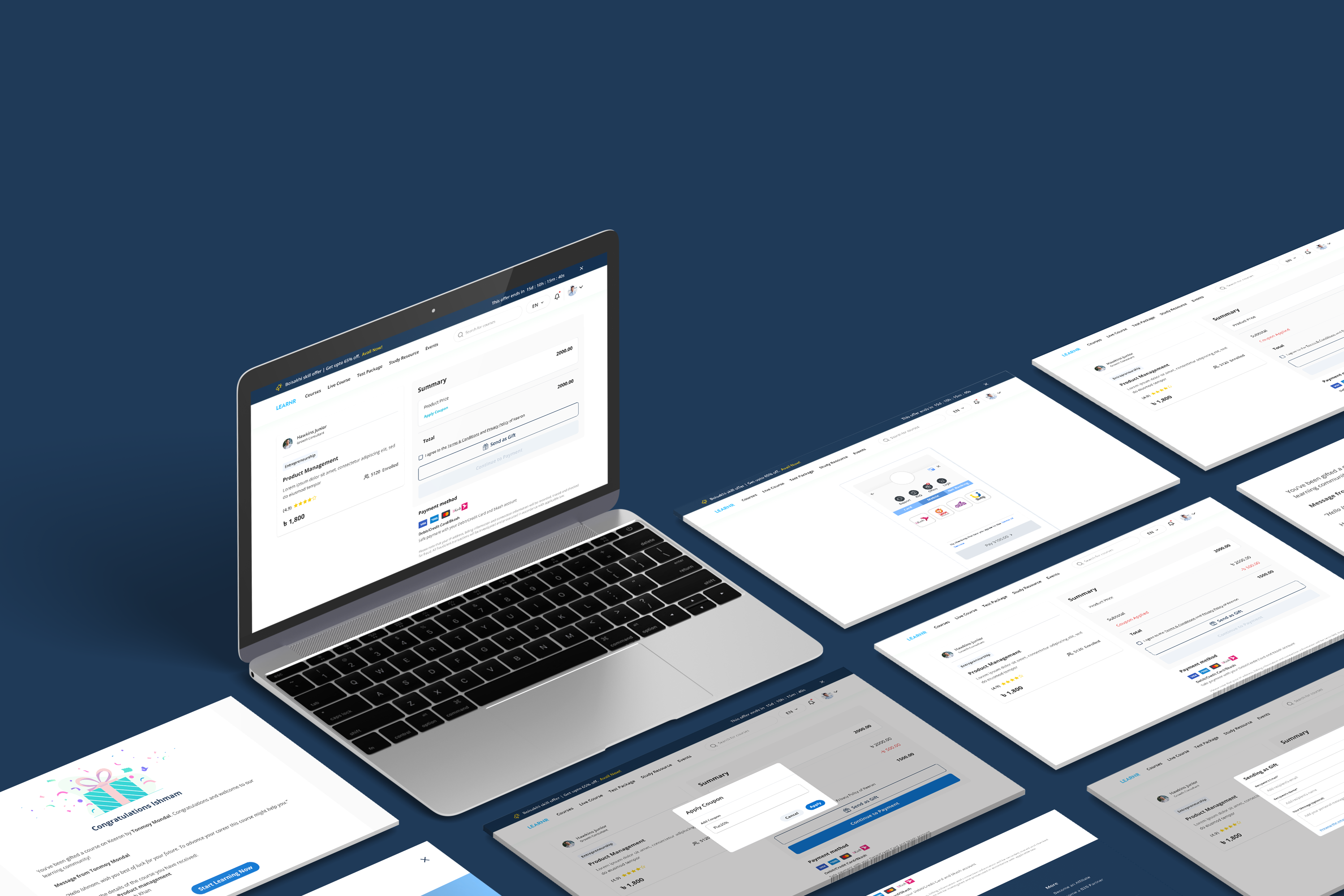
An obvious and powerful call to action which a business is wagered on is by placing the "Place Order" button at the bottom end of the form. In light of the possibility for refinement of the visual design, we aim to improve the button on the facet while maintaining that it is distinguishable without interrupting the main forms.
Accessibility and Inclusive Design:
The design is dedicated to accessibility, and the form is navigable with a keyboard for those of us with motor disabilities. In the future we hope to implement ARIA labels and roles, which will make this experience more inclusive.
Streamlined Checkout Experience:
The overall design rationale is geared towards an easy of checkout for users. As a practice, we’re looking to minimize anything that is not necessary, and highlight what really matters. Further reducing friction and ongoing considerations include integrating user friendly features like saved information and guest checkout options.

Reviews
1 review

Hi Aihan
From a conversion strategy perspective, a checkout flow for a learning platform needs to feel trustworthy and uncomplicated. Education purchases often involve consideration, so clarity around pricing, course access, and payment security is essential. If the structure reduces friction and keeps the path straightforward, that’s a strong baseline.
What stands out in course-related checkouts is reassurance. Users should clearly understand what they’re receiving duration, access rights, certifications, or refunds. If the design surfaces this information at the right moments without overwhelming the user, it reflects thoughtful information architecture.
To elevate it further, I’d explore how value is reinforced during checkout perhaps through reminders of learning outcomes or social proof. In education, motivation and confidence play a role even at payment. Overall, this feels grounded and conversion-aware, with room to strengthen emotional reassurance.
You might also like

Improving Dating App Onboarding: A/B Test Design

FORM Checkout Flow - Mobile


A/B Test for Hinge's Onboarding Flow


Accessibility Asse


The Fitness Growth Engine


The Relational Workspace

Interaction Design Courses

UX Design Foundations


Introduction to Figma

Design Terminology
