Landing Page Redesign for Local Plumbing Service
Hi everyone! 👋
Excited to share my latest UI/UX design — a landing page for a local plumbing service business. This redesign project for Priority Plumbing focuses on improving user clarity, highlighting services, and building trust through a clean layout and strong visual hierarchy.
I aimed to make the experience feel professional, approachable, and conversion-ready — while staying aligned with the brand's real-world personality.
I’d love to hear your thoughts and feedback! Feel free to leave a comment or share your suggestions 💬 Hope you enjoy it!
Reviews
1 review
Great work overall. With a few thoughtful refinements, it can be elevated even further.
If this is a redesign, consider including a comparison with the previous version. Highlighting the before-and-after states can help viewers clearly understand the rationale behind your design decisions and the improvements you’ve made.
Clarity & Communication
The landing page headline is an important touchpoint. You might want to explore a few iterations to make it more engaging and straightforward. Aim for a message that communicates what the company offers—something that can be understood at a glance, even by users from different backgrounds.
Accessibility
It’s worth reviewing the color contrast between text and background. Ensuring compliance with Web Content Accessibility Guidelines (WCAG) will make the design more inclusive and user-friendly.
Information Architecture
Here, there are a range of services being offered. To enhance usability, try grouping them into clear categories. This way, users won’t have to scan through a long list—they’ll be able to quickly find what they’re looking for with ease.
Once again, great job on the project! A couple more iterations will help smooth out the remaining details.
You might also like
Loginino
Notification microcopy - Project
El Mandoub-GovTech App
MalishaEdu Counselor Workspace
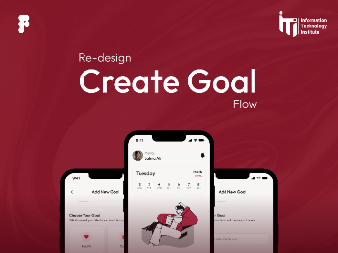
Goal Creation Flow
Portfolio website
Content Strategy Courses

UX Writing

Common Design Patterns


