Landing Page for Tech Startups

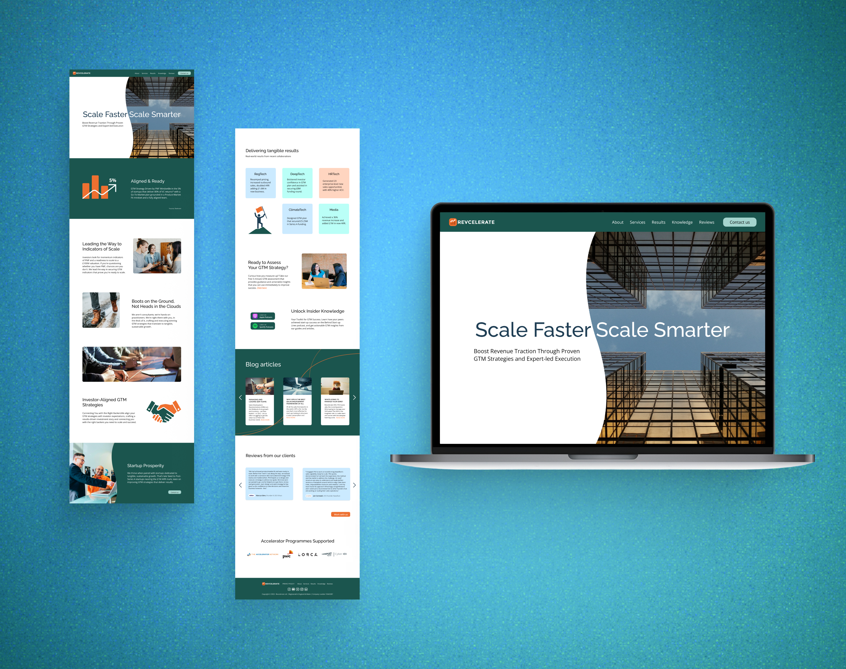
I am pleased to share my recent project: a landing page for a company that assists tech startups in designing and implementing effective go-to-market strategies. The main text for the site was provided by the client.
Before diving into the design, I conducted a thorough marketing analysis:
1. Target Audience: The target audience is primarily startups. I focused on understanding their specific needs and aspirations during the development phase.
2. Competitor Analysis: I researched the startup development niche, analyzing competitors to identify their strengths and weaknesses, which informed our differentiation strategy.
Design Solution:
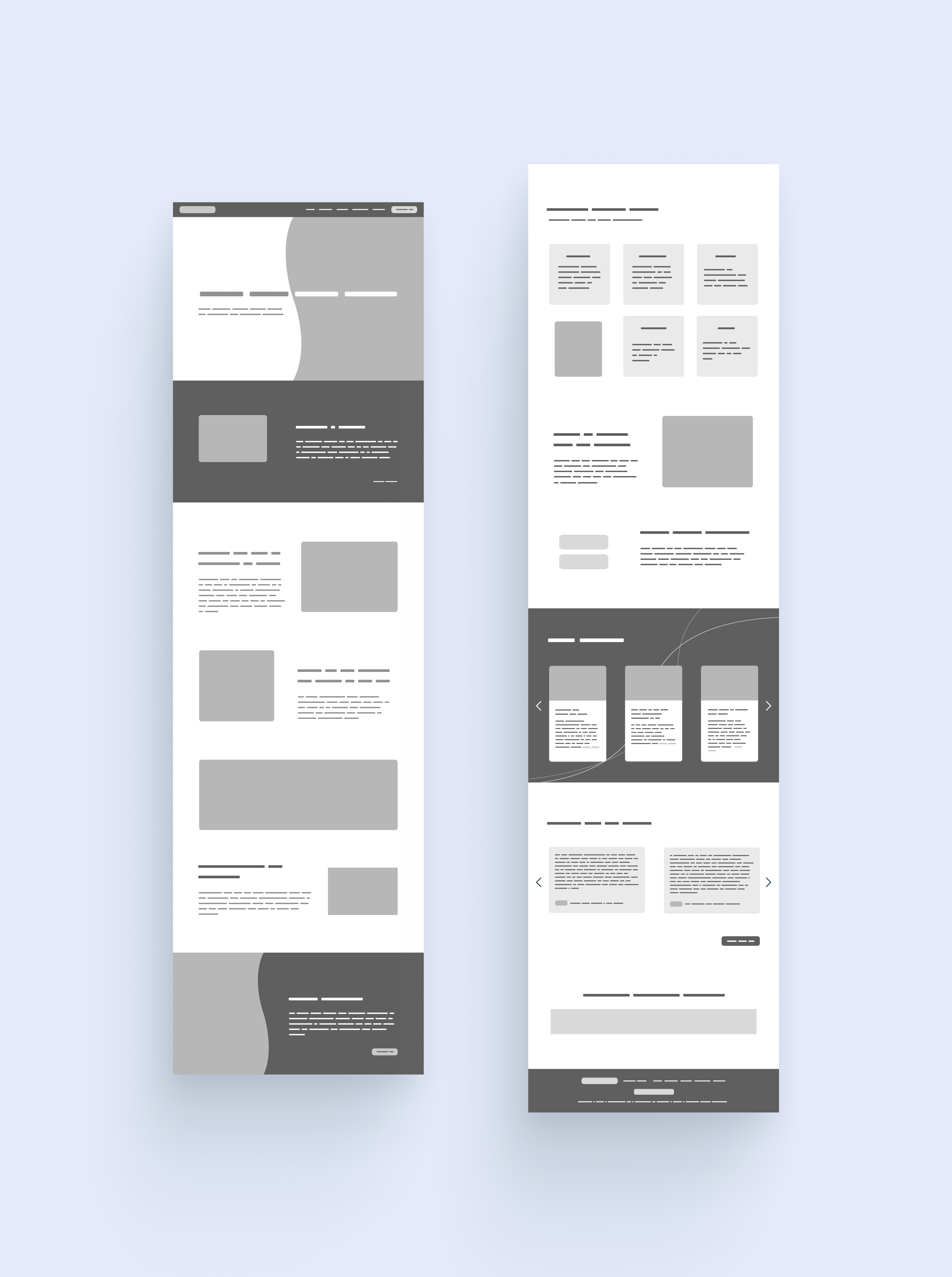
1. Clean and Modern Design: The website features a contemporary and professional look while remaining user-friendly.
2. Clear Navigation: The site offers clear and intuitive navigation, ensuring easy access to the main menu and desired information.
3. Testimonials: Client testimonials are included to showcase expertise and build trust.
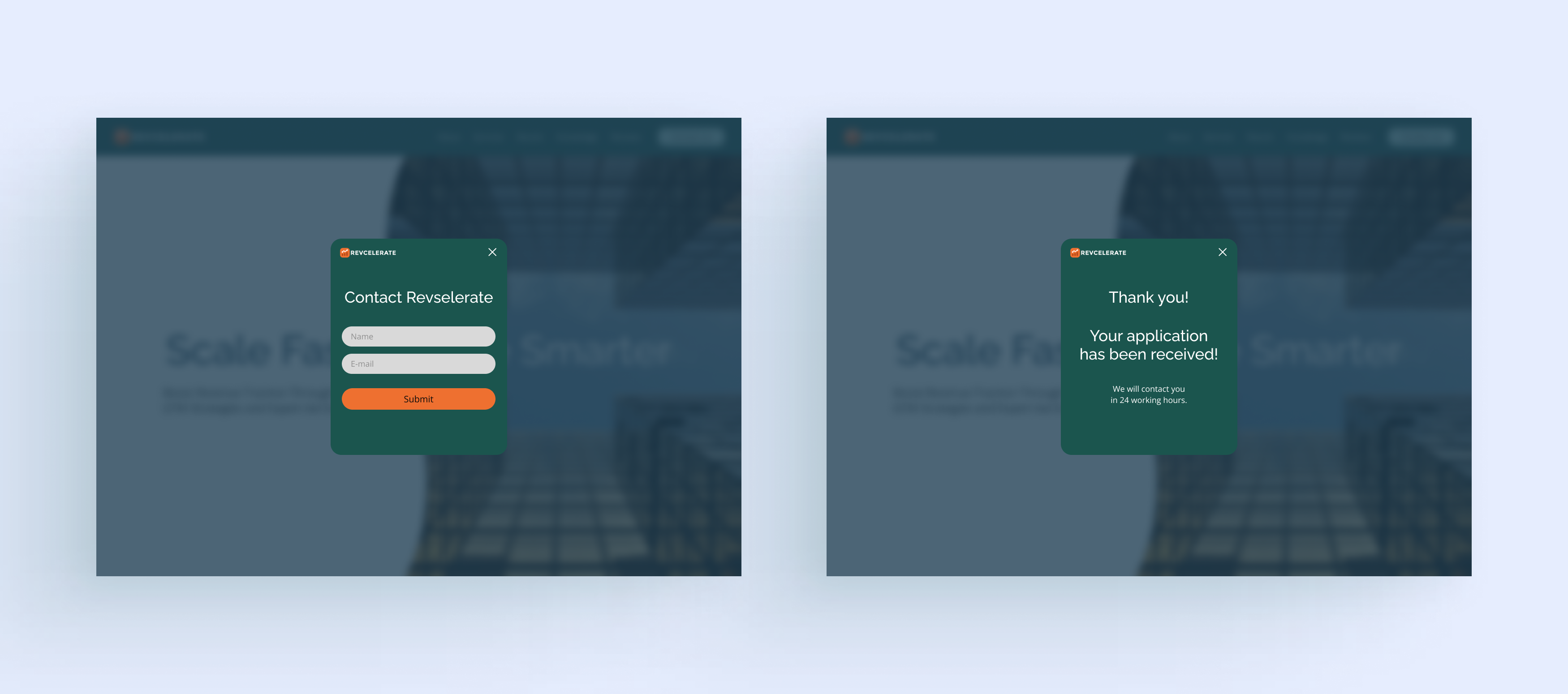
4. Effective Call-to-Actions (CTAs): Strategically placed CTAs, such as "Contact us" and "Work with us," encourage visitor engagement.
5. User-Friendly Contact Form: A straightforward contact form is integrated to streamline the inquiry process and minimize user effort.
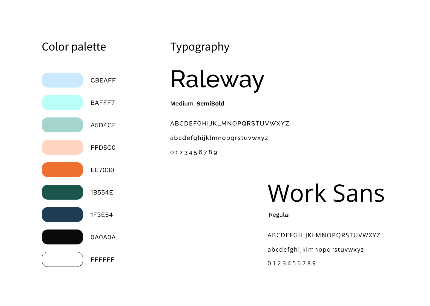
About color palette
The primary colors of this site are #1B554E and #EE7030. This combination can have specific psychological effects on users:
#1B554E - Dark Green - Calmness and Stability: Dark green conveys calmness and stability, reassuring startup founders of the company's reliability.
#EE7030 - Bright Orange - Energy and Enthusiasm: Bright orange symbolizes energy and enthusiasm, reflecting innovation, creativity, and the forward-thinking spirit of startups.
Combined Effect for Startups:
The blend of dark green and bright orange creates a balanced psychological impact:
- Trust and Innovation: Dark green instills trust and dependability, while bright orange adds a dynamic and creative touch. This suggests that the company is both reliable and innovative, ready to support startups in their ventures.
- Creativity and Forward-Thinking: Bright orange highlights the company's innovative approach, suggesting readiness to support startups in their endeavors.
- Attention-Grabbing: The contrast between dark green and bright orange is attention-grabbing, drawing users' focus to important elements on the website.
Sources:
1. Color Psychology: The Emotional Effects of Colors
2. The Fundamentals of Color Psychology
3. The Psychology of Color in Marketing and Branding
4. Color meaning and symbolism:How to use the power of color
These customized strategies and design solutions for startups aim to effectively connect with the target audience and enhance user experience on the landing page.
Thank you for watching!
Reviews
1 review
The website is easy to follow, and the color palette is soothing, setting the right mood. Overall, this is a great presentation of your case study.
The only concern I have is the use of jargon in the copy. It's difficult to read, and NNGroup's study proved that even native speakers, whether academic or professional, prefer simple language when dealing with interfaces. You mentioned that the texts were provided by clients, so this could be a great opportunity for your team to conduct simple research and demonstrate that the copy is too complicated. This complexity likely makes users feel incompetent and may cause them to leave.
Additionally, the website currently looks like a template and could benefit from a unique flair and a stronger presence of the company's brand.
You might also like

Improving Dating App Onboarding: A/B Test Design

FORM Checkout Flow - Mobile


A/B Test for Hinge's Onboarding Flow


Accessibility Asse


The Fitness Growth Engine

Uxcel Halloween Icon Pack

Popular Courses

Design Terminology


UX Writing

Ethical & Responsible Product Design
