Landing Page for Fashion Service

Design Concept:
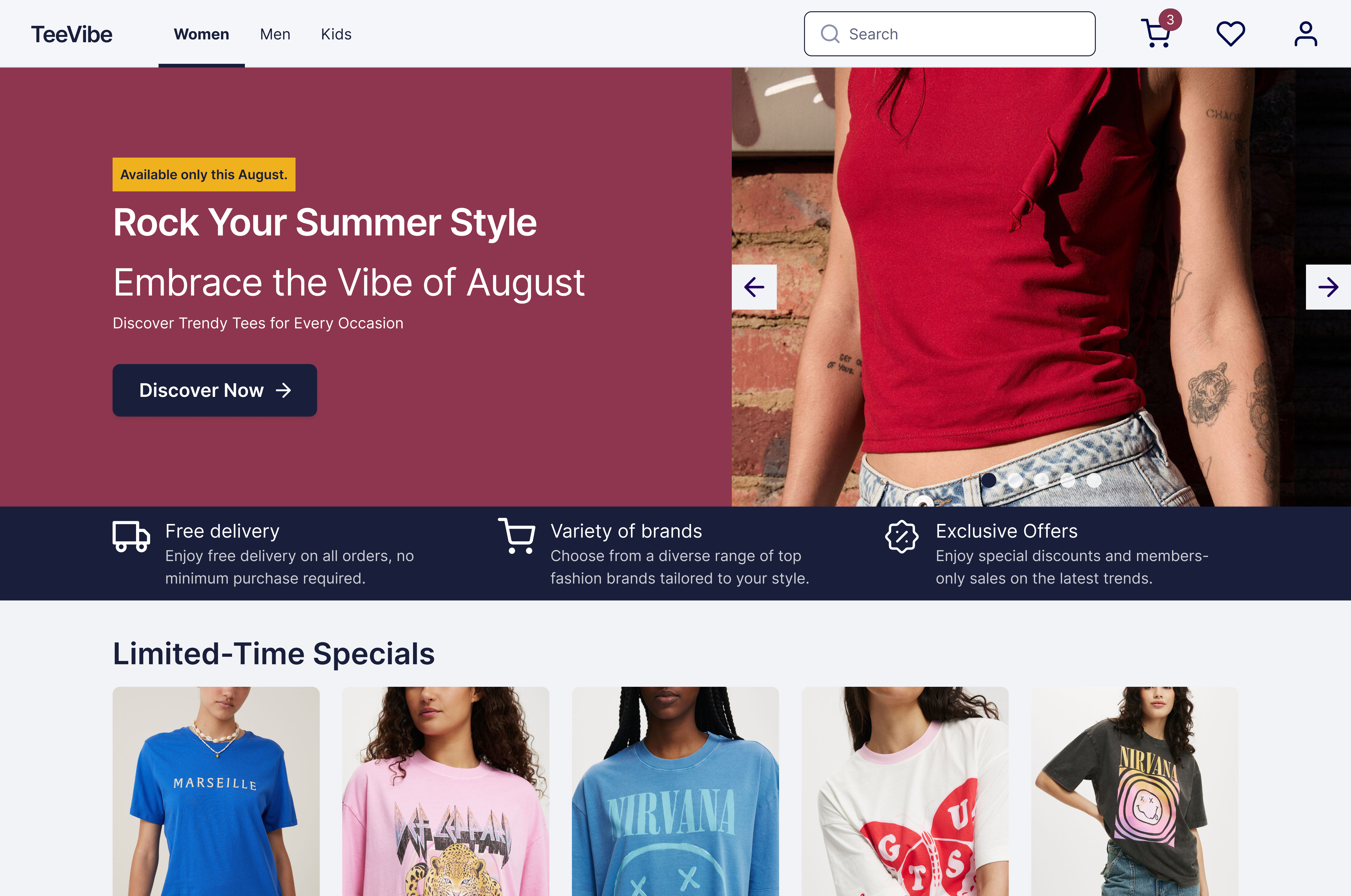
The website is an e-commerce platform selling clothing, primarily targeting teenagers who love fashion, focusing on tees. The overall look and feel of the website aim to represent youthfulness by using colors that evoke fun and excitement, and by playing with contrasts to convey the joy of dressing up.
The landing page is designed to create an engaging experience for users, where they discover various t-shirts to browse and enjoy.
Image Credits (for mock-up only):
- https://cottonon.com/US/
- https://www.gu-global.com/jp/ja/
From brief

Share
Reviews
1 review

I like the layout, especially the main picture and the CTA section. One suggestion I have is to define your hierarchy better. You can refer to the typography hierarchy lessons on Uxcel for guidance. Also, try to add more white space; increasing the vertical padding will help avoid a cluttered feel as users scroll through the landing page.
Regarding the gaps between elements, it's important to follow a predetermined hierarchy to ensure users understand where to focus first and how different sections relate to each other. It would also be helpful to see the entire landing page to provide a more comprehensive evaluation.
p.s. whenever you're showcasing products, especially on a fashion website, they have to be high quality and correctly cropped, although products are visible now, it just leaves the impression that they are not properly cropped.
Overall, it's a good start!
You might also like

SONZ - Entertainment platform


Camp & Travel Explorer - App Design


Solar system Dashboard Utility

Uxcel Halloween Icon Pack


Signup page for a SaaS website


Color System

Content Strategy Courses

UX Writing


Common UX/UI Design Patterns & Flows


Go-to-Market Strategy Fundamentals
