Style Me Now - Landing Page
- The logo design is a plain mannequin which signifies the tailored approach taken in curating fashion recommendations specific to each user.
- The brief had mentioned a modern and minimalistic design for the page. Hence the choice of a modern typeface and clean illustrations was made to fit the requirements.
- The colour palette of brown and blue was picked to instil trust and assurance to the customer that their outfits are being curated with care.
- Using a big font size for the hero section without using an image was to emphasize the motto of the service which resonates with the target audience.
Tools used
From brief
Topics
Share
Reviews
2 reviews
Your landing page has a lot of potential, but it could use some tweaks. The fonts make it hard to read and scan through the page. Choosing better fonts and ditching the all-caps for headings would help a lot. The visuals could also be improved — actual product images would work better for a styling service. The color scheme feels a bit choppy and could be more cohesive. Plus, the copy needs a good proofread to fix any errors.
On the bright side, I really like the way you’ve sectioned the page. The progression is good and makes sense.
(edited)
Thank you so much for this detailed review Raaghavi! I really appreciate you taking the time! I would love to have you as a mentor as I'm still learning alot!
The design is decent, but It can be improved by a lot just by adding some room for breathing.
Thank you for your review! I'll get to work on the spacing!!
6 Claps
Average 3.0 by 2 people
You might also like
Project
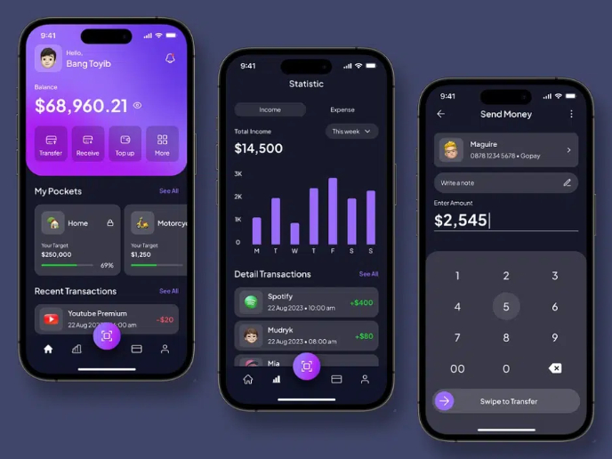
eWallet App Development Project
✨ Experience the future of digital payments with our innovative eWallet App design! Our concept combines powerful fintech capabilities with
Project
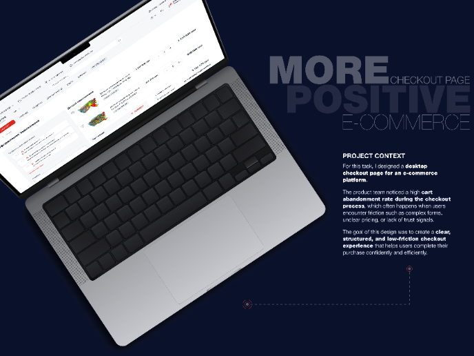
🖥 Desktop Checkout Flow Design
Designing a friction-free checkout experience to reduce cart abandonment 1️⃣ Project ContextAs part of the product design team for an e-comm
Project
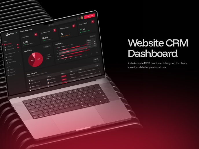
Website CRM Dashboard
When designing the DataPollex CRM dashboard, the core question I kept asking was: what does a person actually need to do in the first 60 sec
Project
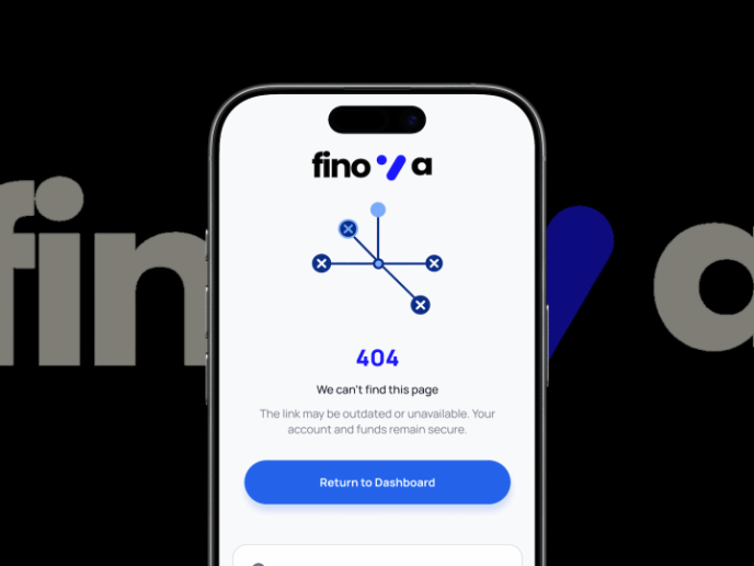
Helpful 404 Error Page for a Fintech Mobile App
Project ContextError pages are often overlooked in product design, yet they play an important role in maintaining trust and guiding users wh
Project
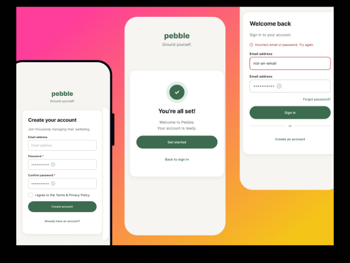
Pebble Accessible SAAS Signup Flow
Pebble Pebble is a mental health SaaS concept designed as part of the UXCEL UX Design career path. The brief was to design an accessible s
Project
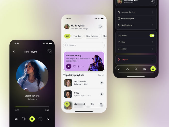
Music Player UI - Light & Dark Mode
Open Full ProjectUnderstanding the ContextMusic streaming is a long-session behavior, often used during evening hours, commuting, or in low-
Content Strategy Courses

Course
UX Writing
Learn to write microcopy that communicates clearly and concisely to improve user experience, build trust, and boost conversions across digital products.

Course
Common UX/UI Design Patterns & Flows
Learn how to use tried and tested UX/UI design patterns and flows to solve recurring design problems faster and build interfaces that feel intuitive

Course
Building Content Design Systems
Master systematic approaches to creating consistent, reusable content across your entire product ecosystem
