Kraftery Design
Reviews
3 reviews
Hey Irina! It's awesome to see how much you've been practicing and sharpening your design skills every day. That kind of dedication really shows.
When you showcase your work, try to present it in a way that grabs everyone's attention. Maybe add a little explanation about what the project or even just one screen is all about. It helps us understand your thought process better. Also, let us know if the project is still in progress so we know to look out for more updates.
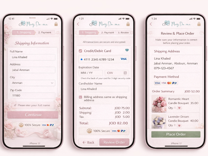
For this specific design, I'm having a bit of trouble figuring it out because there's not much context. There’s a cool design concept, but a lot of it is placeholder text, and it feels like it's between high-fidelity and low-fidelity stages.
I also noticed some contrast issues that need tweaking for better readability.
Overall, it's a great start! With a bit more info and some adjustments, your work will really shine.
Hey Irina,
I like:
-The Original Layout composition
-The Order Disordered Style
I don't like:
-I counted more than six font sizes on only one screen.
-It seems like an advanced wireframe instead of a final UI. I think there is room for improvement in essential UI details.
-You could improve the use of margin and padding consistently, empty spaces, and content hierarchy.
Thanks for sharing your work. Keep posting!
Keep working
You might also like

Islamic E-Learning Platfrom Dashboard

Pulse — Music Streaming App with Accessible Light & Dark Mode
SiteScope - Progress Tracking App

Mobile Button System

FlexPay

May.Da.Ma Candles & more
Content Strategy Courses

UX Writing

Common UX/UI Design Patterns & Flows


