InSight - Onboarding

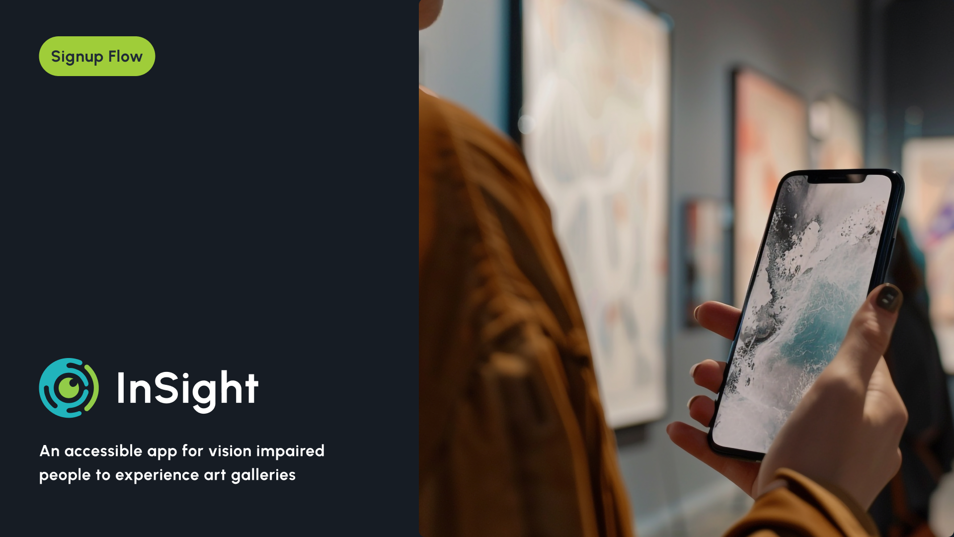
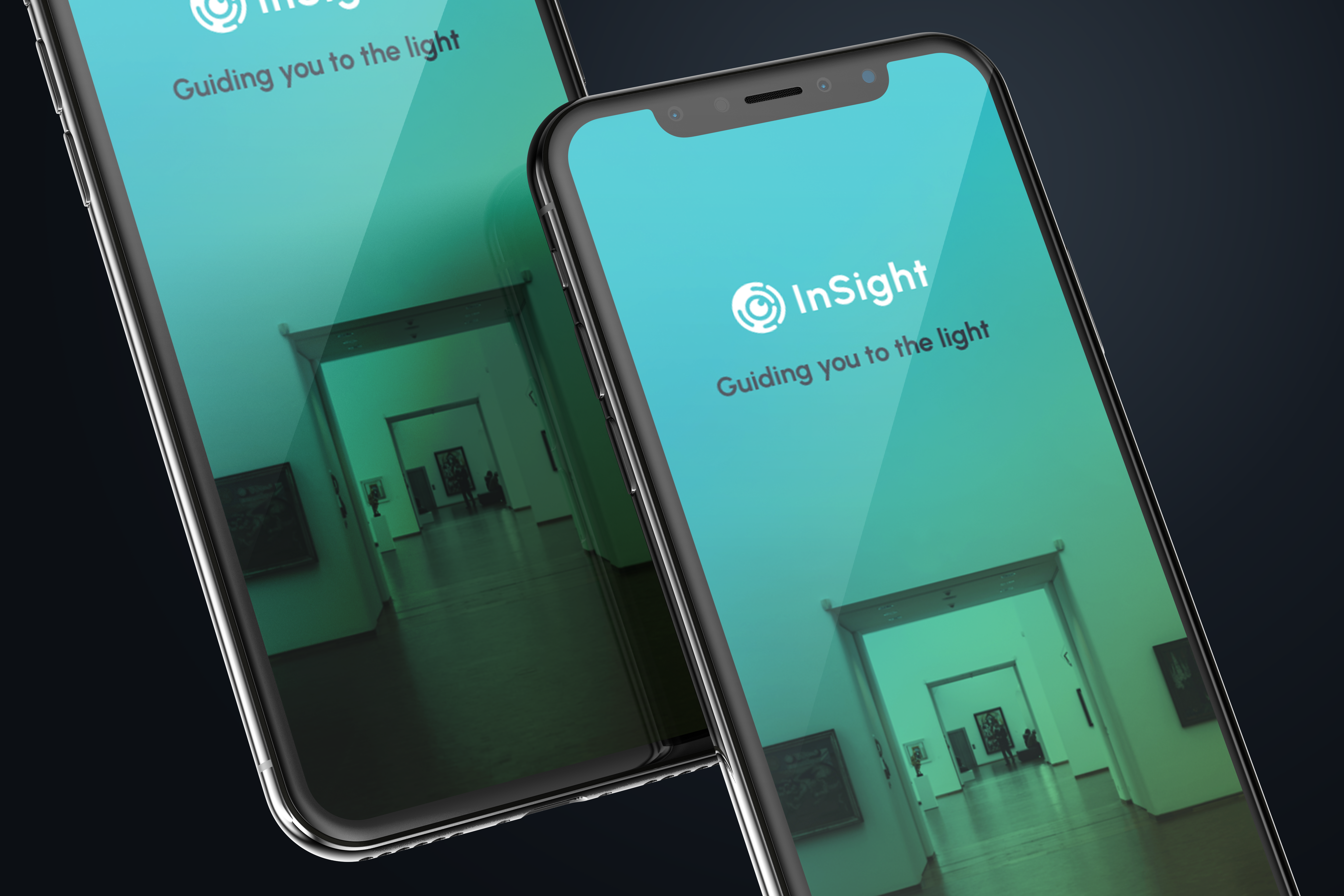
Insight is an intuitive and engaging mobile app that enhances the art exhibition experience for visually impaired users by using audio, tactile feedback, and interactive storytelling.
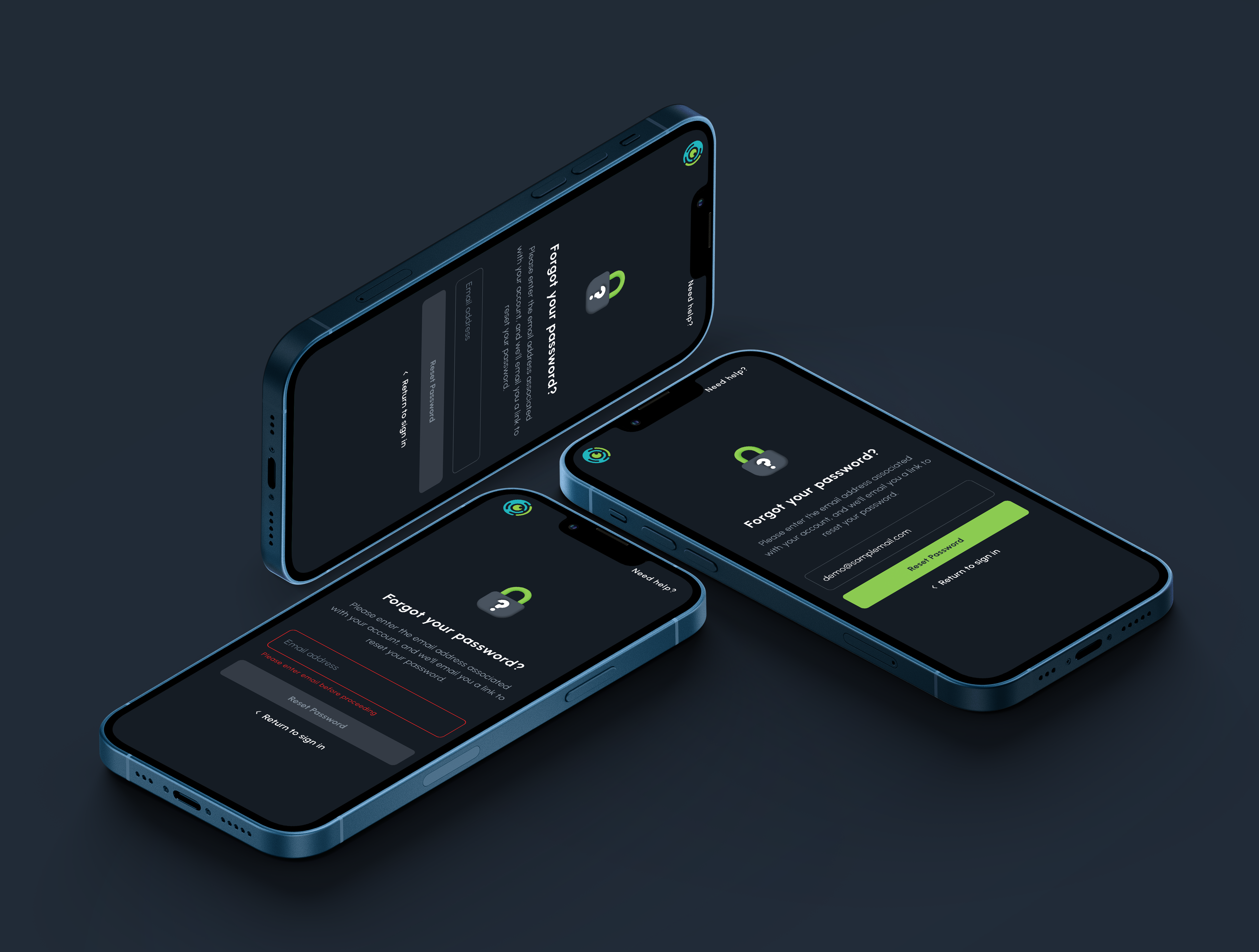
The Signup flow here is focused on accessibility. The color contrasts here to meet the WCAG AAA standard checked. The spacing and tappable areas are tappable according to Material Design Guidelines.
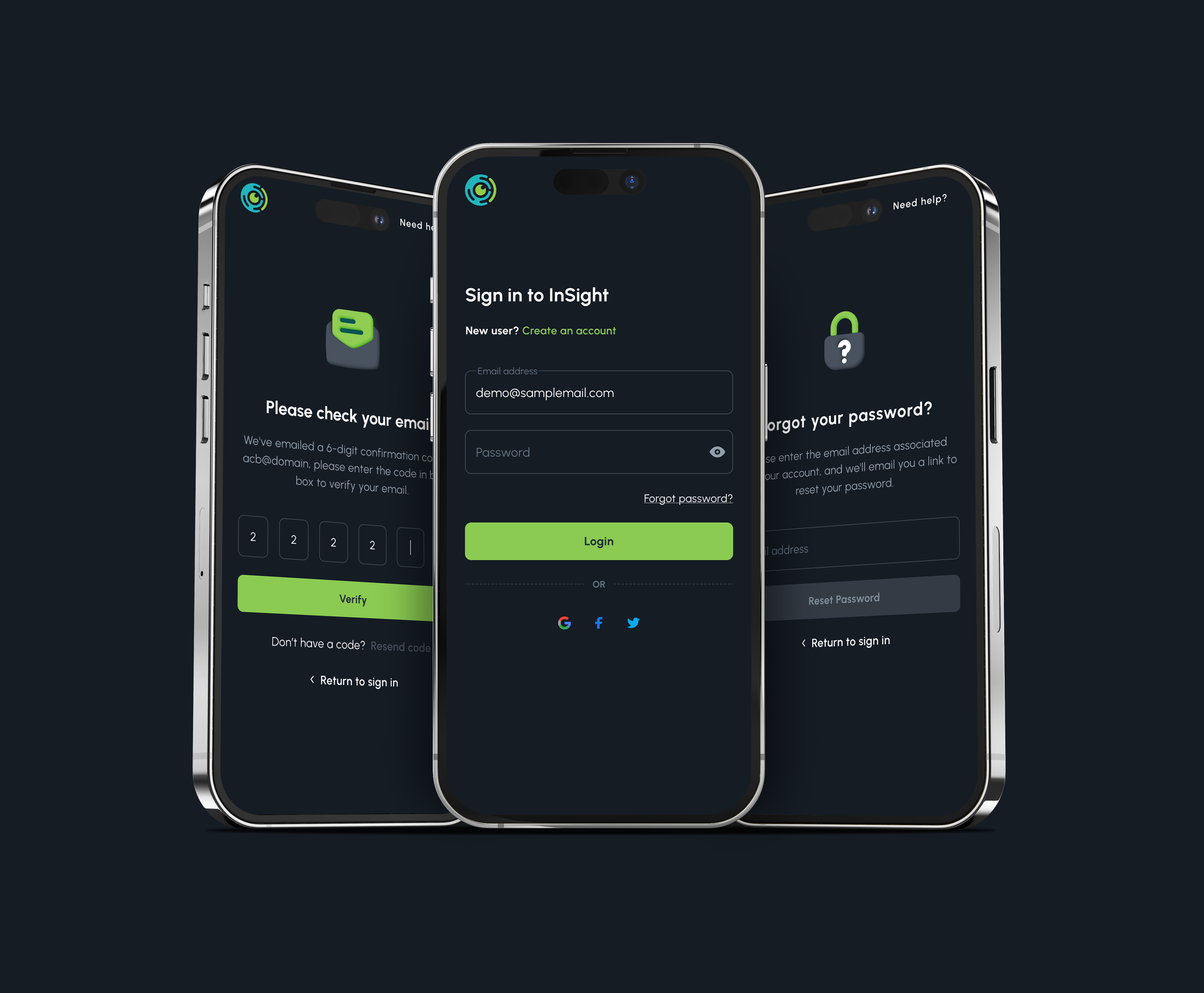
The number of screens is limited on purpose so that users can finish the flow fast and get into the app as fast as possible. Here is the prototype link to the signup flow:
https://figma.fun/Jdadxu
Please let me know what you think. Thanks for viewing. Cheers!
Tools used
From brief

Topics
Share
Reviews
1 review
- Attractive UI Presentation: The UIs are presented attractively, showcasing your design skills effectively. The clean and visually appealing layout captures attention and reflects well on your design abilities one you are inside the post itself.
But...
- Thumbnail Aspect Ratio: The aspect ratio of the thumbnail (main image of the post) needs improvement. A poorly cropped or distorted thumbnail can give a bad first impression, so ensuring it’s correctly sized and proportioned is crucial for drawing viewers in.
- Figma File Access: The link to the full project (Figma file) currently requires access permissions. Consider making it publicly accessible to provide better accessibility to all reviewers. This will offer a smoother, faster experience, allowing others to fully explore and appreciate your work without unnecessary barriers.
Overall, your presentation is not bad, but with these tweaks, you can ensure a more polished and accessible experience for your audience. Keep up the great work!
You might also like

Improving Dating App Onboarding: A/B Test Design

FORM Checkout Flow - Mobile


A/B Test for Hinge's Onboarding Flow


Accessibility Asse


The Fitness Growth Engine

Uxcel Halloween Icon Pack

Visual Design Courses

UX Design Foundations


Introduction to Figma

Design Terminology
