FxFort | Branding & Logo

Graphic Design: Akhil
UX/UI design: Akhil
Content Design: Sachin & Akhil
Client: @Fxfort
Crypto + wallet + secure
FxFort is a high-end, invite-only crypto wallet tailored for merchants. We're crafting a brand identity that exudes exclusivity, security, and efficiency. The visual language will employ a sophisticated color palette, clean typography, and imagery that symbolizes wealth and technological prowess. The overall goal is to position FxFort as the ultimate crypto vault for discerning merchants.
![]()
![]()
![]()
![]()
![]()
![]()
![]()
Tools used
Topics
Share
Reviews
2 reviews

Thanks for your sub, Akhil!
You did a great job here! I love the color palette and typography. I would like you to focus more on deliverables, which are crucial details! Here are some things:
- on the first page, you gave us some metrics ( padding of 2x ) - but you didn't tell us the ratio of the logo and font or the distance between them according to padding. Golden tip: try to put some golden ratio ( 1,618 ) with a selling point for the client.
- the black and white logo is pixelated
- the alignment of the logo is different on the mockups from the guidelines. The guideline should have all the acceptance forms and also restrictions
Great vibes only! Keep on creating!


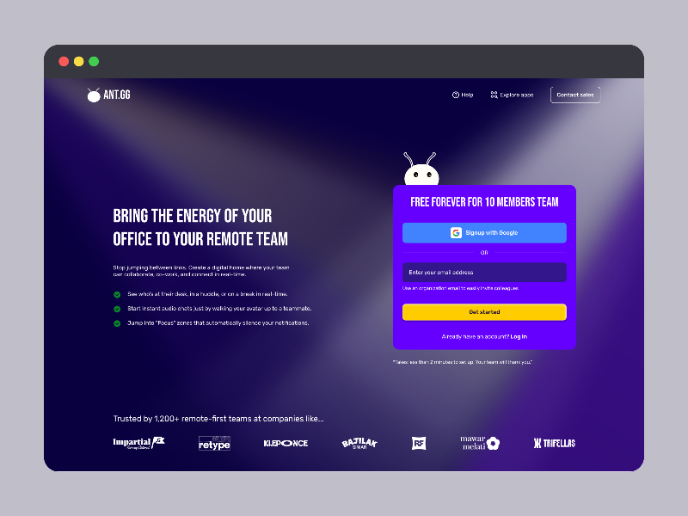
The FxFort project is an exceptional example of thoughtful and polished branding. Everything—from the logo to the colour palette and typography—feels cohesive and intentional, perfectly aligning with the brand's promise of exclusivity, security, and efficiency. The gradients are vibrant yet professional, the typography choice (Montserrat) is clean and timeless, and the mockups effectively showcase the brand in real-world scenarios. Overall, it’s a job well done, and I can see the attention to detail throughout the project.
What I Loved:
- The logo design is minimal yet impactful, with a solid grid system backing it up.
- The gradients, typography, and colours are working together seamlessly to convey a premium, futuristic feel.
- The mockups help visualize how FxFort would come to life across different touchpoints.
What Could Be Improved:
- Adding a Security Element: While the logo is clean and modern, adding a subtle security element (like a shield or lock) could make it even more relevant for a crypto wallet. This would need to be tested for scalability and clarity in smaller applications like favicons.
- Dark Mode Showcase: A dark mode version of the branding would help highlight how it performs in digital-first environments, especially since many apps and websites are trending towards dark UI. It’s also a great way to ensure accessibility with proper contrast ratios.
- UI/UX Context: Showing how the branding integrates into an app or website design—like on a dashboard or in a transactional flow—would make the brand’s usability even more compelling.
- Logo Scalability: It’s worth testing how the logo performs at really small sizes, like app icons or headers. Slight tweaks might be needed to maintain clarity without losing its essence.
- Gradient Adaptability: Gradients look fantastic on digital screens, but they can sometimes be tricky in print. Testing for consistency in physical applications—like merchandise or business cards—and having a solid fallback colour could ensure the branding holds up everywhere.
This project is already fantastic, but these tweaks could make it bulletproof. Keep up the amazing work!
You might also like
SaaS Signup Design


Events Managment App


Customer Journey Map — Offsite Co-Working Experience


Mobile Onboarding: Casa di Pasta


Accessible Signup & Login Experience — Brainex


Accessible Signup Form

Popular Courses

Color Psychology


Typography

HTML Foundations