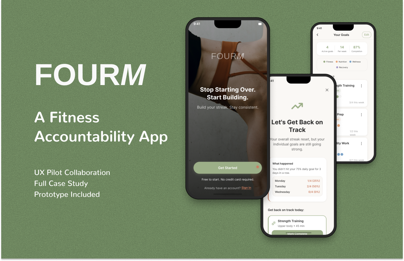
FOURm A Fitness Accountability App
FOURM FITNESS APP - CASE STUDY
Role: UX Writer (transitioning from copywriting)
Timeline: 4 weeks (October 2025)
Tools: UXPilot, Figma Make, Figma, Claude, ChatGPT
Credits Used: 282 UXPilot credits
Deliverables: 17 screens generated in UXPilot, refined and expanded to 19 final screens in Figma Make
PROJECT NAVIGATION NOTE: In the prototype, there is a grid navigation button on the right, you can access all the screens from there :)
THE PROBLEM
Most people struggle with fitness consistency in the same predictable way. They start strong—hit the gym four days in a row, meal prep every Sunday, feel motivated. Then they miss one day. Then another. And suddenly they feel like they've failed, so they abandon everything and start the cycle over again.
The data backs this up: 80% of people abandon their fitness goals within the first three months.
But the issue isn't lack of motivation. Most fitness apps are designed for people who are already consistent. They punish missed days with broken streaks and guilt-inducing notifications, reinforcing the exact shame spiral that made people quit in the first place.
What's missing is an app that acknowledges reality: sustainable fitness isn't about perfection. It's about building resilience to inevitable setbacks.
THE SOLUTION
FOURM is a fitness accountability app built on consistency over perfection. FOURM combines the four pillars of sustainable fitness (Effort, Consistency, Diet, Recovery) with form—your foundation, what you're building toward.
The core concept is simple: set your personal goals across different areas (strength training, meal prep, mobility work, sleep tracking—whatever matters to you), and as long as you hit 75% of them each day, your streak continues. Miss too many days in a row, and instead of a punishing "streak broken" notification, you enter a non-punitive comeback protocol that helps you restart without shame.
The app also tracks individual goal streaks alongside your overall consistency, so even if your daily streak resets, you can see that your strength training streak is still going strong. This preserves motivation during rough patches.
Why 75%? Research on habit formation shows that flexible consistency (75-80% adherence) is more sustainable long-term than rigid perfection. It accounts for life happening.
CONTEXT: LEARNING UX DESIGN
Coming from a copywriting background, this was my first complete UX project. I utilized AI tools to assist with visual design and information architecture, while leveraging my copywriting expertise to refine the messaging and tone. All final design decisions were made by me.
THE DESIGN PROCESS
This was my first time using AI-assisted design tools for a complete project, and I learned quickly that different tools serve different purposes. The key is understanding when to use each one.
Phase 1: Learning UXPilot
UXPilot excels at generating structured layouts quickly, but it requires a very specific approach. Coming from traditional design thinking, I initially treated it like a design assistant that would understand my intent. That didn't work.
My first welcome screen prompt looked like this:
Welcome screen for FOURm fitness app

CONTENT:
- FOURm logo at top
- Headline: "Stop Starting Over. Start Building."
- Subheadline: "Track your workouts. Stay consistent."
- Button: "Get Started"

STYLE:
- Clean and minimal
- Modern fitness aesthetic
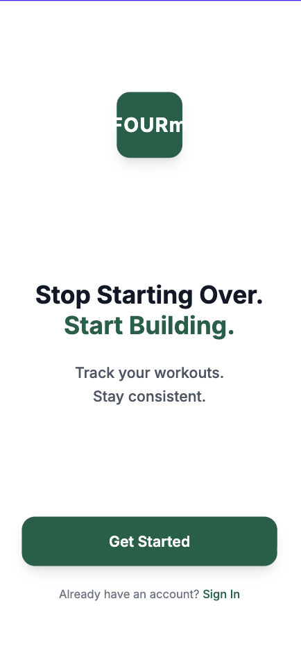
UXPilot generated a basic layout, but it was generic—the kind of template you'd see on any fitness app. I realized the tool wasn't guessing my intent; it was building exactly what I described. And I hadn't described much.
After several iterations and 18 credits spent just on the welcome screen, I understood what UXPilot needed: extreme specificity. Every measurement, every color value, every spacing decision had to be explicit.
My prompts evolved to look like this:
Welcome screen for FOURm fitness app

DEVICE: iPhone 16 (393 x 852 px)

HEADLINE:
- Text: "Stop Starting Over. Start Building."
- Font: Inter Bold, 32px
- Color: #2A2A2A
- "Start Building." in sage green (#9CAF88)
- Line height: 40px
- Center aligned
- Position: 48px below logo

SUBHEADLINE:
- Text: "Build your streak. Stay consistent."
- Font: Inter Regular, 16px
- Color: #9B8B68
- 16px below headline

PRIMARY CTA:
- Text: "Get Started"
- Background: #9CAF88
- Width: 345px, Height: 52px
- Border radius: 26px
- Shadow: 0px 4px 12px rgba(156, 175, 136, 0.3)

[...exact specifications for every element]
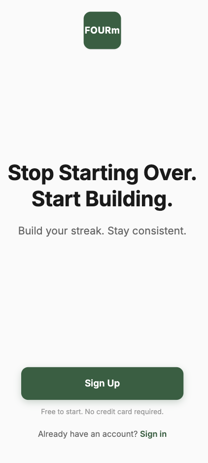
This approach worked much better. I learned to think systematically about every design decision and to define visual hierarchy explicitly. UXPilot taught me to be methodical in a way I hadn't been before.
The same pattern repeated across all 17 screens. The Today dashboard took 24 credits across four iterations before I got the hierarchy right: streak card most prominent, consistent 24px spacing between sections, proper typography scale (48px for the main streak number vs 16px for body text), refined copy that felt encouraging rather than clinical.
By the end, I'd used all 282 credits, but I had solid structural foundations for every screen.
Phase 2: Moving to Figma Make
After UXPilot gave me the structure for 17 screens, I moved everything to Figma Make for refinement and polish. This is where the 17 screens became the final 19, and where they gained personality.
UXPilot had forced me to be precise and systematic. Figma Make gave me creative freedom to refine those foundations. I refined typography weights to improve hierarchy, added subtle gradients to streak cards for visual prominence, improved color balance throughout, and fine-tuned spacing for better visual rhythm.
More importantly, I could iterate on specific elements without regenerating entire screens. Want to try a different button treatment? Just adjust it. Want to refine the copy from "Track your workouts" to something warmer like "Build your streak. Stay consistent"? Change it instantly.
I also added trust indicators throughout ("Free to start. No credit card required" on the welcome screen) and made sure the tone stayed consistent: encouraging, non-judgmental, realistic about the fact that life happens.
Figma Make also enabled me to build out the complete design system documentation—adding two new screens (Typography and Components) to document the comprehensive color palette with category colors, the full typography scale, and the component library with specifications.
Phase 3: Final Organization in Figma
The last step was bringing the 19 Figma Make screens into Figma for production work: organizing all screens, creating an interactive prototype, building the component library, and preparing everything for potential development handoff.
THE DESIGN SYSTEM
After going through the entire process, I had a complete design system:
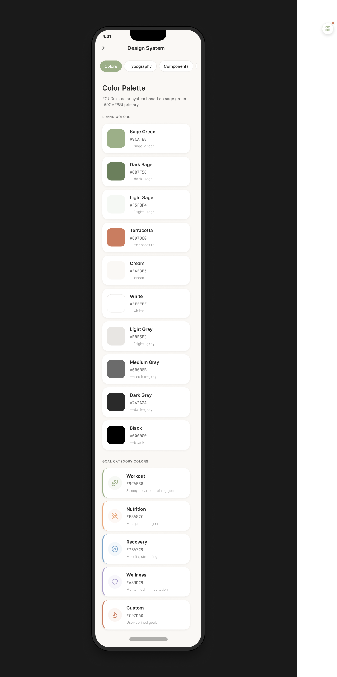
Colors
The color system is built around sage green as the primary brand color, with terracotta as an accent for urgent or selected states. Each goal category has its own color to make them instantly recognizable throughout the app.
Typography
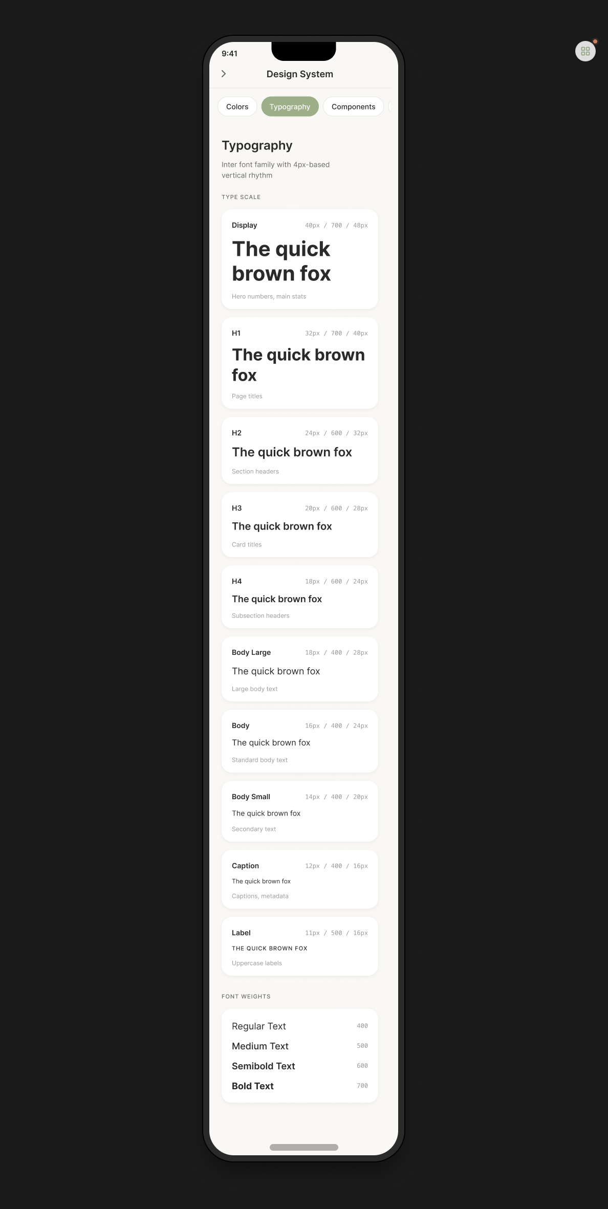
I used Inter as the font family with a 4px-based vertical rhythm. The type scale ranges from Display (48px bold for hero numbers and main stats) down through H1 (32px bold for page titles), H2, H3, H4, and various body text sizes, ending at Label (11px medium for uppercase labels). Font weights range from Regular (400) through Medium (500) and Semibold (600) to Bold (700).
Components
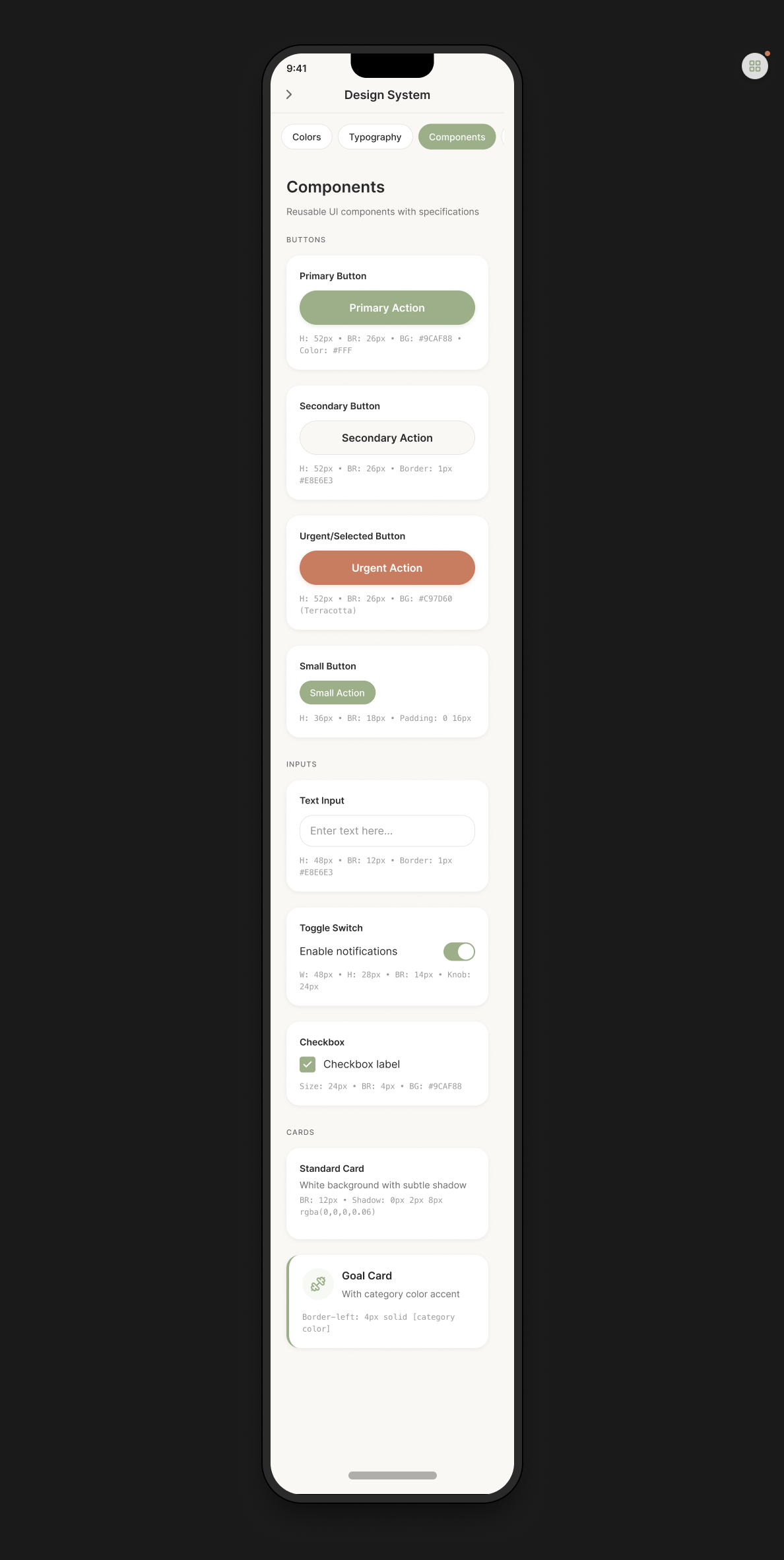
The component library includes four button styles: Primary (52px height, 26px border radius, sage green background), Secondary (52px with 1px gray border), Urgent/Selected (52px with terracotta background), and Small (36px with 18px radius). Input components include text fields, toggle switches, and checkboxes. Card components include standard cards with subtle shadows and goal cards with 4px colored left borders.
The spacing scale follows a consistent pattern: 4px, 8px, 12px, 16px, 24px, 32px, 48px.
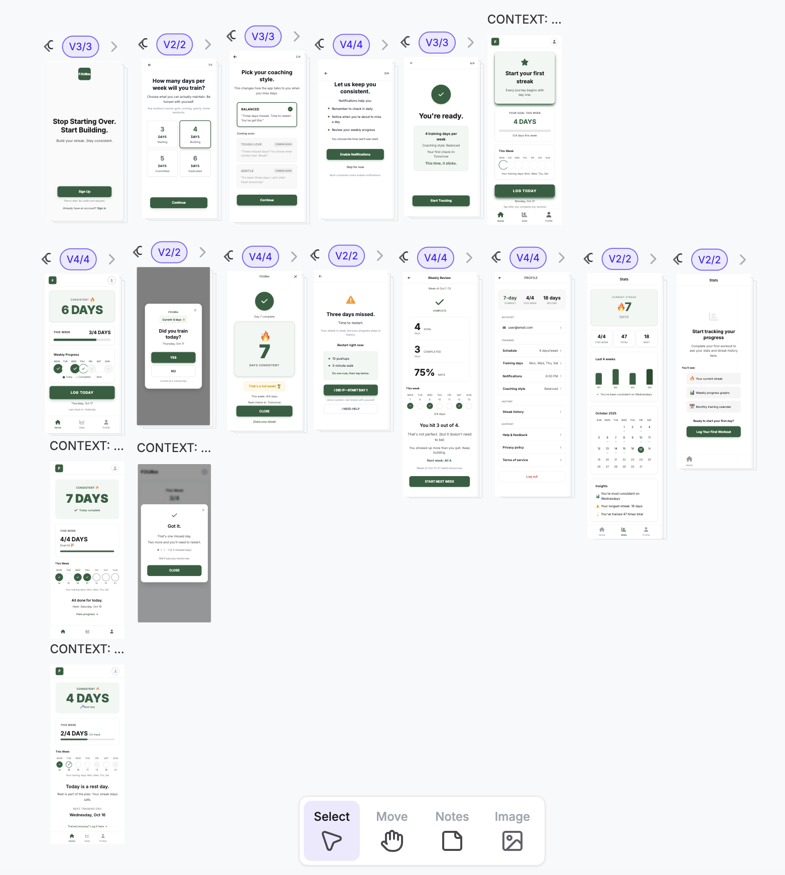
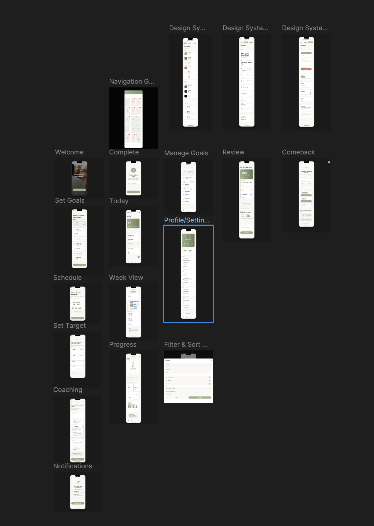
THE FINAL 19 SCREENS
After taking the 17 UXPilot screens through Figma Make for refinement, I ended up with 19 final screens:
User-facing screens (15): Welcome, Set Goals, Schedule, Set Target (where users choose their consistency threshold), Coaching Style Selection, Notifications Permission, Onboarding Complete, Today Dashboard, Week View Calendar, Manage Goals, Progress Dashboard, Filter & Sort Modal, Weekly Review, Comeback Protocol, and Profile/Settings.
Design system documentation (4): Navigation Grid Overview, Colors, Typography, and Components. The two additional design system screens (Typography and Components) were added during the Figma Make phase to document the complete system.
https://www.figma.com/design/YMopOQFhdrJvdPOuYBVlqA/FOURm-App---UX-Portfolio?node-id=9-21&t=PTn2DHhir94Nuvoj-1
WHAT I'D DO DIFFERENTLY
If I were starting over, I'd begin with low-fidelity wireframes before touching UXPilot. Establishing information architecture and user flows on paper first would have saved credits by ensuring I knew exactly what I was building before writing detailed prompts.
I'd also write better initial prompts now that I understand what UXPilot needs. And I'd plan the complete design system—color palette, typography scale, spacing—before generating any screens. This would ensure consistency from the start rather than having to retrofit it later.
Finally, I'd map all screen states (empty, error, loading, success) earlier in the process to ensure comprehensive coverage.
FINAL REFLECTION
This project taught me that AI-assisted design is incredibly powerful when you understand each tool's role. UXPilot forced me to think systematically and make every design decision explicit. Figma Make gave me the creative freedom to refine those foundations into something with personality.
The result is an app that addresses a real problem that (hopefully) could be useful to the target audience.
Thank you for taking the time to take a look at my project!
Please feel free to provide any feedback that might help me improve my work in the future. :)
______________________________________________
Changelog:
10/23/2025 - Changed "Comeback Protocol" icon
Tools used
From brief

Topics
Share
Reviews
4 reviews

Hi Yael! I found your project really meaningful. Many people strive for perfection, which makes missing a day or not working at 100% feel like a failure. But staying consistent— even at 80%—isn’t failing; it’s progress.
In addition to the feedback you’ve already received, you might consider reducing the amount of text, or hiding extra information until users start asking questions. This could make the experience feel cleaner and more focused.
Great work, and good luck!
Yuliia

Thank you for the prototype—there’s a lot of thoughtful work here and the flow feels motivating.
One important improvement: some screens have low color contrast, which makes text and key actions hard to read. Aim for at least a 4.5:1 contrast ratio for normal text and 3:1 for large text and UI elements to meet accessibility standards. Adjusting text color or darkening backgrounds will keep your style while improving readability for everyone.
Great progress—keep going!

Hey Yael! Overall, I am enjoying the outcome of your project — it's nice and neat, and well thought out. The only thing that struck me negatively was the exclamation mark on the screen when you warn the user that it's time to get back on track.
Thank you for the note about starting with a low-fidelity prototype before opening UX Pilot — I totally agree with this approach.

The app looks good at first glance and I appreciate that you would reconsider learning more about the tool before working on something like this the next time.
I can see there are a bit of hierarchy issues in the screen contrast ratios are also off in some spaces. What can be helpful is that you ask Chatgpt to take care of these things for you and ask it to make sure to maintain hierarchy and contrast.
I hope this helps and all the best for future!
You might also like

Smartwatch Design for Messenger App


Bridge: UI/UX Rebrand of a Blockchain SCM Product


Pulse Music App - Light/Dark Mode


Monetization Strategy


Designing A Better Co-Working Experience Through CJM


Design a Settings Page for Mobile
Product Thinking Courses

Ethical & Responsible Product Design

Product Vision & Strategy


Product Management Foundations