

Reviews
2 reviews

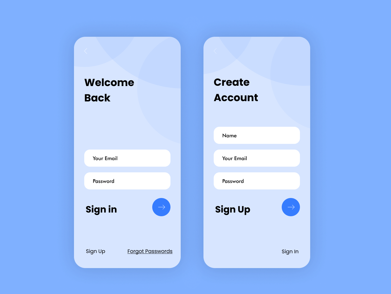
Your approach to simplicity and straightforwardness in design is a good start, Faith! It's essential, however, to align with industry standards where necessary. To better understand your decisions, it would be for the best if you'd include a brief paragraph with your rationale in future submissions. This will aid in a more precise evaluation or feedback of your designs. Looking ahead, consider exploring hierarchy in typography and color palettes to enhance content arrangement in compliance with WCAG guidelines. Also, clarity in UX copy is crucial; for instance, why did you decide to use plural in "Forgot Passwords". Lastly, assess the hierarchy and functionality of buttons to improve user interaction. Good way to start!
I'm really drawn to the clean, bluish color palette and the sans-serif typeface you've selected for your sign-in/sign-up page. It sets a sleek and modern tone right off the bat.
However, to fully grasp the impact of your design, I'd need to know a bit more about the context. What app are these pages designed for? Understanding the industry and the app's theme is crucial as they can influence not just the choice of words but also the overall tone and voice of the brand.
Additionally, the brief emphasizes the importance of form accessibility, which seems to be missing in your current presentation. Incorporating these elements could significantly enhance the specificity, uniqueness, and user inclusivity of your work.
You might also like

eWallet App Development Project

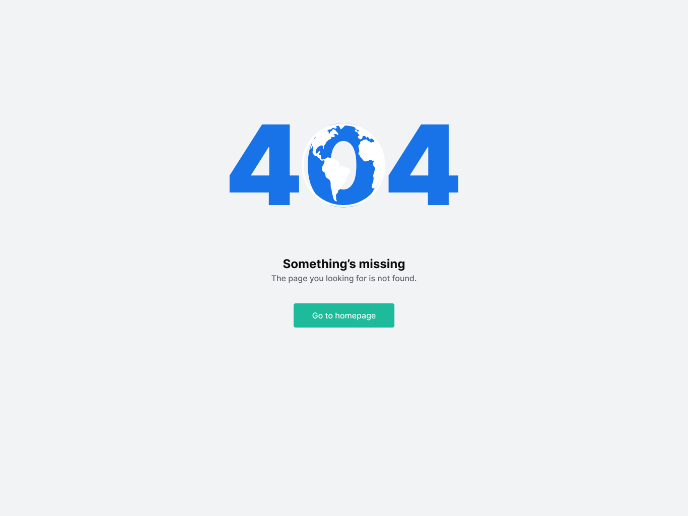
Design a 404 Error Page


🖥 Desktop Checkout Flow Design


Website CRM Dashboard

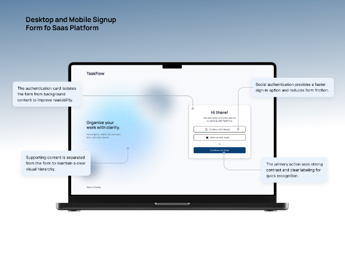
TaskFlow Authentication Flow


Helpful 404 Error Page for a Fintech Mobile App

Visual Design Courses

UX Design Foundations


Introduction to Figma

Design Terminology
