FlowTrack Color System

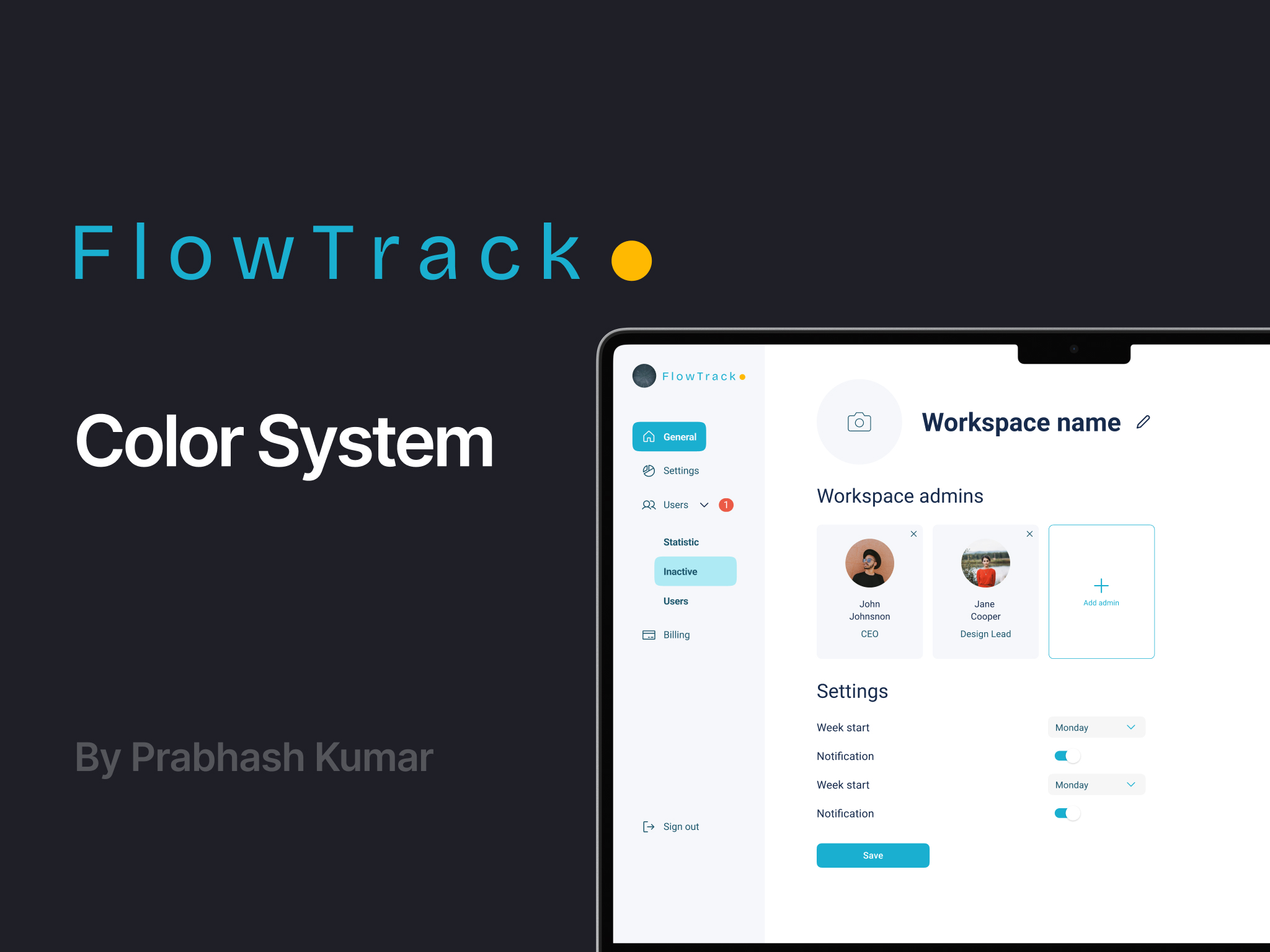
A cohesive, vibrant color system anchored by an energetic Primary Blue and balanced with supportive secondary hues delivers a fresh, distinct identity—evoking trust, clarity, and creativity—while ensuring WCAG-compliant contrast across all UI and branding touchpoints.
Each choice is backed by psychological research showing blue builds reliability, green inspires optimism, yellow/gold grabs attention, and neutrals support clarity without distraction
All colors were checked for WCAG AA/AAA contrast compliance
Tools used
From brief

Topics
Share
Reviews
3 reviews

Hey Prabhash,
Your FlowTrack Color System is well balanced and thoughtfully designed, with a clear hierarchy that feels modern and versatile. To make it even stronger, try showing the colors applied on real UI elements like buttons or alerts, and add a note about accessibility testing or contrast ratios. Overall, it’s a clean and solid system—great work!

The FlowTrack Color System is well-balanced and thoughtfully structured—mixing neutral tones with vibrant accents in a way that’s both modern and functional. The hierarchy feels intentional, making the palette versatile for various UI elements.
To elevate it just a bit more:
- Show it in action: Try applying these colors to actual UI components—like buttons, alerts, charts, or cards—to give viewers real-life context on how they'd scale across the interface.
- Address accessibility: If possible, include a note on contrast ratios or accessibility testing to show the system’s real-world usability.
Overall, it’s a clean, considered color system that’s ready to support a cohesive UI. Nice work! 👏🎨

Nice
You might also like

Beautify Login page WCAG principles


edX Sign-Up Page Redesign


Design Prioritization Workshop


Notion Login Page Accessibility Optimization


Sanyahawa - Landing page Design


Healthy Dashboard

Visual Design Courses

UX Design Foundations


Introduction to Figma

Design Terminology
