FitnessFirst - Mobile App
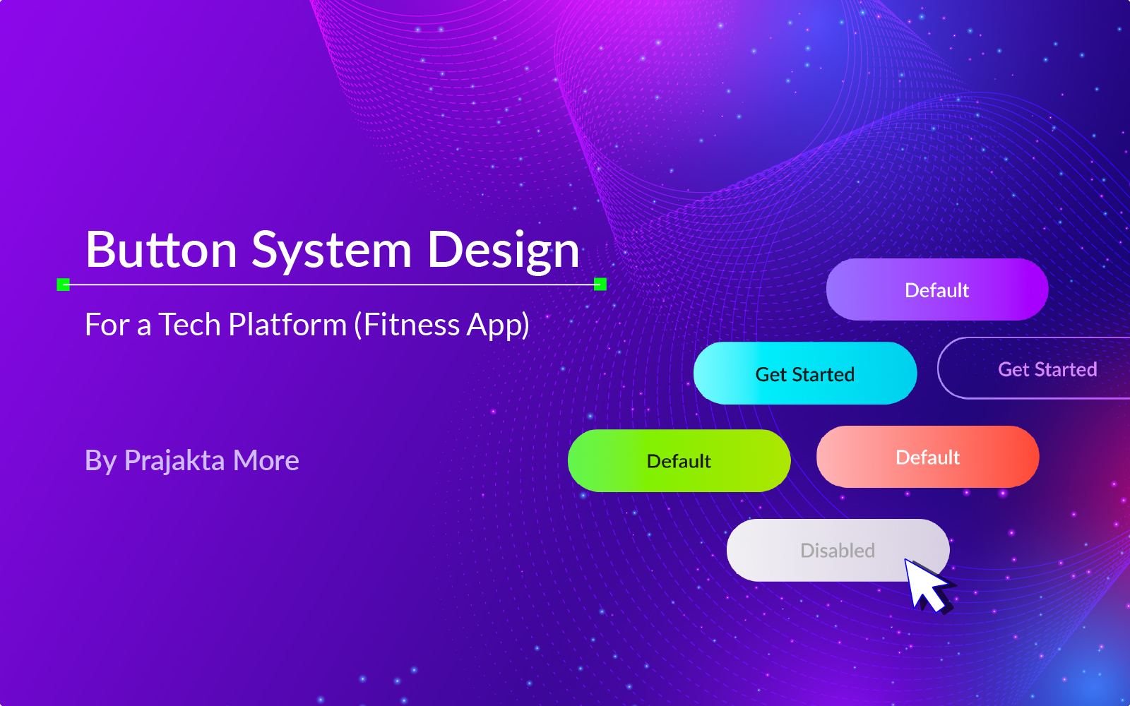
Button System Design for a Fitness Mobile App - FitnessFirst
I began by first deciding the brand color for the Fitness App.
In a gym or during any workout, we generally push our limits and try to reach our milestones. Once we reach there, we set a new milestone and try to achieve that too. This spirit of overcoming physical challenges and limitations and setting farther, more difficult goals is best depicted by Purple color. The color is vibrant, energetic and still makes you feel calm and positive.
I have used a gradient instead of a solid color. There is a reason behind this. It represents a person's transition from a certain fitness level to the next fitness level.
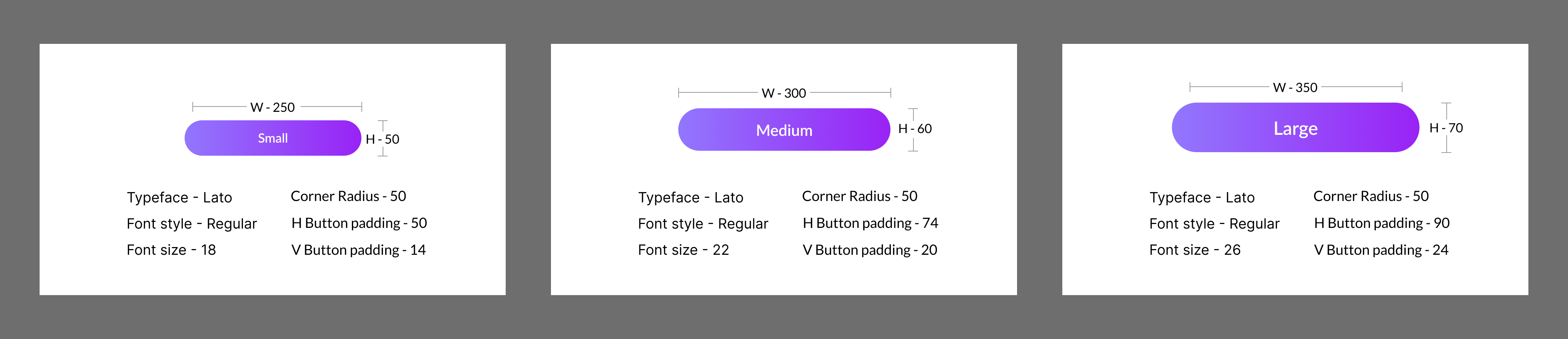
I have chosen Lato as the typeface for its clean and professional look. This typeface is legible and easily available for free.
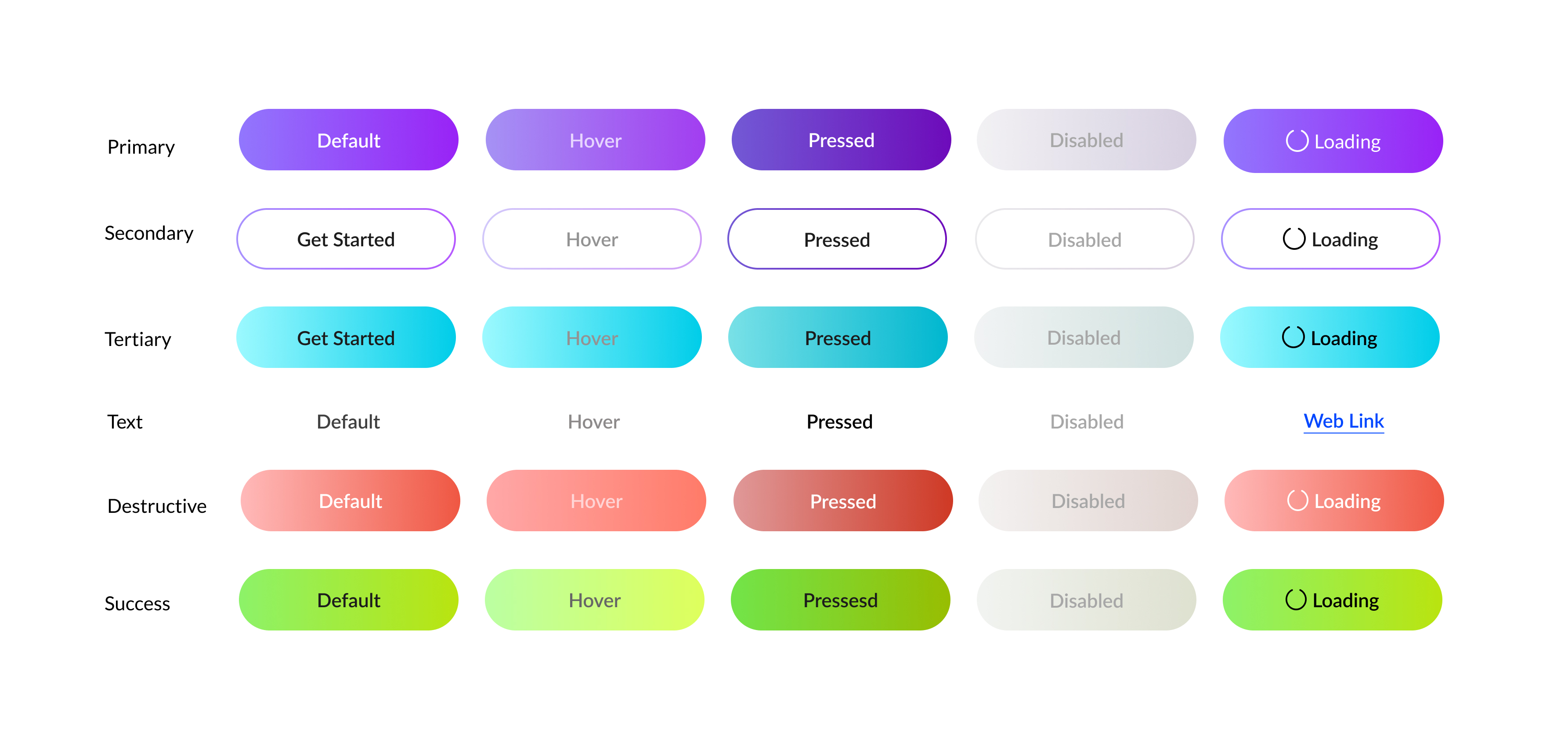
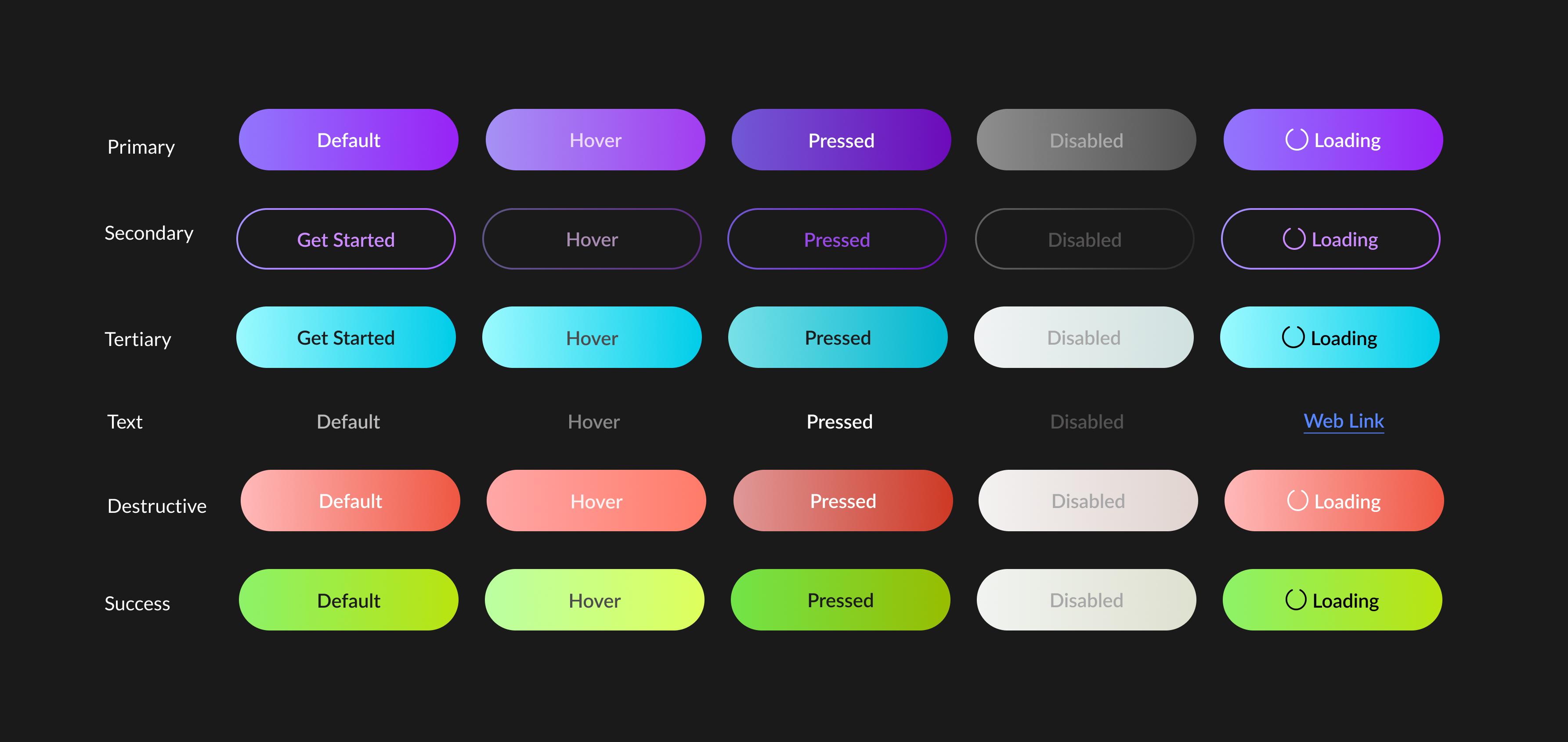
Types of buttons
I created 3 main types of buttons. Primary, Secondary, and Tertiary.
Primary buttons will be used for the most important actions and for the normal navigation through the application.
Secondary Buttons will be used whenever there is less priority task/action or when there is a choice between 2 actions. These buttons do not need to have more attention, so I have just used outlines.
Tertiary buttons will be used for some rare actions. Their appearance on the screen should be noticeable as well as pleasant.Therefore I have used a bright color for it, Cyan.
Apart from these, there are buttons in the form of text links, buttons for destructive and successful actions too.
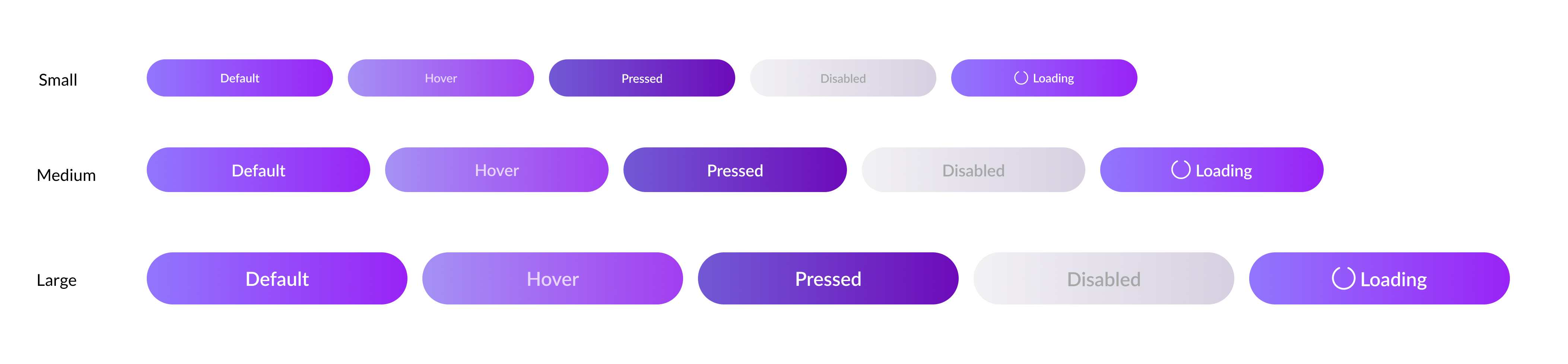
Button states and sizes
These buttons are designed in small, medium and large sizes. The states designed are as follows: Default, Hover, Pressed, Disabled and Loading.
I have created buttons for dark as well as light mode UI.
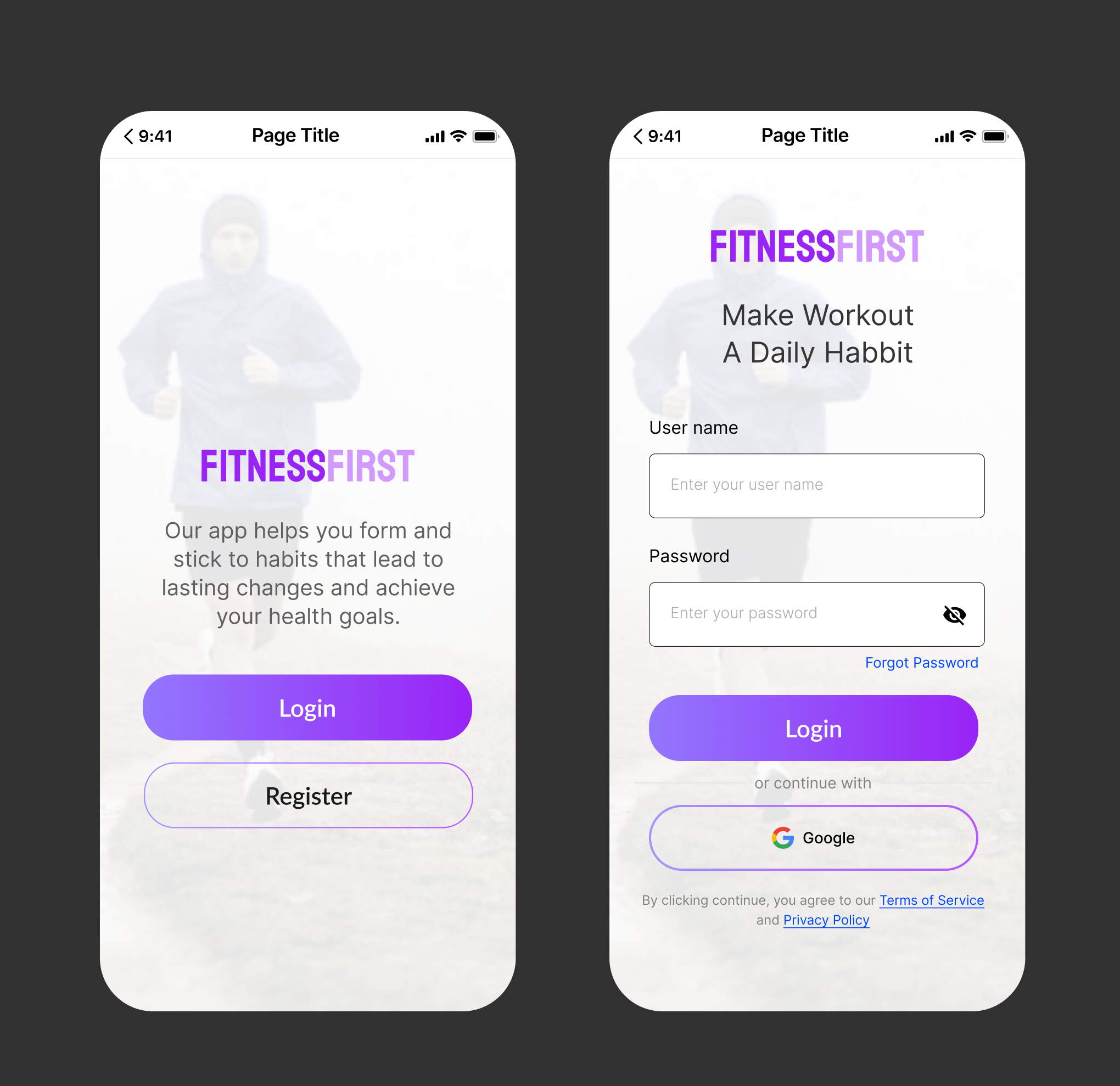
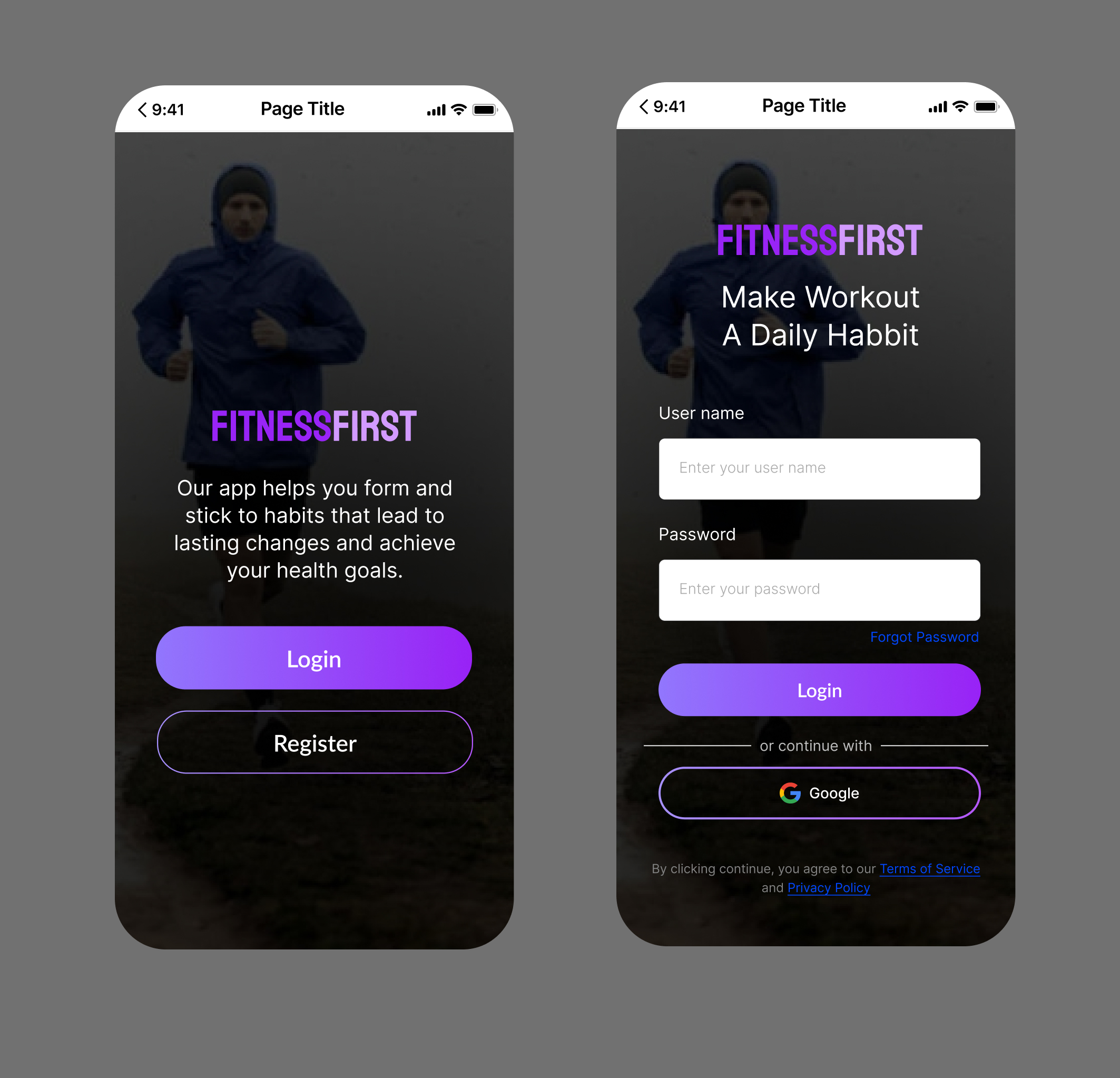
Use Cases
I created 2 screens in dark and light mode each to show how the buttons look when used in the actual app screens.
Final Word
This button system is designed to create such an impact on the user, that it makes them feel confident and energetic and to help them navigate through the app with joy and ease.

Reviews
1 review
The button systems look good overall. Here are a few suggestions for improvement:
1. Font Weight: Consider using a medium or bold font to make the buttons more readable.
2. Spacing: Reduce the spacing between the label and the icon.
3. Vertical Alignment: With the current font selection, adjust by 1-2px for visually correct vertical alignment.
4. Presentation: Update the cover image to better present your work, which will help gather more reviews and feedback from the community.
You might also like
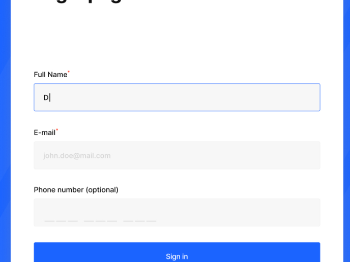
Loginino

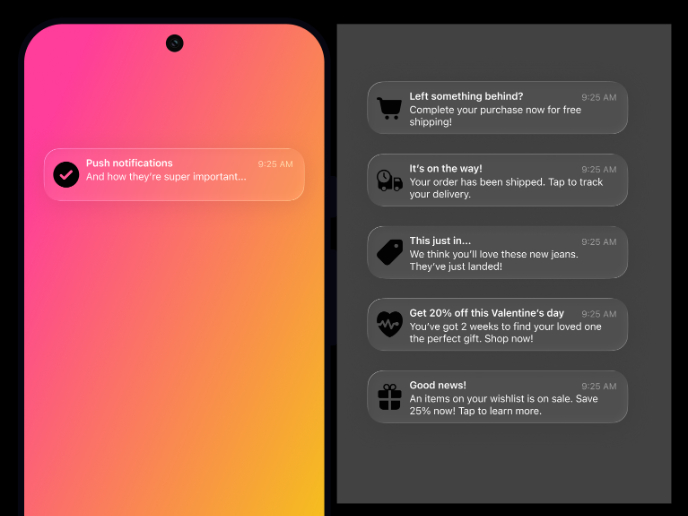
Notification microcopy - Project

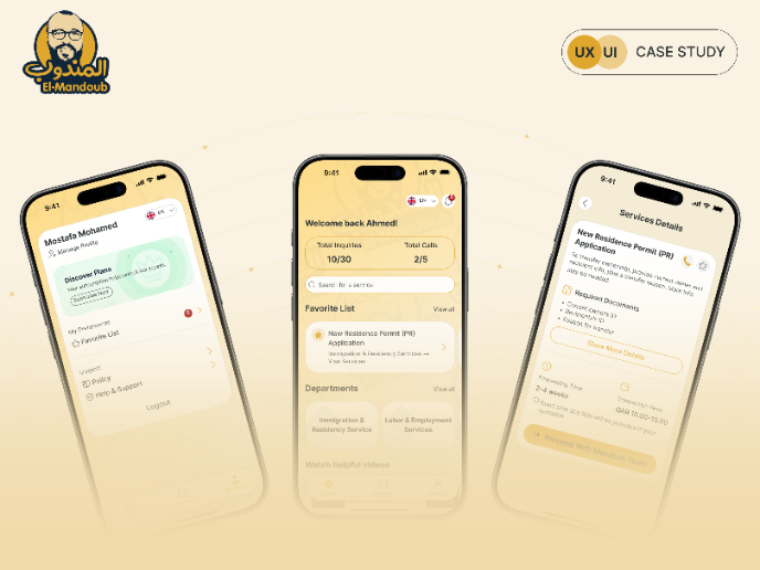
El Mandoub-GovTech App

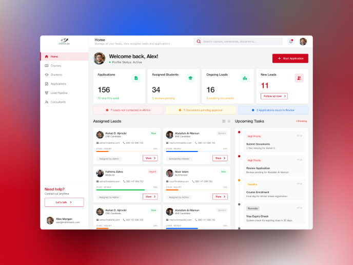
MalishaEdu Counselor Workspace

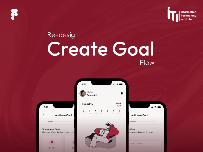
Goal Creation Flow
Portfolio website

Visual Design Courses

UX Design Foundations


Introduction to Figma

Design Terminology
