Fitness App Settings

Clean Layout: The page has a clean layout with plenty of white space, reducing cognitive overload by avoiding overwhelming users with too many elements.
Categorized Options: General, Personal Info, Notifications, Privacy & Terms, and Tech Support, helping users find the specific settings they need.
Profile Highlighting: The user's profile picture and name are prominently displayed at the top, making it easy to access personal settings.
Primary Action: The "FitPro" setup card is prominently placed under the profile, guiding users to set up their fitness plan, which is likely a primary action for many users.
Consistent and Clear Iconography: Each setting category is accompanied by a relevant icon, aiding quick identification and intuitive navigation.
Soothing Colors: The light green background with darker green accents creates a calm and inviting interface, aligning well with the fitness app's purpose.
Highlighting Active Elements: The active elements, such as the profile picture and the "FitPro" card, stand out with a slightly different shade or a more vibrant color, drawing users' attention naturally.
Bottom Navigation Bar: The bottom navigation bar with icons for Home, Search, Favorites, Messages, and More ensures users can easily switch between different app parts without confusion.
Clear Labels: Each setting option is labeled with clear, concise text, avoiding ambiguity about what each option does.
Tools used
From brief

Topics
Share
Reviews
3 reviews

Hi Antonija, well done here! I think you’ve done really well in meeting your goals here. The color works really well and your design overall is well balanced and harmonious. Here are just a few points you could push it even better:
• Keep your microcopy user-centric. For example, you have “Change your photo.” You’re the designer talking to the user there. That’s going to be a cognitive step for the user. Better would be “Change my photo.” Read it from the user’s perspective.
• Watch your spacing. Overall, it’s quite good, but I see that the “settings” heading looks just about equidistant between the card and the settings action list. Better would be to establish a bit more hierarchy by moving it a bit closer to the settings it’s associated with. Better proximity will help with ease the cognitive connection here.
• Your icons are definitely clear and styled harmoniously, but my impression is that you could be a bit more consistent with the sizing. The bell in particular looks extra wide for its shape to optically balance with the others.
Great work on the settings page. It's clear, informative, and effectively supports the brand while including a CTA to encourage users to subscribe to a plan.
From a visual standpoint, I recommend elevating the settings section from the main screen to make it stand out and add some hierarchy to the page. Overall, well done!

Hey, Antonija! I really like how simple and consistent the screen is - just what a settings page should be. The colors provide great contrast, and the text hierarchy is nicely done.
Here are a few suggestions:
- The FitPro card doesn’t appear clickable - adding an arrow could indicate that it’s navigable.
- The spacing between the icons and their labels (e.g. general) feels a bit too wide - narrowing it slightly could enhance the layout.
- The arrow on the settings options looks optically misaligned with the text. Consider resizing the icons and text or adjusting the spacing.
I also agree with Boyd's feedback! Keep up the great work 💪
You might also like
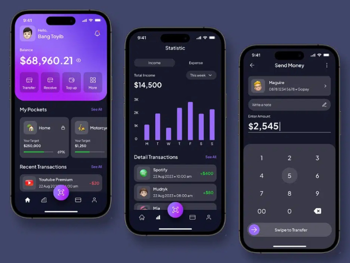
eWallet App Development Project

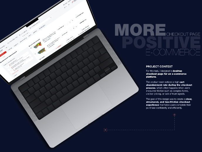
🖥 Desktop Checkout Flow Design

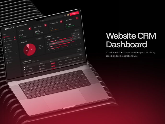
Website CRM Dashboard

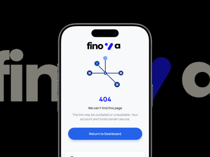
Helpful 404 Error Page for a Fintech Mobile App

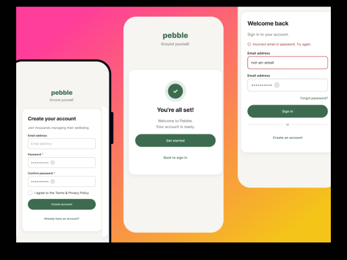
Pebble Accessible SAAS Signup Flow

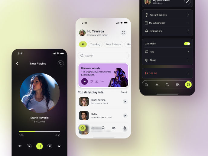
Music Player UI - Light & Dark Mode

Content Strategy Courses

UX Writing


Common UX/UI Design Patterns & Flows


Building Content Design Systems
