Fintech - Accessible login & sign up

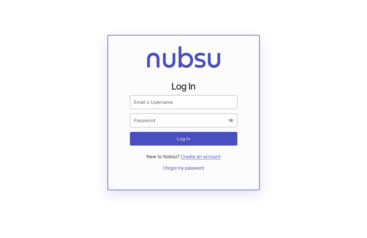
This task was developed in Figma, understanding that the potential user will login or create an account in a fintech(SAAS) that performs payroll payments. So I created an accessible login & sign up focused on web use(Browser). contemplating the following:
- Good contrast and color implementation.
- Care, font size and weight typography to ensure accessibility and readability.
- Input fields and buttons with a size of 48px to ensure readability and greater degree of action.
- button states (Pressed, Filled, Error state)
- Readable, understandable and coherent icons.
- Help information on errors.
- Use multiple cues for error states.
Without leaving aside the implementation of the Plugin a11y use to verify compliance with the AAA requirements to have a work really accessible to all.

Reviews
1 review

You’ve put a lot of thought into the design: it’s easy to navigate; everything you need (e.g., the sign-up and password restoration flows) is at hand. Clear hints guide users effortlessly; defined boundaries make the fields accessible to users with cognitive disabilities and low vision.
To make forms more accessible, consider:
- Opting for a single-column layout (the “First name” and “Last name” fields)
- Placing labels outside input fields
- Using autocomplete (for email)
A few tips from a UX Writer’s perspective:
- Screen 11, error state for the “Password” field: “Min 8 characters…” highlighted in red looks more like one/some of the requirements were overlooked rather than the field was left empty
- Address typos and maintain consistency (e.g., choose either “email” or “email address” and stick to it) to improve the overall impression of your work
You’re on the right track!
You might also like

Smartwatch Design for Messenger App


Bridge: UI/UX Rebrand of a Blockchain SCM Product


Pulse Music App - Light/Dark Mode


Monetization Strategy


Designing A Better Co-Working Experience Through CJM


Design a Settings Page for Mobile
Visual Design Courses

UX Design Foundations


Introduction to Figma

Design Terminology
