fabrik - Landing Page

Based on your landing page wireframe for Fabrik, here's a detailed explanation of the decision-making process and rationale behind the design:
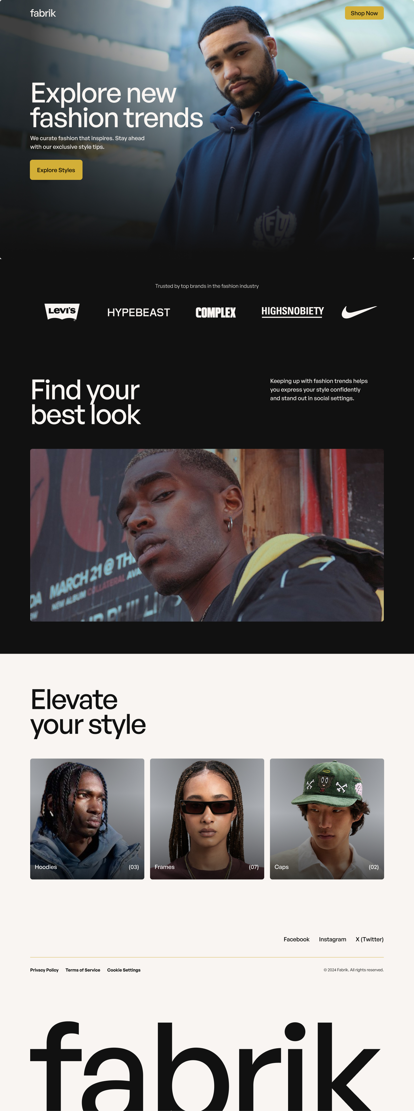
1. Hero Section
Decision:
- The hero section prominently showcases the Fabrik brand name, a stylish image, and a clear value proposition: "Explore new fashion trends."
- Buttons such as "Explore Styles" and "Shop Now" guide users toward the next steps.
Rationale:
- The hero section grabs attention immediately and sets the tone for the entire page.
- The high-quality visual of a model in modern, trendy attire creates an aspirational appeal.
- The headline reinforces Fabrik’s mission to keep users ahead of fashion trends, while the CTA encourages exploration.
2. Trust Indicators (Brand Logos)
Decision:
- Logos of trusted fashion-related brands (e.g., Levi's, Hypebeast, Complex, Highsnobiety, Nike) are displayed under the hero section.
Rationale:
- Including well-known brands builds credibility and positions Fabrik as an authoritative and connected player in the fashion industry.
- These trust signals reassure users about the quality and relevance of Fabrik’s offerings.
3. Secondary Section: "Find Your Best Look"
Decision:
- A subheadline encourages users to discover their style with a supporting image of a model.
- The short text emphasizes the benefit: "Keeping up with fashion trends helps you express your style confidently and stand out in social settings."
Rationale:
- This section bridges the gap between inspiration and action, showing users why Fabrik is valuable to them.
- Featuring a diverse, stylish model adds inclusivity and relatability, appealing to a broader audience.
4. "Elevate Your Style" Section
Decision:
- Showcases product categories like Hoodies, Frames, and Caps with clean, clickable cards and accompanying numbers indicating the available items.
Rationale:
- A minimalist grid layout highlights Fabrik’s curated collections, making it easy for users to navigate the product range.
- Categorization helps users quickly find specific styles or items they’re interested in.
- Numbers on each card suggest abundance while remaining curated, reinforcing exclusivity.
5. Footer
Decision:
- A clean footer with links to Fabrik’s Privacy Policy, Terms of Service, and Cookie Settings.
- Social media links for platforms like Facebook, Instagram, and X (Twitter) encourage further engagement.
Rationale:
- The footer provides essential legal information while keeping the design minimal.
- Social links help build a community around Fabrik, extending its reach and engagement beyond the website.
Visual Design Choices
Color Palette:
- Black and White Base: Maintains a minimalist aesthetic and focuses attention on the imagery and content.
- Accent Yellow: Used for CTAs to grab attention while staying subtle and sophisticated.
Typography:
- Clean, modern sans-serif fonts reflect Fabrik’s brand identity as a contemporary and innovative fashion service.
Imagery:
- High-quality, editorial-style images create a premium feel and reinforce the focus on fashion trends.
Layout:
- Ample white space ensures the design remains uncluttered, guiding the user’s focus toward key elements like headlines, CTAs, and visuals.
How the Design Meets User Needs
- Clarity and Simplicity:
- Minimalist design ensures users can navigate effortlessly and focus on Fabrik’s core offerings.
- Credibility:
- Trusted brand logos and professional visuals reinforce trust and authority.
- Engagement:
- Highlighted CTAs and social links encourage users to take immediate action and interact with the brand.
- Relatability:
- Showcasing diverse models ensures inclusivity, appealing to a broader demographic.
Tools used
From brief

Topics
Share
Reviews
1 review

Hey Marcus, I have requested for the access. Please allow for feedback.
Thanks
12 Claps
Average 3.0 by 4 people
You might also like

Project
edX Sign-Up Page Redesign

OverviewThis project focused on improving the accessibility and user experience of the edX sign-up page. The original design had usability a

Project
Beautify Login page WCAG principles

This accessible signup form design follows WCAG principles by ensuring the interface is perceivable, operable, understandable, and robust fo

Project
Design Prioritization Workshop

A structured session to evaluate product ideas, prioritize high-impact features, and define a clear implementation plan.

Project
Sanyahawa - Personal Portifolio_login page

Used Figma in this design as my core tool. Iconify brilliant place to get icons and vector for the designs and a little twich to my image l
Editors’ Choice
Project
Uxcel Halloween Icon Pack

🎃 Introducing the Uxcel Halloween Icon Pack! 🎃 This custom Halloween-themed icon set was created to enhance the seasonal user experience o
Project
eWallet App Development Project

✨ Experience the future of digital payments with our innovative eWallet App design! Our concept combines powerful fintech capabilities with
Content Strategy Courses

Course
UX Writing

Learn to write microcopy that communicates clearly and concisely to improve user experience, build trust, and boost conversions across digital products.

Course
Common UX/UI Design Patterns & Flows

Learn how to use tried and tested UX/UI design patterns and flows to solve recurring design problems faster and build interfaces that feel intuitive

Course
Building Content Design Systems

Master systematic approaches to creating consistent, reusable content across your entire product ecosystem