Ethical and Inclusive Design (page)

This design aims to create an ethical, inclusive, and accessible shopping experience that aligns with the brand’s sustainability values. Each feature was intentionally chosen to support user needs, reduce friction, and ensure transparency at every stage of the customer journey. Together, these decisions reinforce a user-centered approach that respects diverse abilities, promotes responsible consumption, and builds long-term trust with the brand.
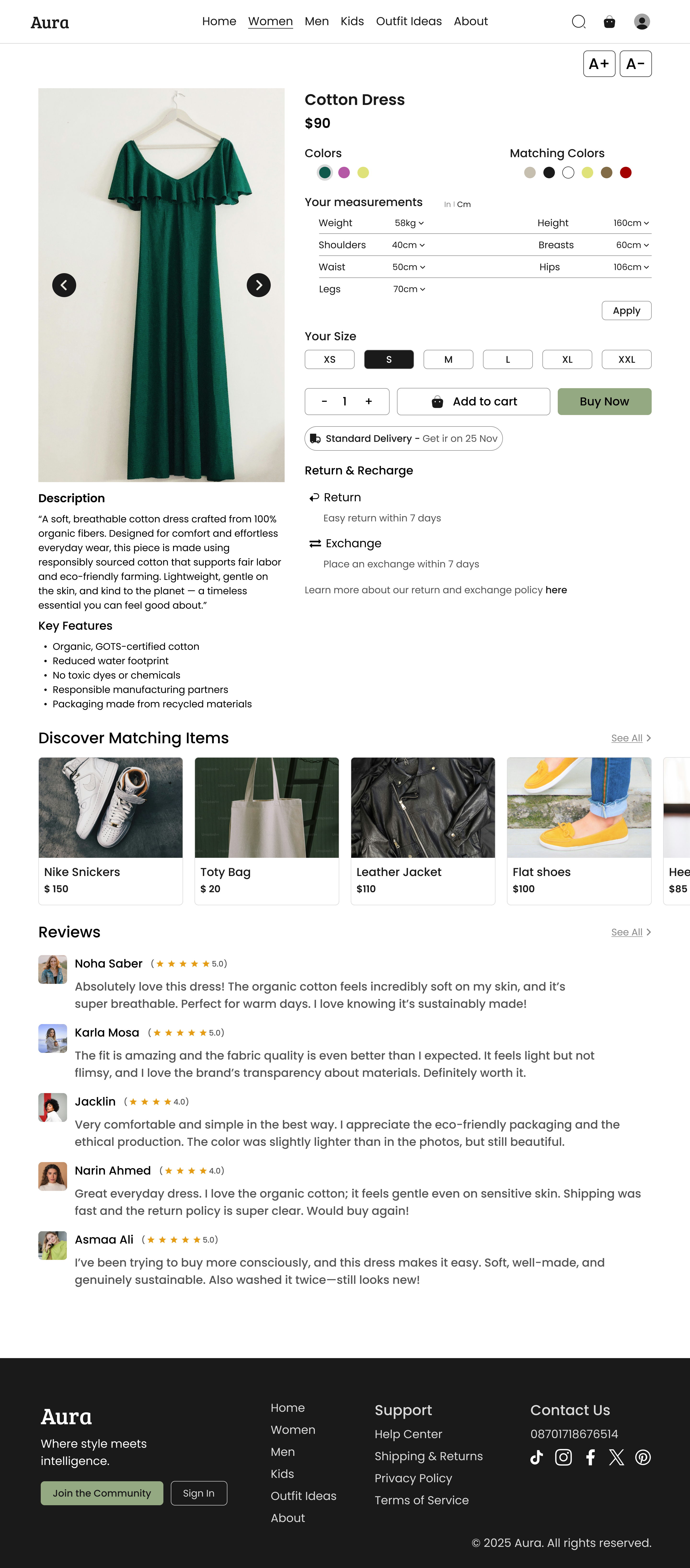
1) Adjustable Text Size for Easier Reading
Rationale:
Providing a text-size adjustment option improves readability for users with low vision, dyslexia, or screen fatigue. It supports accessibility standards (WCAG) and ensures the content remains usable across different visual abilities, making the shopping experience more inclusive.
2) Environmentally Friendly Materials (Eco-Conscious Cotton)
Rationale:
Highlighting eco-friendly materials demonstrates the brand’s commitment to sustainability and responsible production. It helps users make informed, value-aligned decisions and builds trust with environmentally conscious shoppers.
3) High-Quality, Sustainable Packaging
Rationale:
Communicating the use of recyclable or low-impact packaging reinforces the brand’s sustainability values and encourages responsible purchasing decisions.
4) Ethical Messaging & Clear Language
Rationale:
Using simple, accessible language helps all users , including non-native speakers or users with cognitive differences , understand product information easily. It supports fair communication and removes unnecessary complexity.
5) Clear & Fair Return/Exchange Policy
Rationale:
A simple, friendly, and transparent return policy reduces user anxiety and supports ethical UX by avoiding hidden terms. It creates a frictionless experience and shows respect for customer rights, improving user satisfaction and trust.
6) Smart Size Recommendation (Enter Your Measurements)
Rationale:
A measurement-based size tool reduces guesswork and minimizes return rates — especially for users with non-standard body shapes. It promotes inclusivity by supporting all body types and improves decision-making with personalized guidance.
Thanks for watching , and I am ready for feedback 🩵
Tools used
From brief

Topics
Share
Reviews
4 reviews

I appreciate the direction you took with ethical and inclusive design. It shows intention and awareness, and the matching colors feature is a thoughtful touch. I have not seen it implemented quite like this before, so it adds a nice layer of originality.
I would encourage you to take another look at the area with the size pills and the buttons for adding to cart and buying. That section feels a bit crowded. Since the buttons look very similar, users might need an extra moment to understand which action to take. Strengthening the visual difference and hierarchy there would help guide them more confidently.
For the reviews, it would be good to pay attention to line length. Keeping text between 45 and 75 characters per line improves readability and helps the layout feel more comfortable.

This is a really interesting project. I love that not only did you design an ecommerce page, but you also considered the company's service design with eco friendly and sustainable products and packaging. Great work considering text sizes for visually impaired users and you have clean UI / your contrast seems to be good for all fonts.
Only things I'd suggest is maybe showing a bit of the journey, some of the research or sketches / iterations while working on it. The dress is also slightly off center in the picture and that's the only thing I see that makes it look a bit less polished.
Great work!

I like your approach and the way you present your screen. Walking through your rationale makes it easy to understand your decisions and your intended outcomes.
UX improvements
- Consider the habituation principle. Users rely on familiar patterns, especially for product info. Instead of “description” and “key features,” use more standard e-commerce labels like “composition and care,” “details,” or “product description.”
- The measurement flow is a good idea, but it feels long. Many brands offer size comparisons between retailers (for example: “This M at Zara fits like an S here”). You could also capture body details before purchase so the app can recommend the correct size later.
- I’m not seeing the value of the “matching colors” feature. If it’s meant for cross-selling, then push it further and offer complete outfit suggestions. That would create real utility.
UI improvements
- Increase whitespace and margins. The layout feels tight and could breathe more.
- Strengthen text hierarchy. The current styles sit too close together in weight and size.
- The “Buy Now” CTA contrast looks low. Make it more visually decisive.
- The standard delivery pattern is too small and easy to miss.
- The product image is very tall and narrow. Show how the layout behaves with more square images, like a T-shirt or mini skirt, not only dresses.
- The scalable text idea is great, but I’d like to see how the layout holds up when the text size increases.
Overall, solid start. I’m looking forward to seeing how you refine this further.

Well Thoughtull work nada - but as a mentor let me help you find some errors you can imrpove
- visually appealing, but there are too much text, which makes me read, which is a bad idea for a normal fast pace customer
- See some examples, you will see many of the text, like the size chart needs to be hidden for a reason because it makes the things more cluttered
- Don't use a scrollbar pointer as image. Use a four image grade, which shows a lot of images in one place.
- Add some verified icon in the trust review column, and some real photos that shows that it's not just fake reviews for real testimonial
- The contrast of the colours of X specifically are not matching, so do the menu bar is not well arranged. So a lot of work need to be done there.
👉And there are so much things that I could help you to improve, can't go in this one paragraph – about this, let's arrange a one-on-one mentorship where I can guide you on the next steps for becoming a better Designer and cracking a job. Check my profile and contact me.😇
You might also like

Smartwatch Design for Messenger App


Bridge: UI/UX Rebrand of a Blockchain SCM Product


Pulse Music App - Light/Dark Mode


Monetization Strategy


Designing A Better Co-Working Experience Through CJM


Design a Settings Page for Mobile
Design Leadership Courses

UX Design Foundations


Introduction to Figma

Introduction to Design Systems
