Ethaneiondesignhub / Checkout Page for E-Commerce Platform

In this project, I've redesigned the checkout flow for our e-commerce platform to minimize cart abandonment and enhance user trust. Our goal is to create an intuitive, friction-free experience that guides users smoothly from cart review to order placement.
Design Decisions
1. Simplified Checkout Flow.
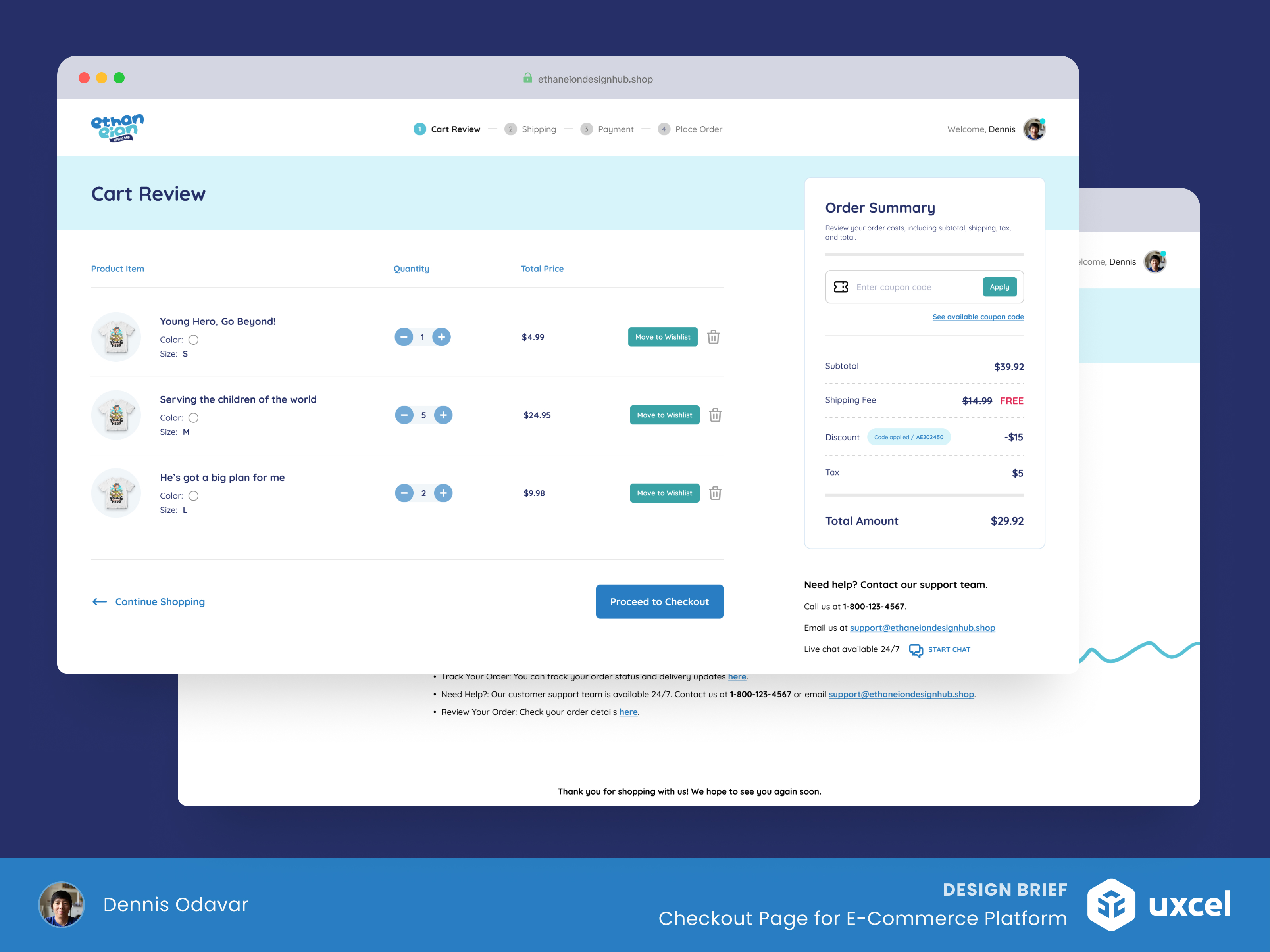
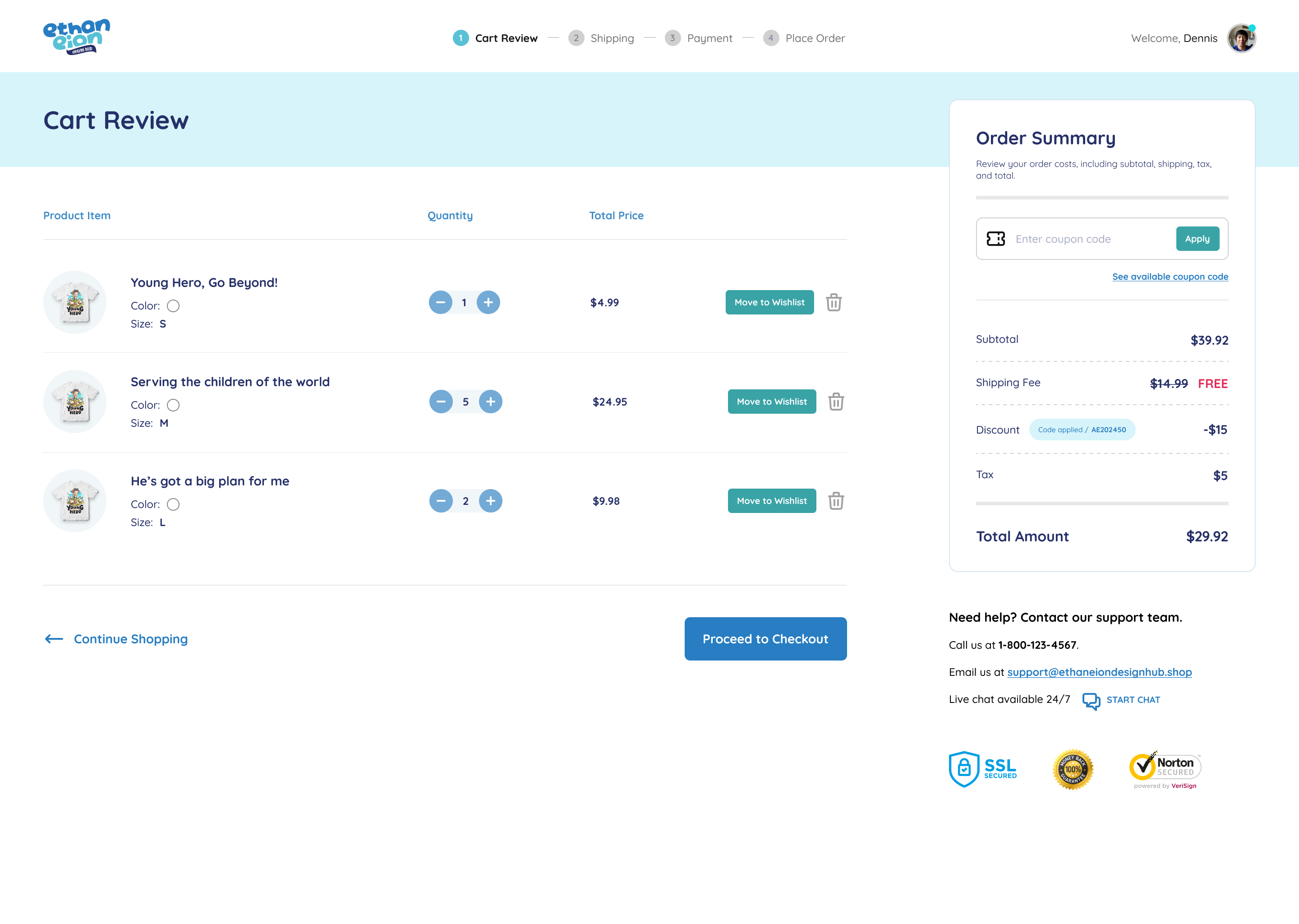
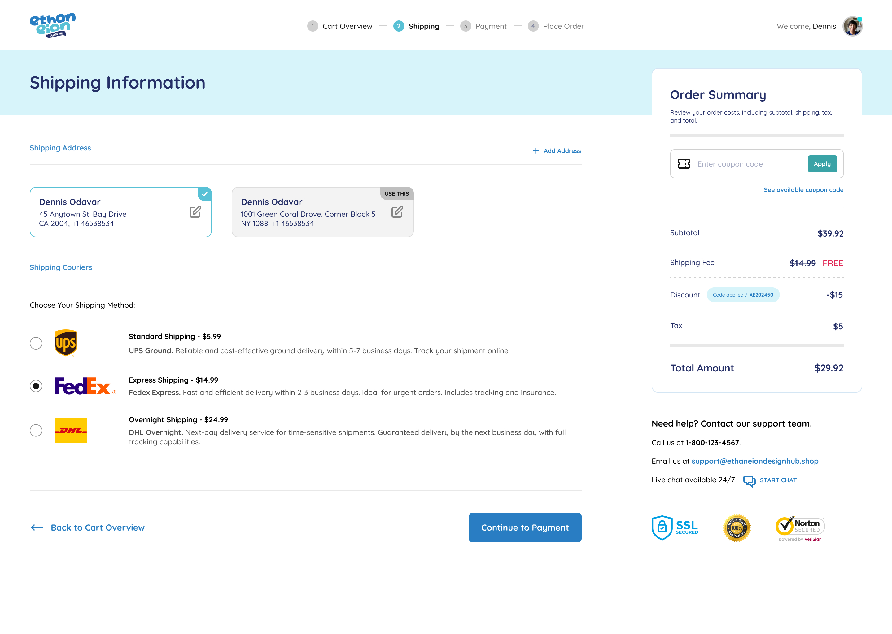
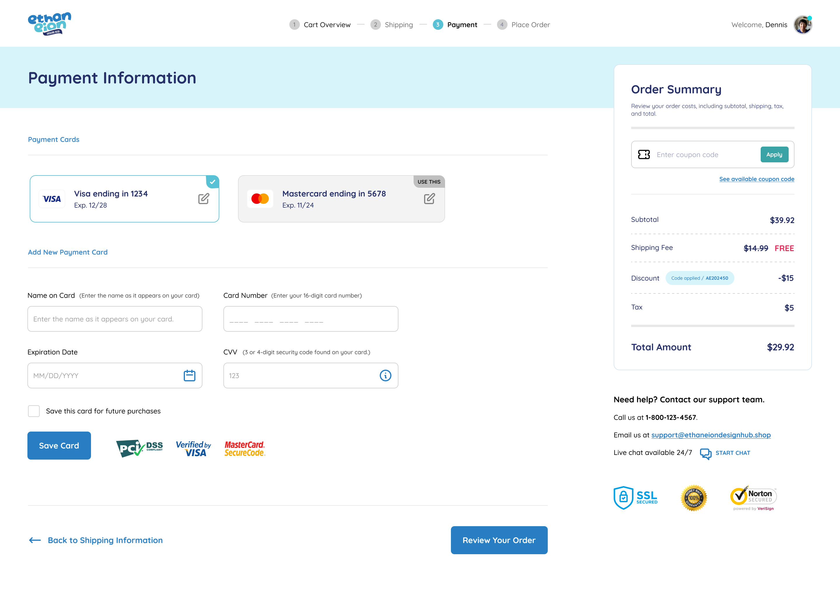
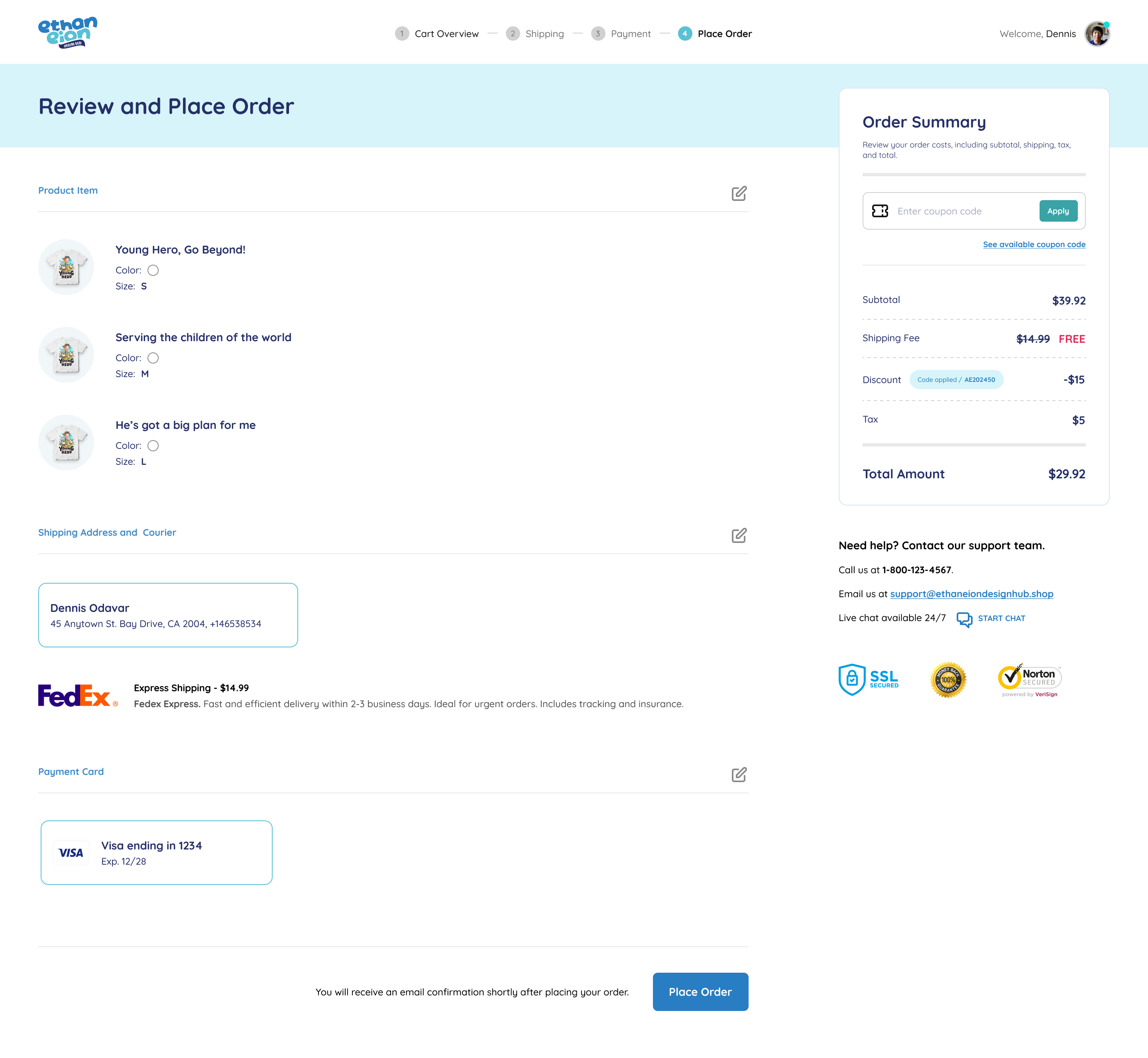
I streamlined the checkout process into four clear steps: Cart Review, Shipping Information, Payment Information, and Order Review. This structure minimizes user confusion and facilitates quicker decision-making.
2. Intuitive Form Design.
Each form field is clearly labeled and logically organized, reducing cognitive load. Auto-fill features and error prevention mechanisms improve usability and enhance user confidence.
3. Trust Elements.
Prominently displayed security badges and reassuring messages about data protection foster trust. This is crucial for encouraging users to complete their purchases.
4. Helpful Microcopy.
Throughout the checkout process, supportive microcopy guides users and provides additional context where needed, ensuring they feel informed and supported at every stage.
5. Clear Call to Actions (CTAs).
Each step includes prominent CTAs that encourage users to proceed confidently. Phrases like "Review Your Order" and "Place Order" provide clarity on the next steps.
By focusing on these design principles, I aim to create a seamless and trustworthy checkout experience that ultimately reduces cart abandonment rates.
Cart Review
Shipping Information
Payment Information
Review and Place Order
Success Order
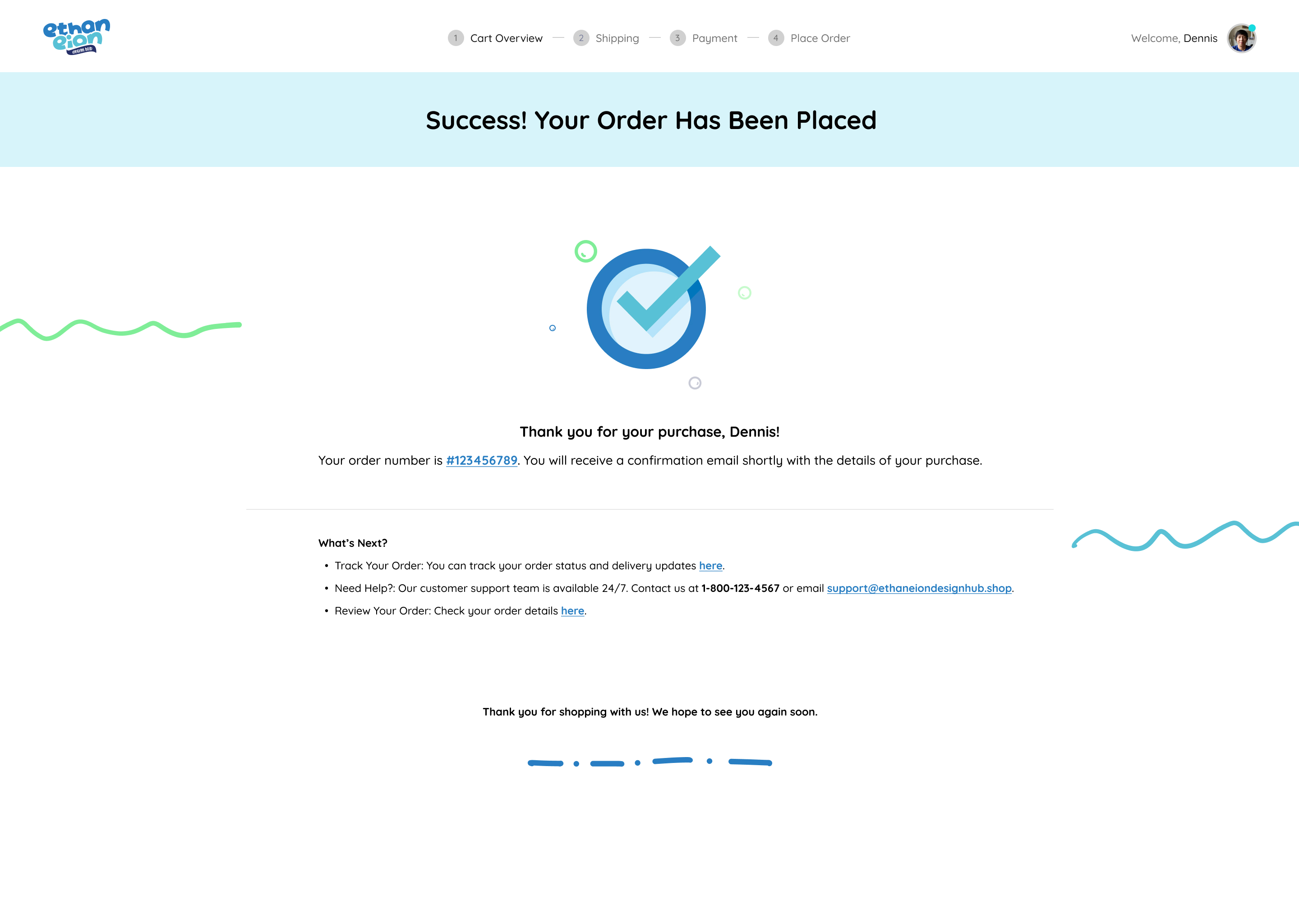
Thank you!

Reviews
0 reviews
You might also like

Improving Dating App Onboarding: A/B Test Design

FORM Checkout Flow - Mobile


A/B Test for Hinge's Onboarding Flow


Accessibility Asse


The Fitness Growth Engine

Uxcel Halloween Icon Pack

Interaction Design Courses

UX Design Foundations


Introduction to Figma

Design Terminology
