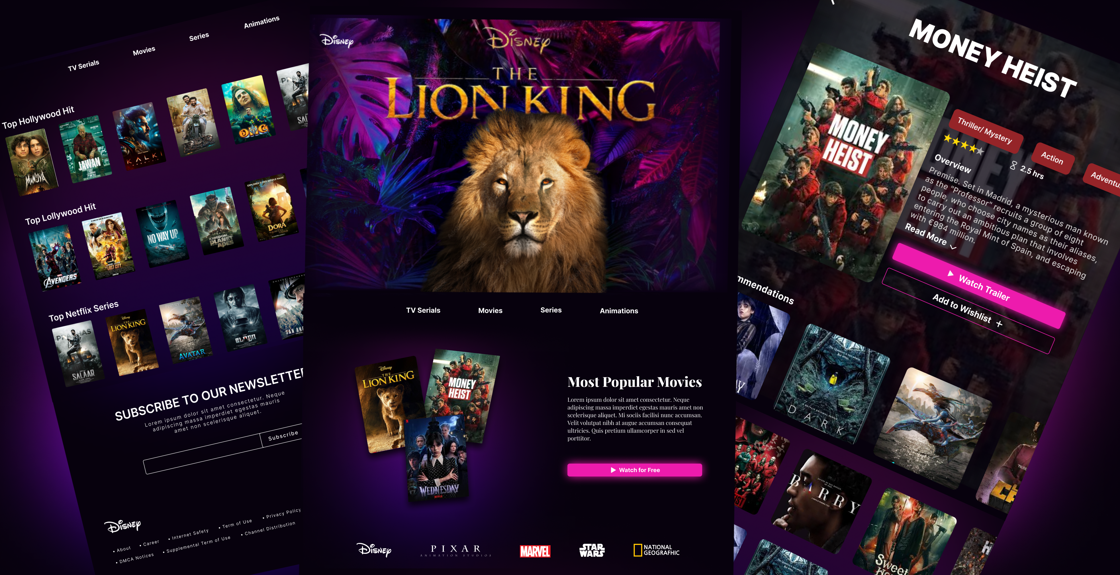
Entertainment Streaming Platform

Here the Figma File: https://www.figma.com/design/1kzJtKFkMmByOymlXfriNC/Entertainment-Streaming-Platform?node-id=102-1998&t=3DUFGj7uvmPXMlhD-1
Key Features
- User Profiles: Allow users to create personal accounts, manage watchlists, and save preferences.
- Content Library: A vast collection of movies, TV shows, documentaries, and cartoons, categorized by genre.
- Search and Filter Options: Users can search for content by title, genre, release date, or popularity.
- Recommendation System: Personalized content suggestions based on user preferences and viewing history.
- Watchlist: Users can save titles for later viewing.
- Ratings and Reviews: Users can rate content and leave reviews for others to see.
- Offline Viewing: Allow users to download content for offline viewing.
User Interface (UI) Design
- Homepage: Eye-catching layout featuring trending content, personalized recommendations, and a clean navigation menu.
- Content Pages: Detailed pages for each title, including trailers, descriptions, cast information, and user ratings.
- Player Interface: A user-friendly video player with controls for play, pause, skip, and volume adjustment.
Tools used
Share
Reviews
5 reviews

Aroob, thank you for your submission!
This looks extremely good! There are a few things you could do better, for instance, switch the tags of the movie to a tertiary and make them consistent ( not switch colors to adapt the movie pattern)
If you can provide a figma file, i can show you more with some comments.
Great vibes!

Greate work!

This is a visually rich and premium cover for an Entertainment Streaming Platform redesign! You've successfully captured the feeling of high-quality content and brand depth.

Cristian Georgescu, Thank you so much for taking the time to review my work! I'm thrilled to hear that you found the design to be extremely good. I appreciate the constructive feedback regarding the movie tags—I’ll definitely work on making them more consistent by switching to a tertiary color.
Here the figma file: https://www.figma.com/design/1kzJtKFkMmByOymlXfriNC/Entertainment-Streaming-Platform?node-id=102-1998&t=3DUFGj7uvmPXMlhD-1
I’m looking forward to your comments. Your insights are invaluable, and I'm eager to refine the design based on your suggestions.
Thanks again for the great vibes and support!

Hi Aroob,
I wanted to provide some feedback on your recent Uxcel design. I appreciate you sharing your Figma file and the effort you've put into the visuals.
Here are a few areas where I think the design could be improved:
- Spacing: Consistent spacing is crucial for a visually appealing and user-friendly interface. Consider using a base unit like 8px and scaling up to multiples like 16px, 24px, etc.
- Navbar: The navbar might be a bit too large. Reducing its size or simplifying its elements could enhance the overall layout.
- Movie Categories: Users should be able to view all movies within a specific category without having to scroll or navigate further.
- Typography: Research how developers use typography in different contexts. Pay attention to font choices, sizes, weights, and line heights to create a cohesive and readable experience.
- Color Palette: Expanding your color palette with tints and shades can add depth and visual interest to your design. Consider using a color tool to generate a harmonious palette.
I believe that with a little more research and experimentation, you can create an even more impressive and user-centered design. Keep exploring, learning, and seeking inspiration from other designers.
You might also like
Blip - Esport app design (Light & Dark UI)


Reimagining Asana's Color System


Customer Journey Map for a Co-Working Space

Responsive Main Screen


Latios - Free Portfolio Template for UX/UI Designers

Workspace Booking Flow - UI/UX Design

Popular Courses

UX Design Foundations


Introduction to Figma

Design Terminology
