Empty State Design for educational platform Alison

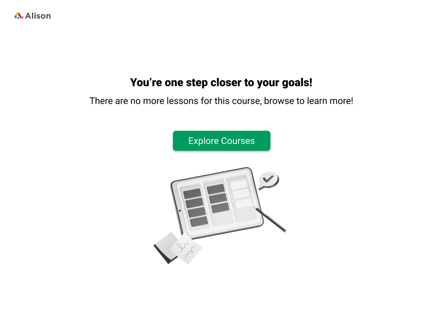
An empty state is the screen users see if there is no content to display. This particular screen is what a user sees when they try to continue learning lessons on their desired course but they've finished all of the lessons for the course, so to learn further, they should explore more courses.

Reviews
2 reviews

Hi Joyce 👋 I like the cheerful vibe and neat typography — it feels very celebratory. That said, this screen reads more like a success state than an empty state. You might want to adjust the copy/CTA to guide users toward their “next step,” like exploring or enrolling in new courses. With a small tweak, it can really align with the brief. Great effort!

I believe some kind of misunderstanding might have occurred—the brief asks for an empty state message, while this one looks more like a success screen. It can make a nice success screen, but the button should work better with the title (they should be self-sufficient without body text). I'd suggest something like [Download Certificate] at least.
An empty state message in this case could be something like "You haven't completed any tasks yet" or "You haven't taken any courses," plus some kind of motivational button like "Explore Courses."
I like the design, though—the fonts are neat, the tone of voice is enthusiastic, and the imagery is appropriate, with those festive guys and confetti.
I'd recommend taking another shot at this task. I'm sure you'll nail it!
You might also like

Smartwatch Design for Messenger App


Bridge: UI/UX Rebrand of a Blockchain SCM Product


Pulse Music App - Light/Dark Mode

Uxcel Halloween Icon Pack


Monetization Strategy


Designing A Better Co-Working Experience Through CJM

Content Strategy Courses

UX Writing


Common UX/UI Design Patterns & Flows


Building Content Design Systems
