EduZap - Empty States UI Design


I am excited to share my first attempt at a Uxcel design brief -Empty State Design for Education App.
GOAL
Designing empty states for EduZap, a playful and inspiring web and mobile educational platform. The goal is to create engaging and informative empty states for the 'Courses' and 'Bookmarks' sections that align with the overall tone of the app.
FEEDBACK ON THE INITIAL DESIGN
Opt for user-friendly and legible typefaces.
Re-evaluate the use of an ambiguous border in design.
Make the copy fun and engaging along with an impactful CTA.
Use subtle visual cues to indicate selected menu items without overwhelming the design.
DESIGN SCREENS
(Initial designs followed by Revised versions)
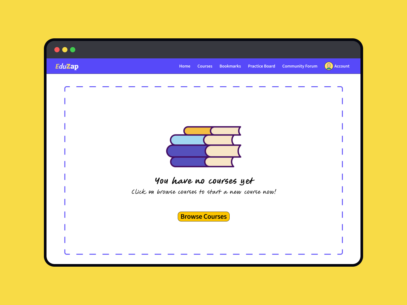
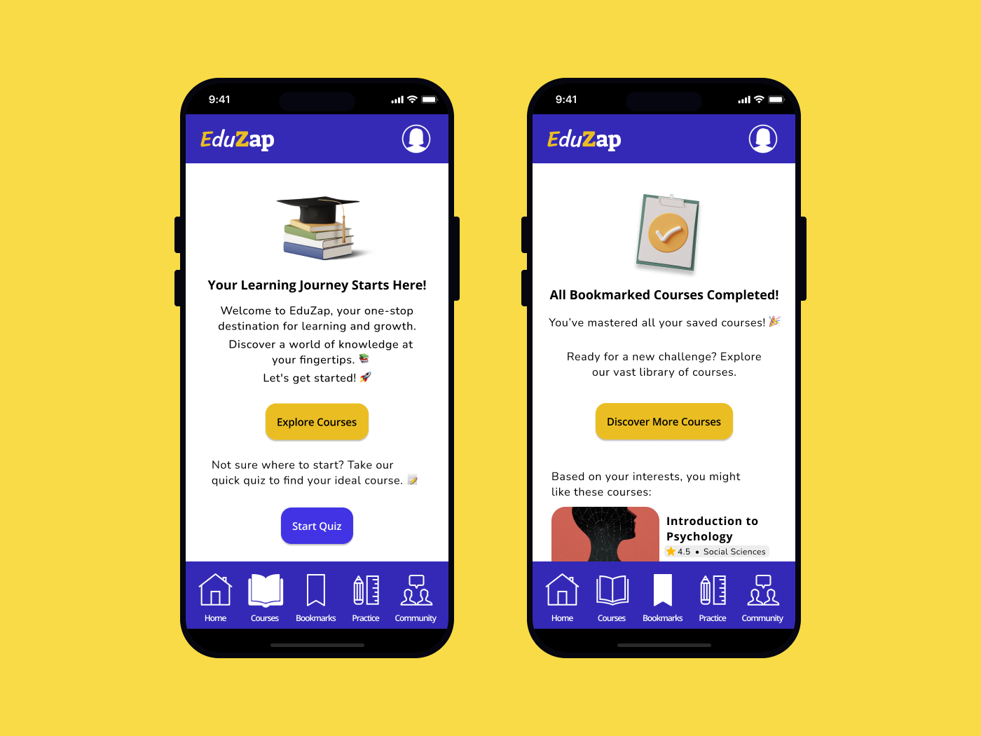
Screen 1: No Courses
This screen is the initial point of interaction for new users or returning users without active courses. The design aims to welcome users, introduce the app's offerings, and motivate them to start exploring courses.
Revised Screen 1:
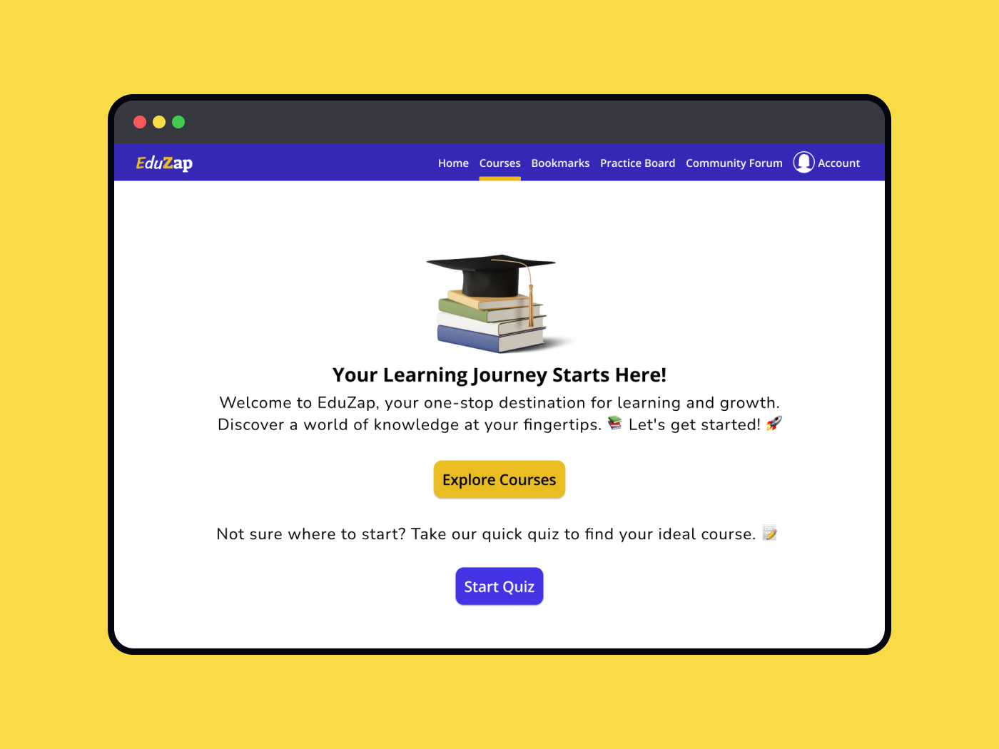
Open Sans and Nunito typefaces have been used in the revised designs to provide a clean and legible look to the platform.
The UX copy has been revised to be more informative and composed to reflect the playful and inspiring nature of the brand voice.
Additionally, a secondary CTA button has been introduced to provide a more engaging and personalised user experience.
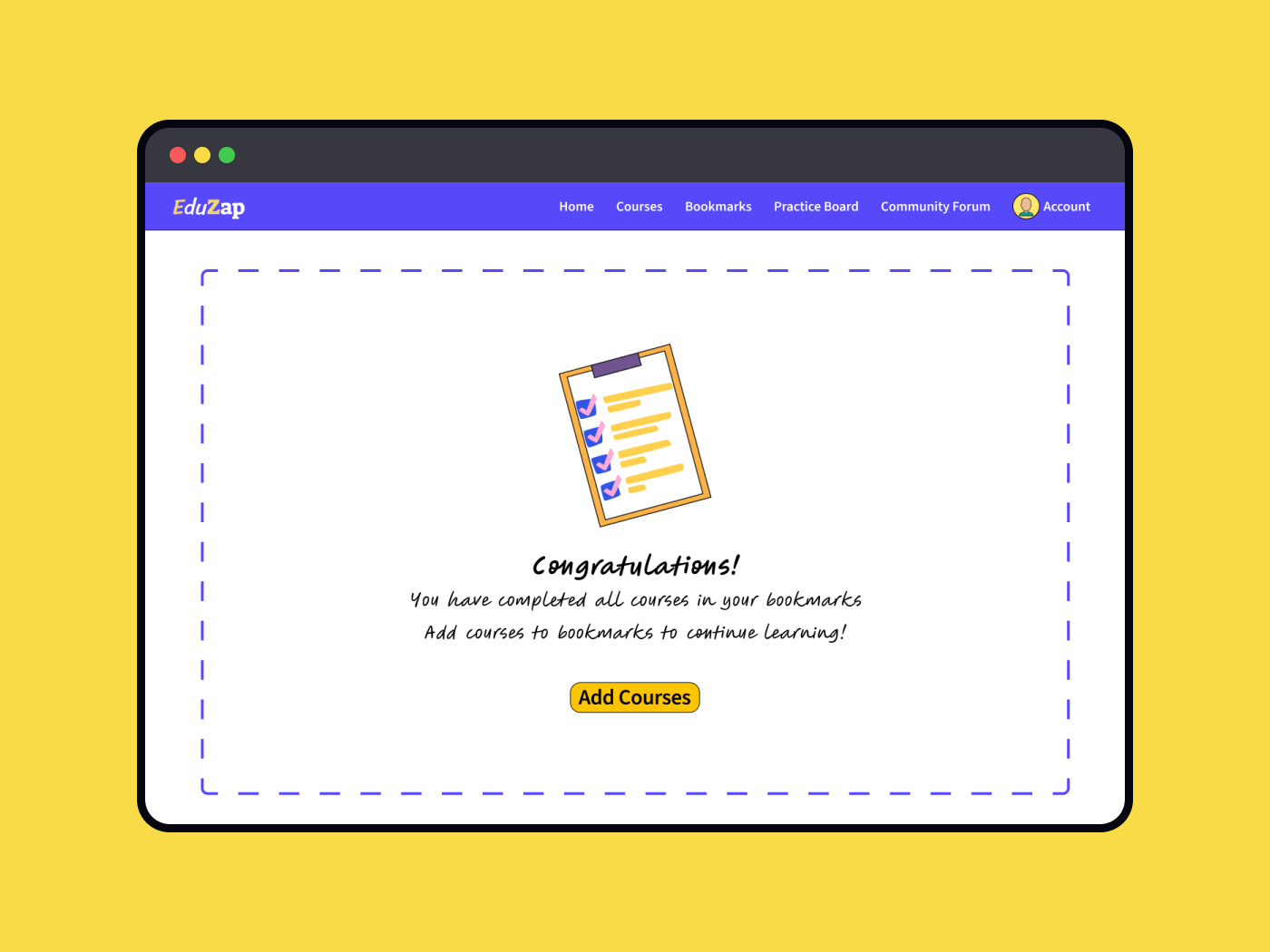
Screen 2: No Bookmarks
This empty state for the 'Bookmarks' section appears when the users complete all the courses saved by them. The UX copy is written to encourage users to explore and bookmark more courses for future learning along with a clear call-to-action button.
Revised Screen 2:
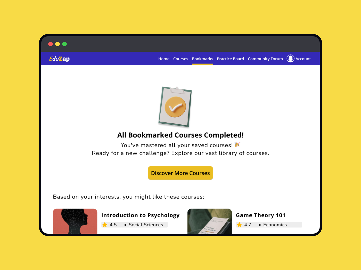
The UX copy now reflects a sense of accomplishment, celebrating the user's progress.
A CTA has been added to encourage users to explore the course catalogue, with personalised course suggestions based on their history.
Screens 3 & 4: These screens are the mobile adaptations of Screen 1 & 2 respectively, optimised for smaller screen sizes and touch interactions while maintaining the tone and the messaging of the app.
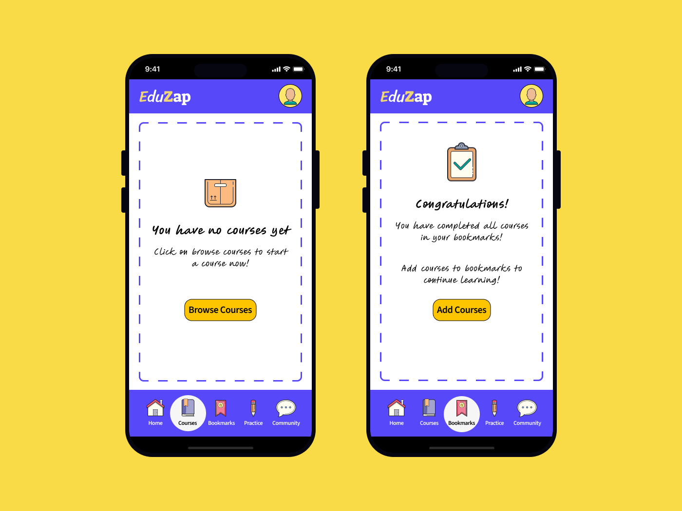
Revised Screens 3 & 4:
Previously cluttered bottom menu icons have been replaced with subtle outlined icons. Filled versions are now used to denote selection, reducing visual noise and improving clarity.
The overall design maintains consistency with the desktop version, ensuring a cohesive experience across all devices.
LEARNINGS
This project taught me the importance of aligning design elements with the overall brand identity, especially in creating a fun and engaging user experience.
The initial designs lacked a cohesive visual and tonal approach, which could have led to user confusion and disengagement. By refining the typography, simplifying the menu selections, and making the UX copy more playful, I was able to create a more intuitive and enjoyable experience for users.
This experience reinforced the value of iterative design and the impact of small changes in creating a more user-friendly and brand-aligned product.
Resources and Acknowledgements:
With feedback from Raaghavi Senthil, Uxcel Mentor
Icons & Illustrations: Icons8 Plugin on Figma
UI Templates: Uxcel Free Mobile and Desktop Mockup Template Community Files on Figma
Images: Free resources available on Unsplash plugin on Figma

Reviews
2 reviews

Hi Chinmayee 👋 I like how you iterated on feedback and refined both the copy and visual hierarchy — the revised screens feel much more playful and on-brand. The addition of a secondary CTA and the subtle menu icon treatment make the experience clearer and more user-friendly. One small tip: you could push the celebratory tone in the “No Bookmarks” state even further to amplify user motivation 🎉 Overall, really thoughtful work!

You're on the right track, but there are a few areas that could use improvement:
- The fonts you’ve chosen are not very easy to read or user-friendly. Consider opting for a more legible typeface.
- The border you’ve used gives the impression of an active drag-and-drop area, which could confuse users. It might be better to remove it or use something more subtle to avoid any misunderstanding.
- The copy could be more fun and engaging. Right now, it feels a bit redundant since the body text and CTA are almost the same. Try to differentiate them to make the message more impactful. This is also a great place to let your brand personality shine through.
- The selected state for each menu category looks a bit over the top to me. Again, consider using something more subtle to highlight the selection without being too overpowering.
Feel free to tag me once you’ve made the edits. I’ll be happy to revisit and revise my review!
You might also like

Bridge: UI/UX Rebrand of a Blockchain SCM Product


Pulse Music App - Light/Dark Mode


Monetization Strategy


Designing A Better Co-Working Experience Through CJM


Design a Settings Page for Mobile


Zoom Sign in Screen

Content Strategy Courses

UX Writing


Common UX/UI Design Patterns & Flows


Building Content Design Systems
