E-commerce Push Notifications
Selected E-commerce Platform
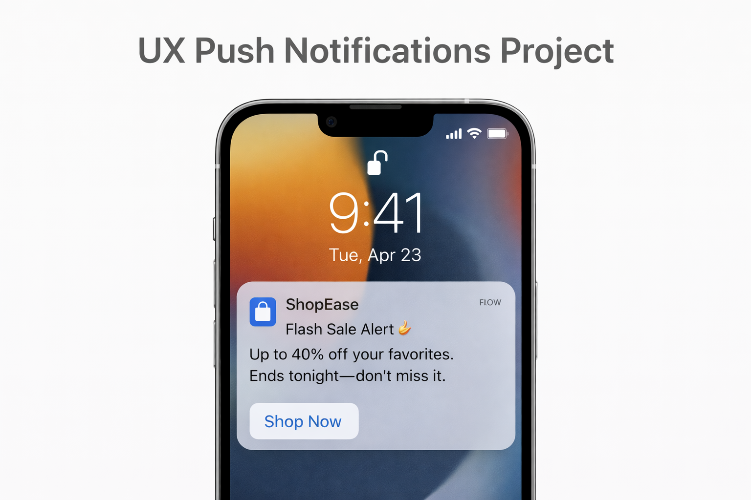
Platform name: ShopEase (generic, safe for Uxcel)
A mobile-first e-commerce app offering fashion, electronics, and home essentials with fast delivery and personalized deals.
1️⃣ Purpose: Cart Abandonment Reminder
Title:
Still thinking it over? 👀
(21 characters)
Body:
Your cart items are almost gone. Check out now before they sell out.
(64 characters)
Button:
View Cart
(9 characters)
2️⃣ Purpose: Limited-Time Promotion
Title:
Flash Sale Alert ⚡
(18 characters)
Body:
Up to 40% off your favorites. Ends tonight—don’t miss it.
(58 characters)
Button:
Shop Now
(8 characters)
3️⃣ Purpose: Order Status Update
Title:
Good news! 🎉
(11 characters)
Body:
Your order has been shipped and is on its way to you.
(52 characters)
Button:
Track Order
(11 characters)
4️⃣ Purpose: Personalized Recommendation
Title:
Picked just for you 💛
(19 characters)
Body:
New arrivals based on what you love are waiting for you.
(57 characters)
Button:
Explore
(7 characters)
5️⃣ Purpose: Back-in-Stock Notification
Title:
It’s back! 🎯
(10 characters)
Body:
The item you wanted is available again. Grab it before it’s gone.
(63 characters)
Button:
Buy Now
(7 characters)
Overall Effectiveness Explanation (For Uxcel)
These push notifications are designed to support the user journey at different stages—browsing, decision-making, purchasing, and post-purchase.
- Clarity: Each message communicates one clear action or update.
- Scannability: Short titles, simple language, and focused body text make messages easy to understand at a glance.
- Creativity: Emojis are used sparingly to add warmth and emotion without reducing professionalism.
- Brand Voice: Friendly, helpful, and customer-focused—aligned with modern e-commerce expectations.
- User Value: Notifications are timely, relevant, and personalized, avoiding spammy or generic messaging.

Reviews
4 reviews

Hi Nour!
What I like here is that the notifications don’t feel desperate. E-commerce pushes can easily scream “SALE!!!” every five minutes 😅🔥 but yours feel more intentional. The messaging seems to focus on relevance and clarity instead of just urgency, which builds way more trust over time.
If I’d push it further, I’d explore smarter triggers like browsing behavior, wishlist activity, or time-sensitive nudges that actually make sense for the user 🤖⏰ That would take it from “good copy” to “strategic retention tool.” Overall though, this feels thoughtful and not just conversion-hungry.

This seems AI generated, especially with the (Safe for Uxcel) and (for Uxcel) lines in parenthesis. This would immediately be clocked by a recruiter who would think that this was not your work and move on.

CTA feels natural. The tone works well without being pushy. Simple, effective notification design.

Hi Nour, It seems the spacing between the header and subheader is too wide. You can adjust it by aligning both texts with the icon on the left, or by refining their vertical spacing so the overall height feels balanced and precisely aligned.
You might also like

Pulse — Music Streaming App with Accessible Light & Dark Mode


Islamic E-Learning Platfrom Dashboard

SiteScope - Progress Tracking App


Mobile Button System


FlexPay


CJM for Co-Working Space - WeWork

Content Strategy Courses

UX Writing


Common UX/UI Design Patterns & Flows


Building Content Design Systems
