E-book Reading App

E-book Reading App 📚 this one was a lot of fun, plus a good excuse to use a Serif!
Feedback welcome 😄
Reviews
3 reviews

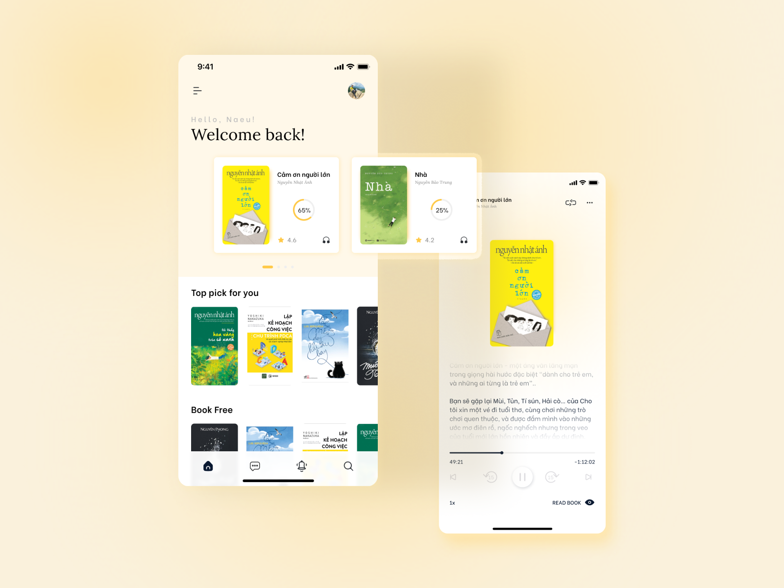
At first sight, your eBook app design looks clean and minimalistic. There are just a few things I believe that could take it up a notch.
First, it would be really helpful to add more screens to show off a broader range of features. For example, onboarding screens to show how new users are introduced to the app, browsing or library screens to highlight how users can search and explore, and maybe even a profile or settings screen to show any customization options. It would also be great to see more detail on specific features like reading progress, bookmarking, or unique options like audiobooks or note-taking.
Another thing that would make a big difference is adding explanations for each screen so people can better understand how the app works and why you made certain design decisions. A clear design rationale would also help explain your choices for things like colors, typography, and the overall user experience.
One last thing. The grey text on the lighter background could be hard to read for some users, so check the contrast to make sure it's accessible.
Overall, this is a solid start! With more screens, feature explanations, and a stronger design rationale, your submission will really stand out.

Nice start Duong I can see the thought you have put in to your design! A few pointers to help your develop it more! Increase the whitespace more to help your design breathe! And be careful with the colours used and some of the design would not pass colour contrast tests. I found the music player very hard to see so maybe increase its opacity! Good luck

Hi, Dương. I must say your design is minimalistic and simple. I love how the elements are arranged. Here are some recommendations and suggestions:
- Add more pages to provide us with more information about the project.
- The media buttons are not very visible; consider increasing their shade.
- On the second page, try lengthening the black text as it reads. Also, move the cover page of the book up, as the space between the header seems quite wide.
- On the first page, if time is part of the design, try aligning it with the hamburger menu.
- Consider adding a soft drop shadow or border for clarity around each book, as the white edges sometimes make the covers look small.
I’ll edit my ratings once these updates are made, so just let me know!
P.S. What is the purpose of the 'message' icon in your reading app?
You might also like
SiteScope - Progress Tracking App


FlexPay


Mobile Button System


CJM for Co-Working Space - WeWork


Ubani Design System


Accessible Signup Form for SaaS Platform
Popular Courses

Introduction to Figma


Design Terminology


Core UI Components
