Digital Asset Management Landing page


digital asset management Landing page
Introducing Danatorex, an intuitive platform designed for efficient asset growth and digital investment. Whether you're a seasoned investor or a newcomer to the world of cryptocurrency, Danatorex's user-friendly interface ensures that managing, tracking, and securing your investments is a breeze.
🌟 Key Features:
– Innovative solutions for managing and growing assets securely
– Real-time transaction monitoring with cutting-edge security
– Clear, simple navigation with vibrant and engaging visuals
– A modern UI language combining bright, friendly colors and rounded shapes
– Easy onboarding with guided registration and sign-up processes
This design focuses on creating a seamless and engaging experience for digital asset enthusiasts. Its intuitive layout and vibrant, visually rich environment ensure that all users, from novice to expert, can enjoy a smooth journey in the digital asset space.


Tools used
From brief

Topics
Share
Reviews
4 reviews

Great use of vibrant visuals and clear flow — adding a glimpse into your design process would make it even stronger, but overall it’s a polished and engaging landing page!

SEYED MOHAMMAD AMIN KAMALI – The landing page is very polished and professional, with an intuitive layout that makes navigation seamless for both novice and expert users. The vibrant visuals, friendly color palette, and modern UI elements create an engaging and welcoming experience, while the clear onboarding flow and real-time transaction features reinforce usability and trust. Overall, it’s a well-thought-out design that communicates accessibility, clarity, and professionalism effectively.

Nice work Amin. The landing page feels modern and user friendly, with clear highlights of key features. I like the bright colors and rounded shapes, they make the design feel welcoming.
You could make it even stronger by showing how the page guides users toward sign up or key actions. Overall, a clean and engaging design.

Hey Seyed, although I’m not fluent in the language, I tried to rely a bit on translation and your descriptions to get the gist. The foundation you’ve built is solid, and the presentation comes across as professional. what I missed, though, is a peek into your actual design process, how you approached research, ideation, and whether you did any prototyping or testing. It would be great to see what kind of feedback you got from users and how that shaped your decisions. If it’s just a concept, maybe share how you imagine it would perform, or what metrics you’d track.
One more thing: consider adding an English version. Now that Figma lets you translate copy, it’s actually pretty easy to do. This could make it much simpler for other mentors and designers to dive into your work, rather than feeling put off by the language barrier. It’s not a huge issue, but it might give you a small edge and help you get more feedback.
You might also like

eWallet App Development Project


🖥 Desktop Checkout Flow Design


Website CRM Dashboard


Helpful 404 Error Page for a Fintech Mobile App

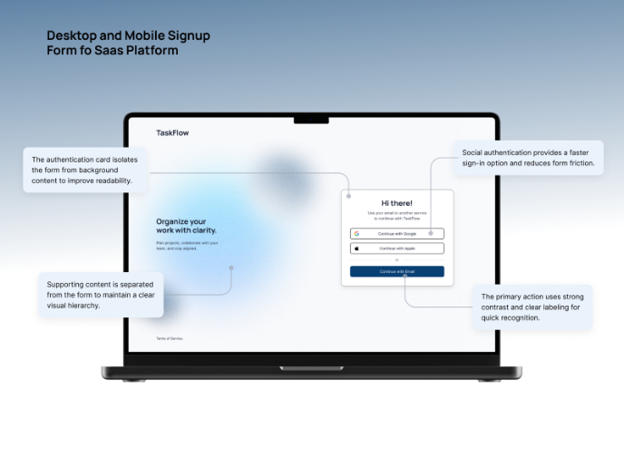
TaskFlow Authentication Flow


Pebble Accessible SAAS Signup Flow

Visual Design Courses

UX Design Foundations


Introduction to Figma

Design Terminology
