Desktop Sign Up form for SaaS

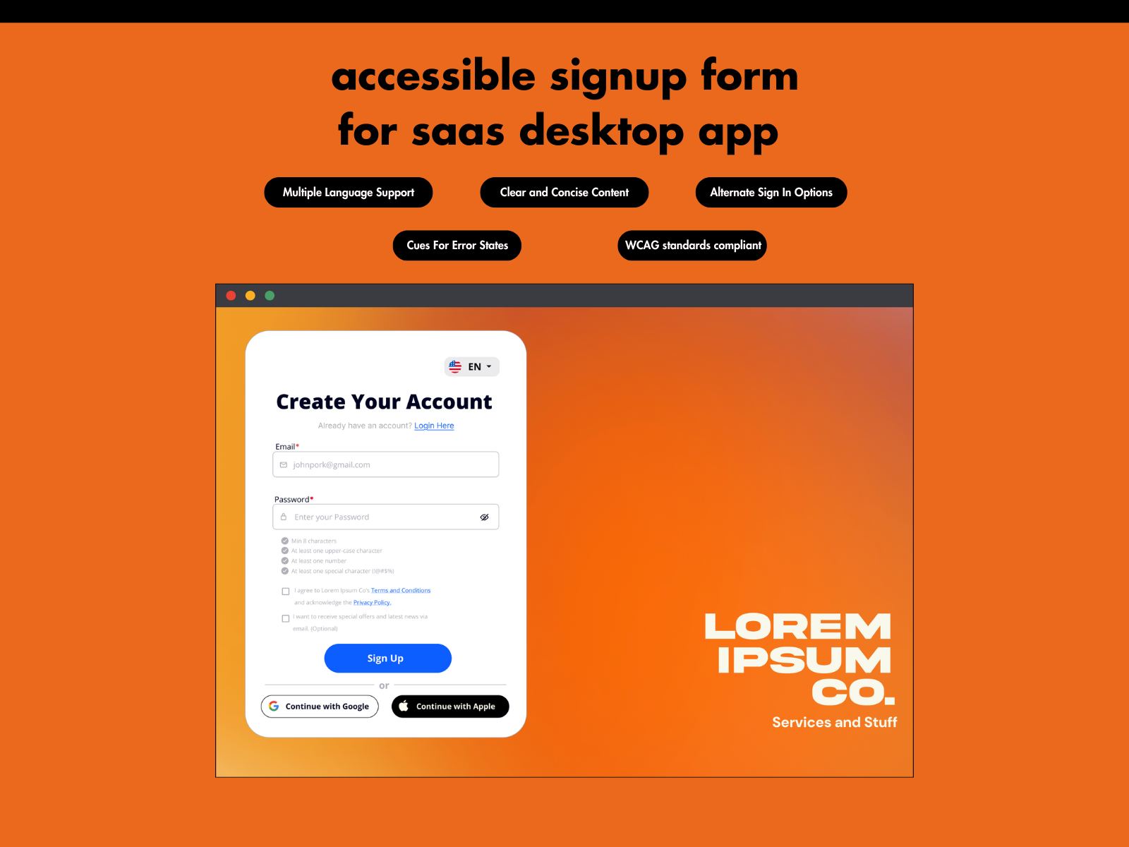
In this project I fabricated a product with the goal of fulfilling the project requirements.
Cool stuff I added:
- Multiple Language Support
- Clear and Concise Content
- Alternate Sign in Options
- Cues for Error States
- WCAG Standards Compliant
Hope you enjoy! I'm excited to hear any feedback as this is my first ever project as an aspiring Product Designer!

Reviews
2 reviews

This is a fantastic start! You're already incorporating key UI/UX elements like clear error states, selected states, and password requirement validation, which enhance the user experience significantly. The inclusion of multiple language support and alternative sign-in options (Google & Apple) adds accessibility and convenience—great job on that!
Suggestions for Improvement:
- Error State Accessibility:
- Right now, the password error state relies only on color to indicate an issue. However, colorblind users may not easily recognize the error. Consider adding an "X" or an exclamation mark icon next to the input field or inside the red box to provide a clear, non-color-based error cue.
- Spacing Adjustments: Some elements could benefit from better spacing for readability and visual balance. For example, the form fields and labels could have more vertical padding to improve clarity.
- Color Selection & Consistency:
- The password error state is in red, which is great for indicating an issue, but ensure the red has enough contrast with the background for WCAG compliance.
- Keep the primary CTA buttons visually distinct from secondary buttons to avoid confusion.
- Typography Hierarchy: The header ("Create Your Account") is bold and stands out, which is great! However, the body text (such as terms and conditions, optional email subscription) could use subtle variations in font size or weight to improve readability.
- Button Styling Consistency: The Google and Apple sign-in buttons follow platform-specific designs, but ensuring uniform padding and alignment with the main "Sign Up" button will create a smoother visual flow.
Overall Thoughts:
This is an impressive first project! You're demonstrating a strong understanding of usability principles. Keep refining these small details, especially around accessibility and consistency, and you'll continue to grow as a Product Designer. Excited to see more of your work! 🚀

Your design is already in great shape, and it’s clear you’ve put a lot of thought into accessibility and usability. These small refinements will take it to the next level and make it even stronger. You’re really close to a polished, high-impact design!
What You Can Improve
- Error messages could be more helpful. Right now, "Invalid Email or Password" is functional, but adding a bit more guidance would improve clarity. A message like "Your email or password is incorrect. If you forgot your password, reset it here." helps users take the next step instead of leaving them stuck.
- No clear focus state for keyboard navigation. If someone navigates using the keyboard, they should always see where they are. A 2px blue or black outline on focused fields will make the form easier to use for everyone.
- Buttons shouldn’t be active when fields are empty. Disabling the "Login" and "Sign Up" buttons until all required fields are filled will make the form feel more intuitive. This small change prevents user frustration and improves usability.
- The red error text might not have enough contrast. A simple tweak like using #D32F2F instead of a lighter red will make sure the text is easy to read for everyone, including users with visual impairments.
- The ‘Receive Special Offers’ checkbox could be placed better. Since it’s optional, moving it under a collapsible ‘More Options’ section keeps the form clean and focused. This improves readability while still keeping it available for those interested.
- No hover or active states for buttons. Adding a small background color change or slight scaling effect will give users a sense of interaction and responsiveness. This makes the form feel smoother and more polished.
- No visual cues explaining accessibility choices. Since this is part of a UX submission, adding small labels like "Keyboard Accessible ✅" and "Screen Reader Friendly ✅" to the mockups will highlight your accessibility efforts and make them stand out.
What to Add to Match the Brief Even More
- A clear focus outline on all interactive elements. Not just input fields, but also buttons and links. This makes the entire form more user-friendly for those navigating without a mouse.
- An error state preview in your submission. Showing what happens when users enter incorrect details will demonstrate that you’ve accounted for real-world usage scenarios.
- A success state preview. Right now, we see the blank and inputted forms, but adding a confirmation state will complete the user journey.
- A working prototype (if possible). If the platform allows, an interactive version (in Figma or CodePen) would make your work even more engaging.
You’re already so close to a fully accessible, well-structured design. These refinements will not only meet but exceed expectations. Keep going—your attention to detail is paying off, and this project is shaping up to be something you can be proud of!
You might also like
Blip - Esport app design (Light & Dark UI)

Reimagining Asana's Color System

Customer Journey Map for a Co-Working Space

Responsive Main Screen

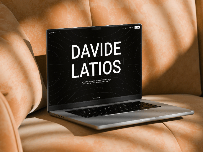
Latios - Free Portfolio Template for UX/UI Designers

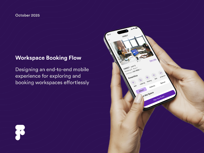
Workspace Booking Flow - UI/UX Design

Visual Design Courses

UX Design Foundations


Introduction to Figma

Design Terminology
