Design an Analytical Dashboard

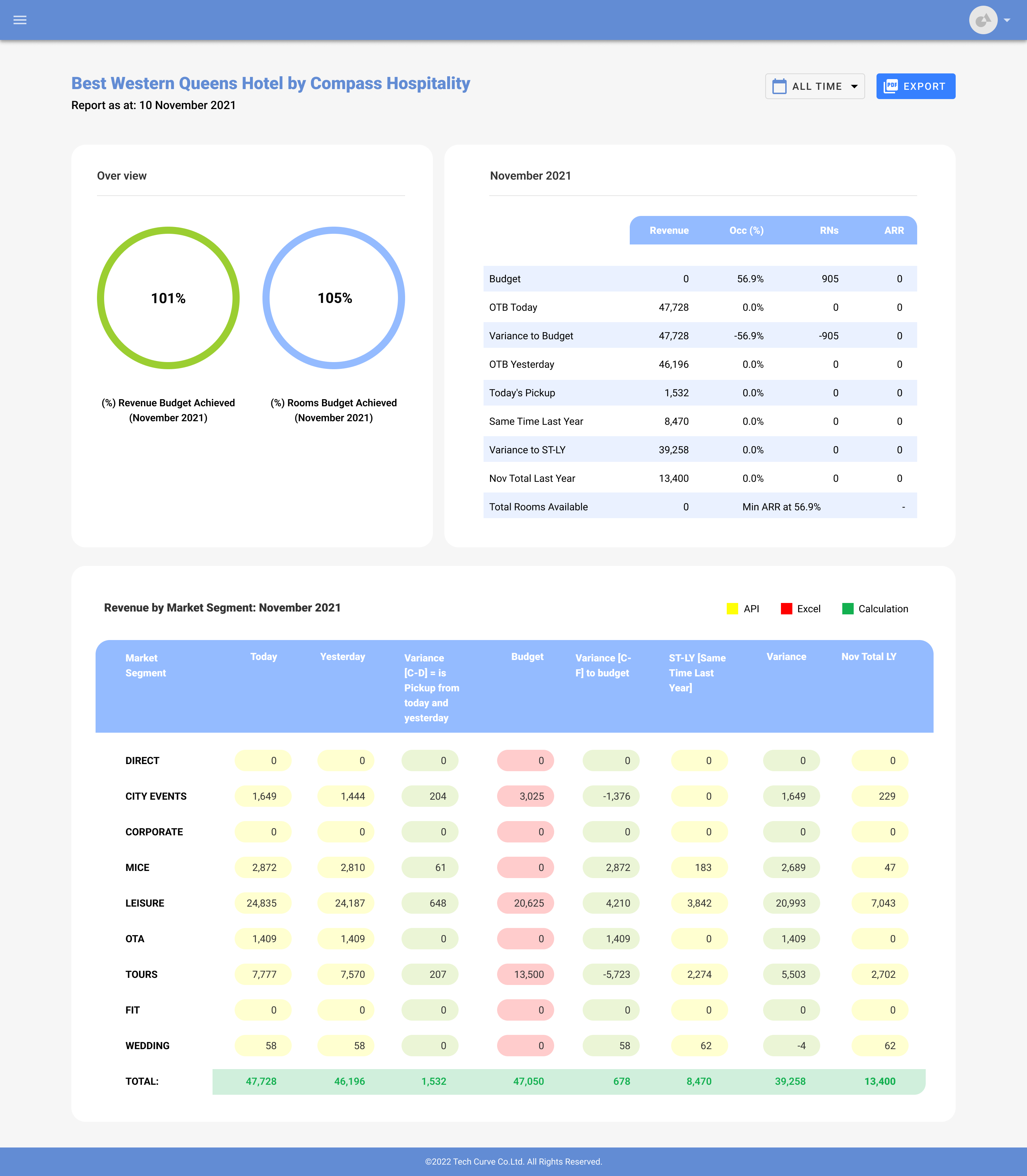
Best Western Queens Hotel by Compass Hospitality

Reviews
3 reviews

Good Work @Laksika
Clean and intuitive dashboard layout with effective use of data visualization. Adding more context on user goals and interaction flows would enhance understanding of your design decisions.

Not a bad design Laksika but it does not fit the brief scenario. I also don't see any research or explanations behind your design. It's an informative MVP dashboard that might help hotels but there is still work to be done here.

Lasika, SAAS learning is all about arranging space and data. When it comes to dashboard, they are generally grey out so that the attention remains on the data and not on colours. My suggestion start copying and learning or download Figma software dashboard from community and understand how those components are arranged your job there is to reduce the text as much as it could show the tutorials. Keep it clean, less, colourful and board heading over there. Menu arrangement is the topmost priority, and sometimes adding the space for errors. Is also one of the big headaches that when you start creating dashboard for business use, you will realise that.
In reality, there are two types of Designer, one who are landing page and e-commerce versus the one who are software and dashboard, and you have to choose which one you want to master because you can't be both or nobody can be both perfectly
You might also like

HealthFlow: Designing a Simple and Insightful Wellness Dashboard


Improving Dating App Onboarding: A/B Test Design

FORM Checkout Flow - Mobile


A/B Test for Hinge's Onboarding Flow


Accessibility Asse


The Fitness Growth Engine

Visual Design Courses

UX Design Foundations


Introduction to Figma

Design Terminology
