Reviews
1 review
Such a refreshing and fun take in Daily UI practice, Ziad!
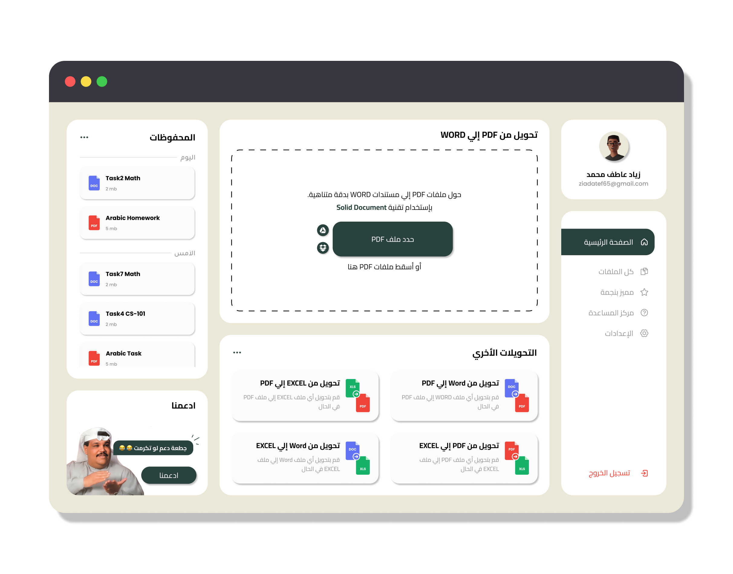
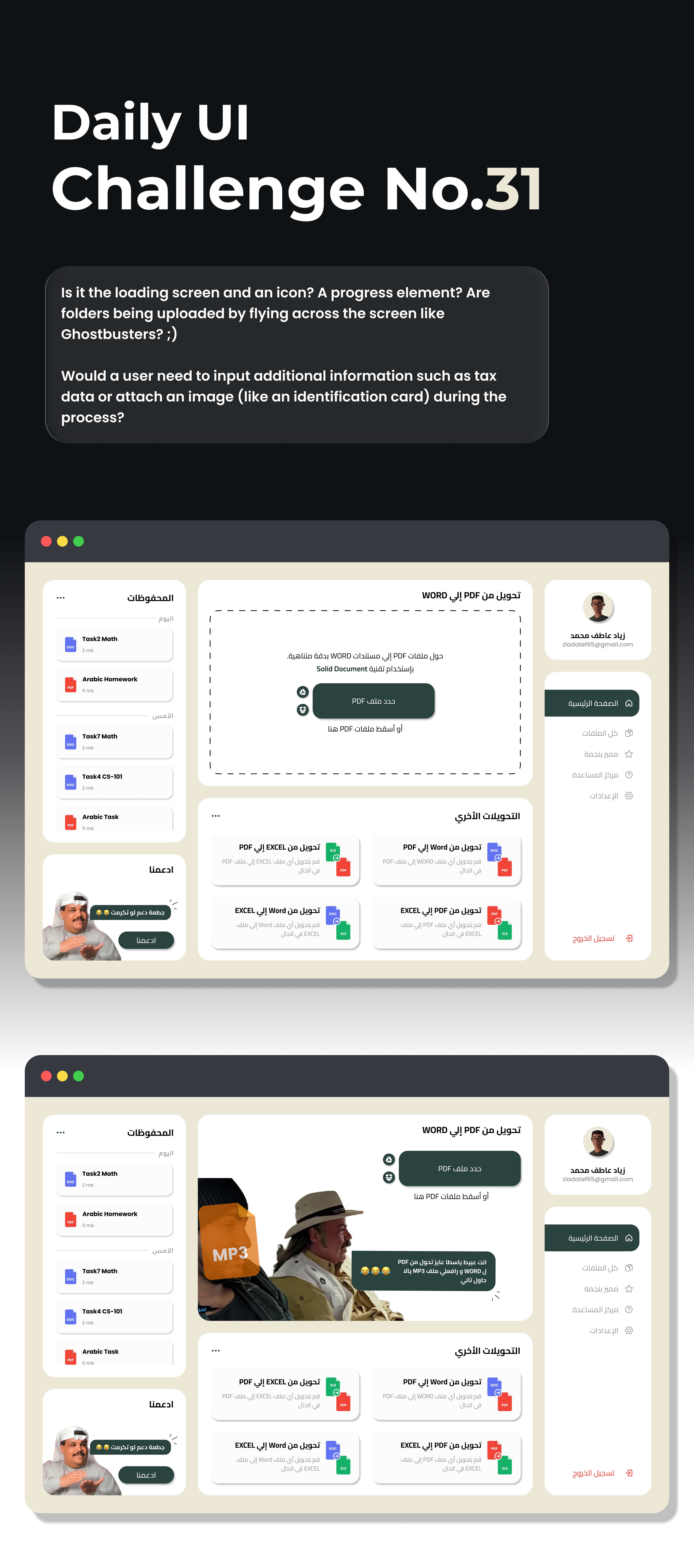
This design feels like it started serious but turned funny halfway through. The donation section with the meme guy adds local humor, which is nice, but it also changes the product tone. Unless the whole app is meant to be playful, it might look more like a meme insert than a real donation feature.
The converter part is even funnier. The scene with the “PDF to MP3” joke looks like a placeholder when you ran out of design ideas, or maybe a joke about an AI converter that failed. It’s funny, but it makes the interface feel like it gave up on its own job.
If you want to keep that humor, you can turn it into a proper error message that still fits the design. Right now it feels half serious, half meme board, fun to look at, but not clear if it’s meant to work or just make people laugh.
You might also like
SiteScope - Progress Tracking App

FlexPay

Mobile Button System

CJM for Co-Working Space - WeWork

Ubani Design System

Accessible Signup Form for SaaS Platform
Popular Courses

UX Design Foundations

Introduction to Figma


