
Reviews
1 review

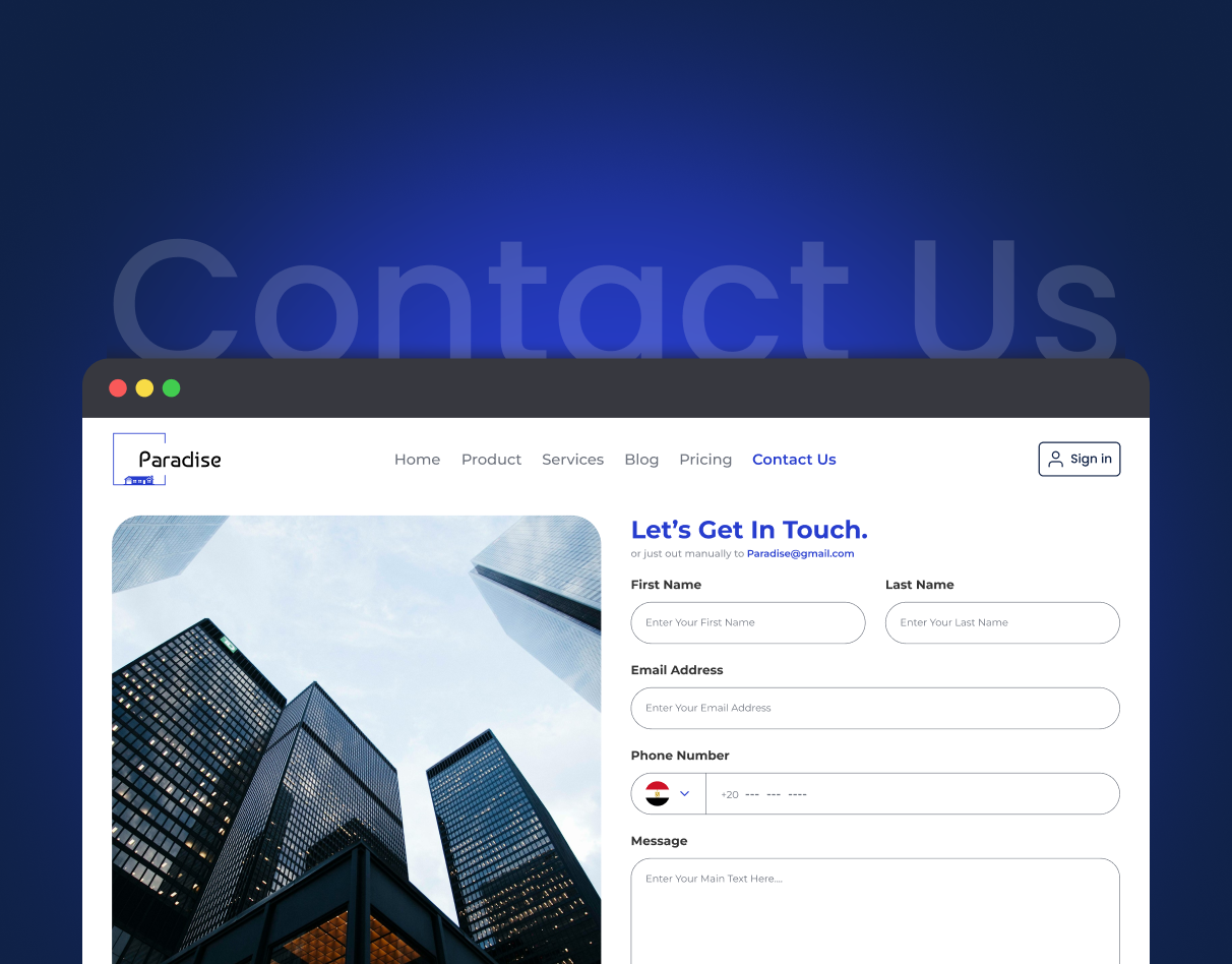
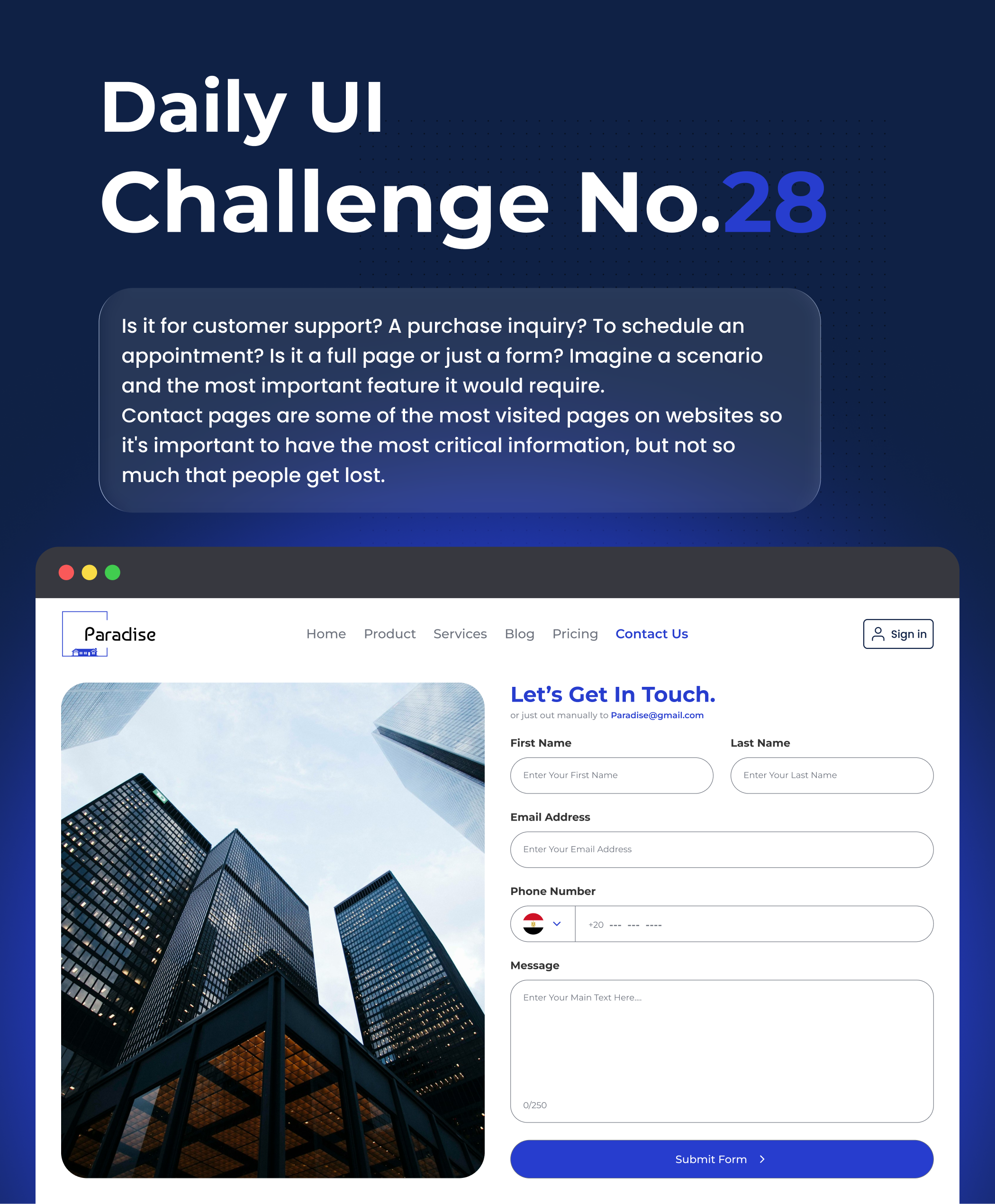
The layout feels fresh and clean—the large photo and generous white space make the page easy to read, while the heading creates a clear focus. The visual hierarchy works well, and the blue accents guide attention to the right places, especially “Contact Us” and the “Submit Form” button. Form fields are clear and comfortable to use, and the rounded corners add a modern, friendly vibe.
To make it even better, consider slightly stronger contrast for placeholder text, add a proper country picker for the phone field, tighten vertical spacing with an 8px grid for a more balanced rhythm, and show a clear success or error message after submission.
Overall, great work—modern, clear, and user‑friendly. Keep it up!
4 Claps
Average 4.0 by 1 person
You might also like
Project
SiteScope - Progress Tracking App

🧩 Project OverviewThis project showcases the design of a mobile login and sign up experience for a construction progress tracking app. The

Project
FlexPay

The onboarding was designed to reduce financial anxiety, create a sense of instant reward, and encourage early action. Instead of overwhelmi

Project
CJM for Co-Working Space - WeWork

This project presents a customer journey map for WeWork, created to understand the end-to-end experience of a remote professional using a co

Project
Ubani Design System

Ubani Design System Includes consistent, accessible, and scalable product foundation across neighborhood social experiences. It includes: a

Project
Accessible Signup Form for SaaS Platform
🧩 Project OverviewFor the Accessible Signup Form for SaaS Platform challenge, I designed a desktop signup experience for TaskFlow, a projec

Project
Loginino

The primary goal of this login page was to create a clean, intuitive, and accessible user experience that minimizes friction and guides user
Popular Courses

Course
UX Design Foundations

Learn UX design fundamentals and principles that create better products. Build foundational knowledge in design concepts, visual fundamentals, and workflows.

Course
Introduction to Figma
Learn essential Figma tools like layers, styling, typography, and images. Master the basics to create clean, user-friendly designs

Course
Design Terminology

Learn UX terminology and key UX/UI terms that boost collaboration between designers, developers, and stakeholders for smoother, clearer communication.