Crafting Consistency: Building a Scalable Design System

Overview
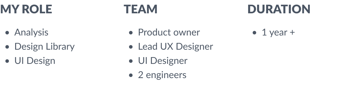
Two years ago I joined to product team as a UX/UI designer. My tasks were quite basics: covering missing use cases, design improvements and immerse in other products that were related with that I was worked with. Organisation I worked for deliver multiple digital products dedicated specific target audience.
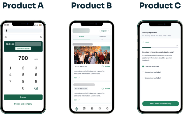
- Admin Panel for members management
- Web app for event registration
- Web app for donations
- Website
- Web app for voting
- Native App with multimedia for kids
and even more!
Workflow there at that point was horrible to be honest. Design files didn't matched with released products. Every product looked different and inside of products inconsistency was the only consistency. But I weren't alone, I had multiple discussion with my collegue, UX Lead, she was working in other product in the same organisation. We were dreaming about design system, pff,.. even design library.
In this case study Im going to tell you a story how we build design system and how we failed and sucessed in the same time.
Problem statement
All teams across organisation were more or less affected by lack of structure, lack of design library, consistency, code quality etc. Generally quality of products were so-so, it took ages to release new features, there were a lot of stress and misalignments.
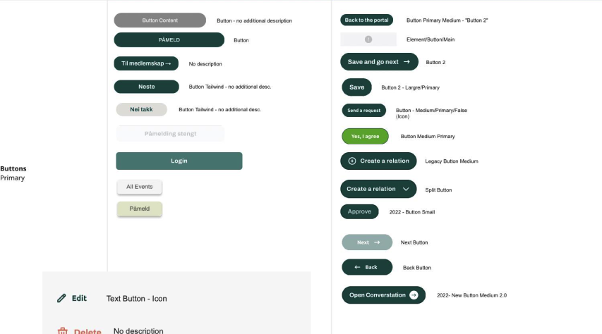
To present the scale of inconsistency I want to show buttons that were used in products. As You can see there were not totally different from each other, these products didn't had their own branding.
All of them used the same logo, or logo variant, they had familiar colour palletes. But we were able to find more than 20 variants of primary buttons.
We wanted to help with these issues by providing seamless, easy to use design system.
The working process and actions taken
1.Products analysis
Together with the UX Leader, we divided the products between us. Each of us was to analyse products in terms of:
- Searching for good patterns, we did not want the design system to change the products beyond recognition, what worked well was to work in the most similar way possible,
- Analysis of visual identification elements, typography, colours. Here again, similarly, what worked and was in accordance with the brand book were foundation drafts of our design system,
- Competition analysis - of course we used this well-known research method to evaluate and create modern & friendly feeling.
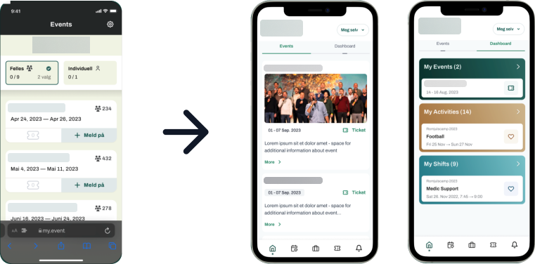
As outcome of that phase we get multiple proof of concepts, we redesigned most popular views from products and iterate these ideas couple times with stakeholders.
2.Foundation
With accepted proof of concept we had to translate it into design system foundation.
Why foundation first?
The foundation of a design system includes core elements like color palettes, typography, spacing, and components that ensure consistency across digital products. It’s important because it creates a unified user experience, promotes efficiency in design and development, and maintains brand integrity. It is like source of truth for building components, layouts or interactions.
3.Token naming
What are design tokens? Why its naming is so important and challenging?
According to one of Medium's article, design tokens are:
"Reusable pieces of the code that describes colors, typefaces, spacing and other visual elements in design system"
Why their naming matters?
#clarity - well named token describes their purpose and function immediately. Proper names reduce confusion and are a great approach to fill gap between design and dev team.
#consistency - in token naming make the design system easier to use, improve maintainability and collaboration.
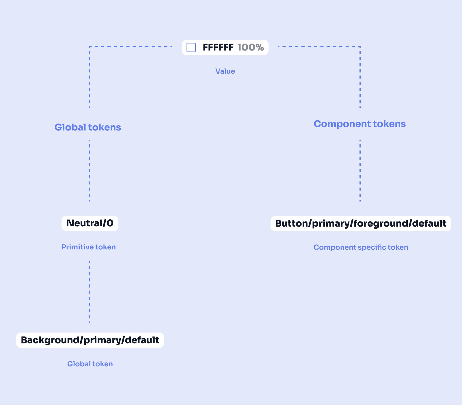
We split tokens into primitiv, global and component specific tokens.
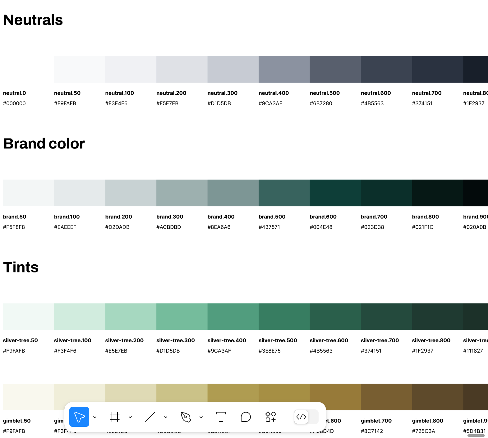
- primitive tokens - their name do not suggest where and how tokens should be used. We used primitive token naming for describe all color palletes we wanted to include in foundation.
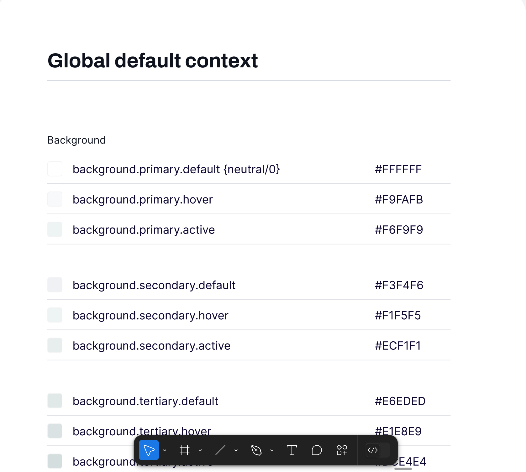
- global tokens - these tokens names inform where and how token should be used.
Background/primary/default - means this token is dedicated for backgrounds (pages, cards etc.) in default state.
But if You need a color for the same background but while hovering - You will use token "Background/primary/hover" itd.
- component specific tokens - their name also include information for which component this token is dedicated. In our design system we decided to use component specific tokens for most important components: buttons.
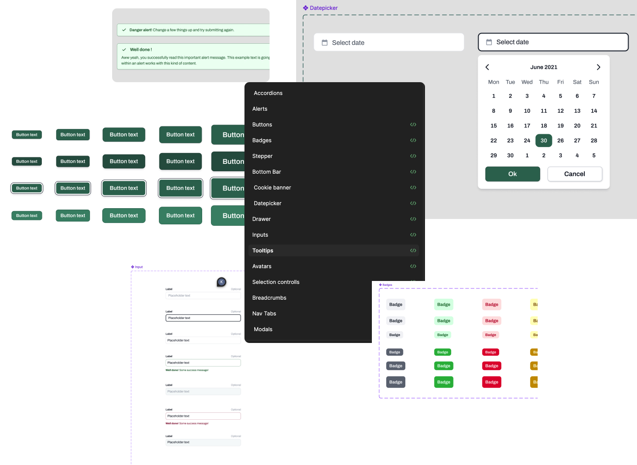
4. Component Library
With foundation in place we were at point when we had to decide: Do we want to build custom design library from scratch or buy library?
After lively discussions with devs, product owner and business we decided to buy Flowbite design library. Why? Because of efficiency, it was much faster and cheaper to buy library with ready to use code and just update CSS instead of designing and coding all of them from scratch.
Due to the uniqueness of products we build design system for we also created multiple custom components.
5.Sync design library and code
We had design library, foundation, token naming structure and most important components (buttons, inputs, dropdowns etc) in storybook.
But that was not a design system. Why? All of these elements were not synced, which means if something changed in token naming structure - that change was not reflected in story book and code.
We used Tokens Studio plugin to export all tokens with values and names to json file, which was embedded in code and could be easily updated in future.
Outcomes
Establishing a design system significantly improved the consistency within the products in which the design system was used, which had a positive impact on the reception of these products.
The time needed for the design phase was shortened from about 2 or 3 sprints to 1-2 sprints. Additionally, designers using the design system noticed that their work became less chaotic and that they began to spend more time exploring various UX solutions, instead of searching the entire figma for the right button.
Initially, when working on the design system, a developer was available responsible for adding subsequent components to the storybook. However, quickly, because after implementing the most important components, this developer was delegated to work on another product.
From that moment on, the difference between what designers could find in the design liberary and what was implemented deepened. After some time, opinions appeared from developers and managers that they actually did not see the benefits of having a design system.
On the other hand, there was a voice from designers - for us it's a game changer. I left the project at the stage of convincing the business that the design system should be completed so that it brings value to the other team members. Not only designers. From what I know, the project came back to life and a dedicated developer was assigned. I keep my fingers crossed for my former team that this time they will manage to complete the mission.
Reviews
1 review

Hi Kaja
From a systems-thinking perspective, this project signals maturity. Building a scalable design system is less about aesthetics and more about alignment across teams, components, and long-term product evolution. If tokens, spacing rules, and component logic are clearly defined, that’s a strong structural foundation.
What I value in design system work is clarity of intent. A system should not just look consistent; it should enable faster decisions and reduce ambiguity. If you’ve demonstrated how components adapt across states and contexts, that reflects thoughtful architectural planning.
To elevate it further, I’d explore governance and adoption strategy. Scalability isn’t just technical it’s organizational. Showing how the system evolves, how contributions are managed, and how teams maintain alignment would strengthen the narrative from visual consistency to operational impact. Overall, this reflects strategic design thinking at a foundational level.
You might also like

Beautify Login page WCAG principles


edX Sign-Up Page Redesign


Design Prioritization Workshop


Notion Login Page Accessibility Optimization


Sanyahawa - Landing page Design


Healthy Dashboard

Popular Courses

Introduction to Design Systems


Design Audits Fundamentals


UX Design Foundations
